Workout 007 – Revenues by business line by customer – various functionalities
Difficulty rating: 4 out of 5
Intro note
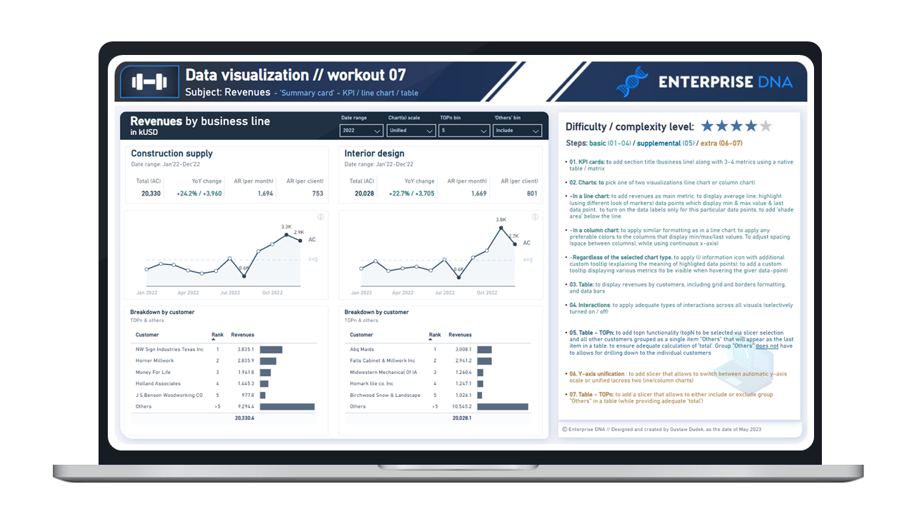
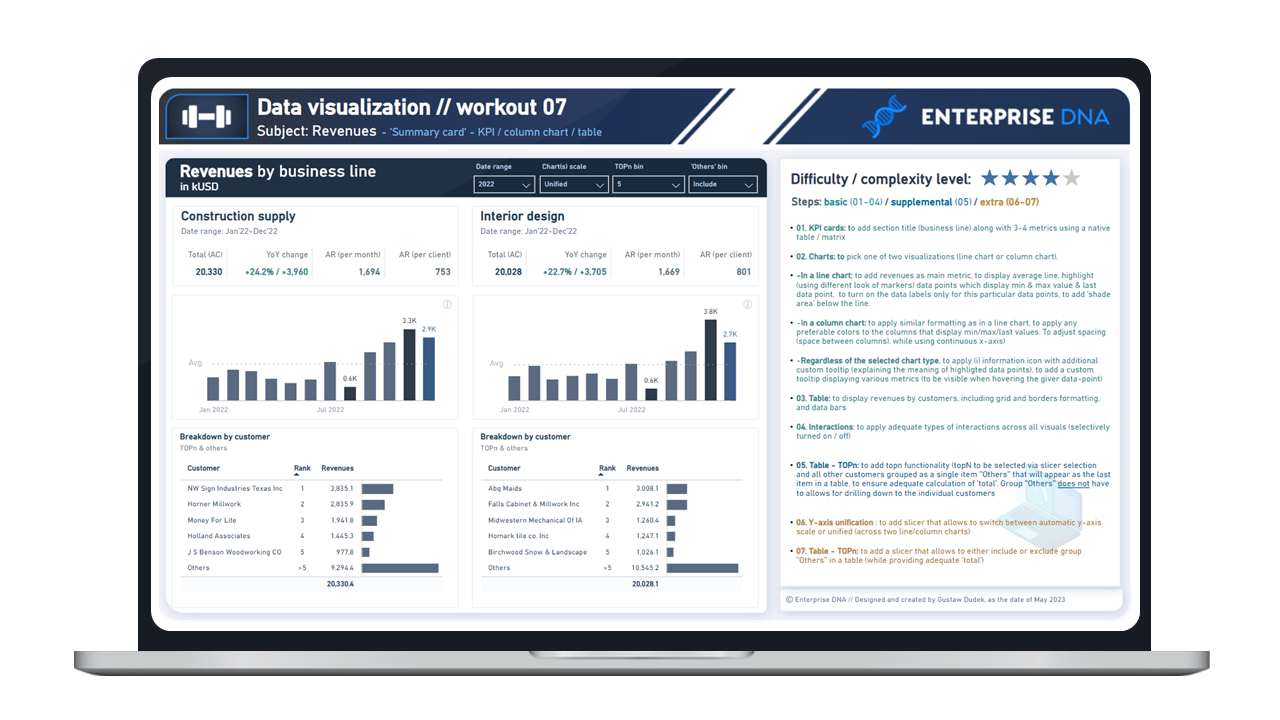
This workout combines various visualization techniques. The most important part of the workout is practice - entries does not have to include every element or functionality to be still considered as great . Please pay attention to the list of functionalities (provided in the screenshoot and in published-to-web report), which includes ‘basic’ elements (1st-4th point), supplemental (5th point) and extra (6h - 7th point). I would kindly recommend to review them before executing green and blue points to provide proper plan and flow of your work.
A good starting point is to implement: titles & headers along with basic KPI metrics (using matrix / table) // picking either line or column chart and replicating with presented functionalities and formats and adding tables without TOPn selection. Realizing further points (blue/yellow) will provide additional technical practice
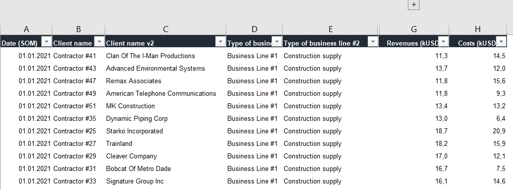
Following workout bases on exact same data source as provided in workout 002 // workout 005 // workout 006 - if you already participated in one of this two workouts - please feel free to reuse your already transformed datasource / model / measures etc.
**Following workout does not require to use each column. Nevertheless, please feel free to use any columns and any data which is valuable from your perspective. Feel free to use your entries as a part of your project portfolio, if it’s instrumental in realizing your goals.
Additional notes
-
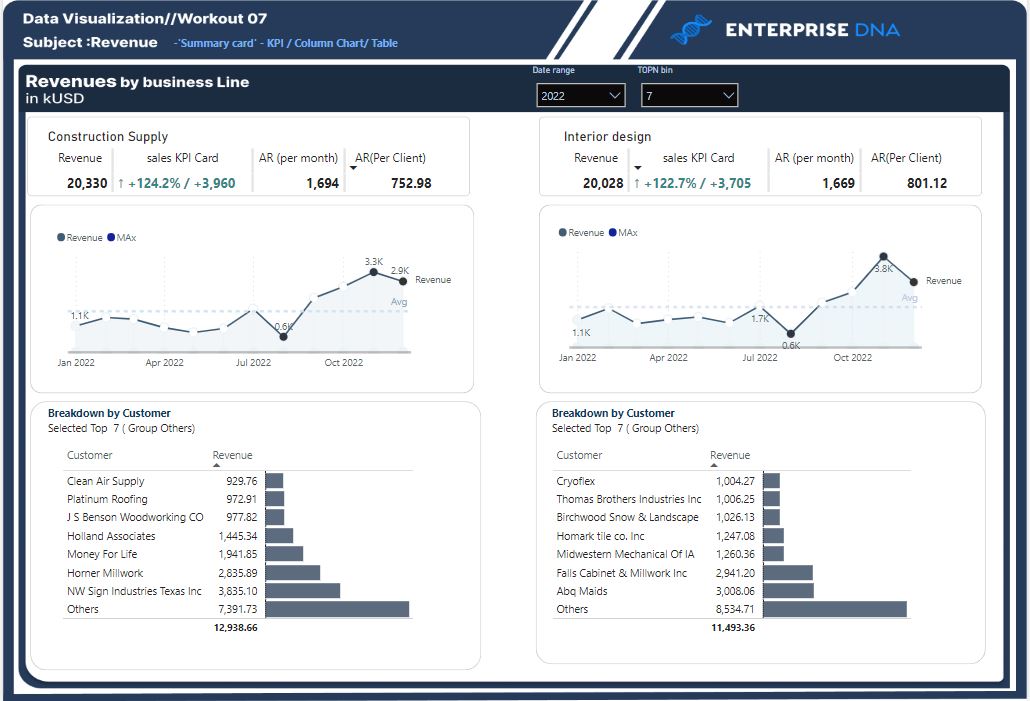
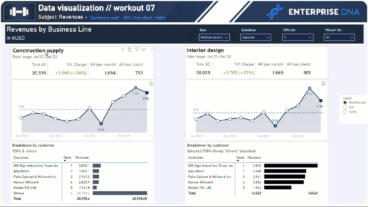
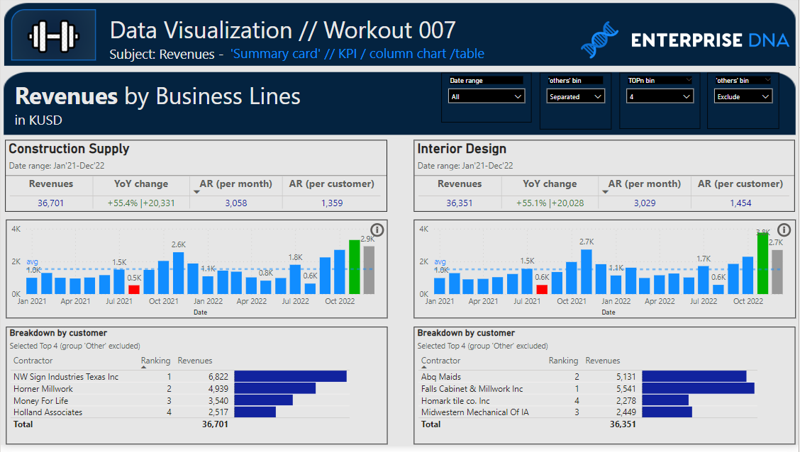
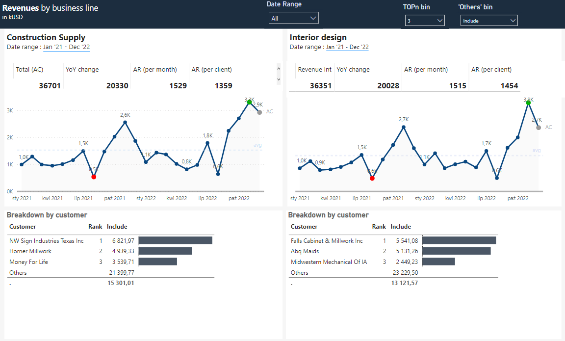
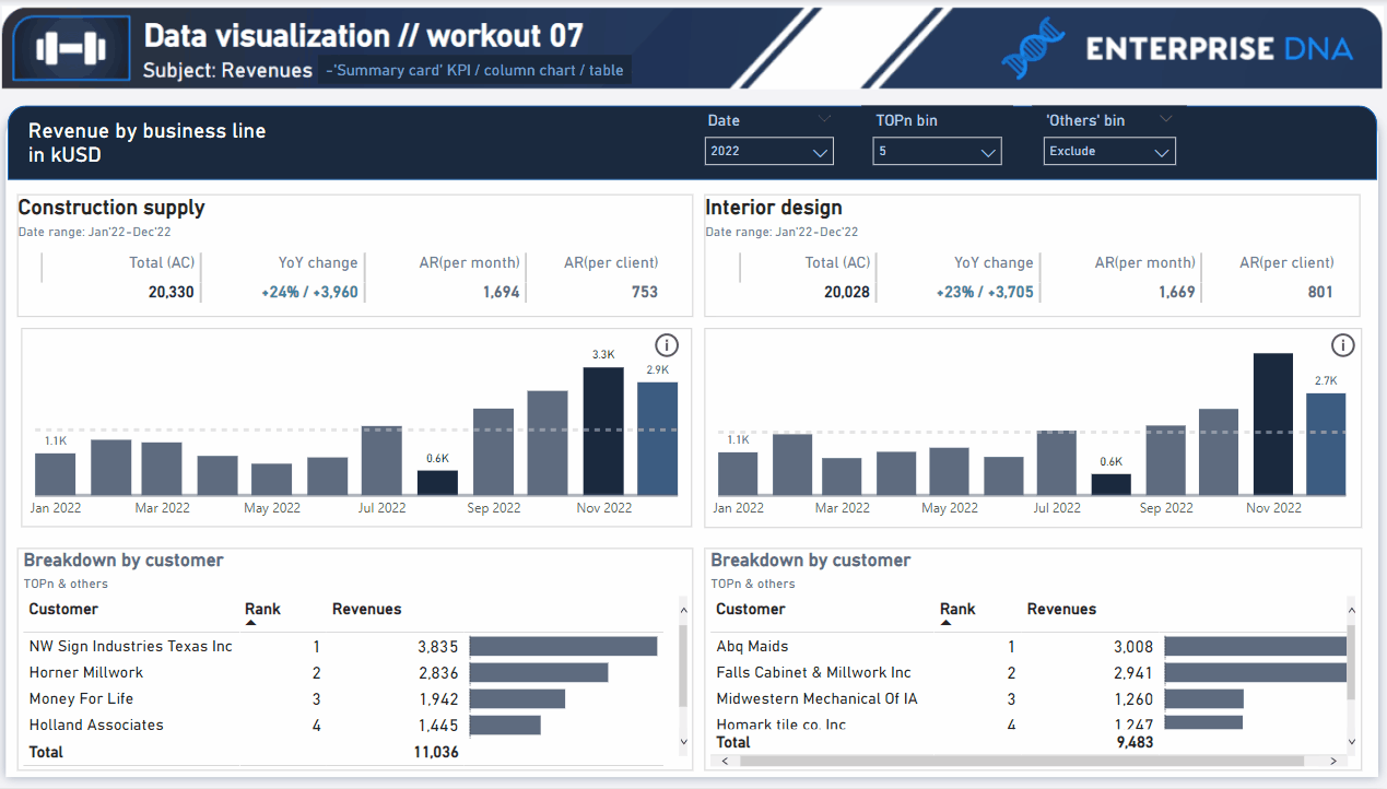
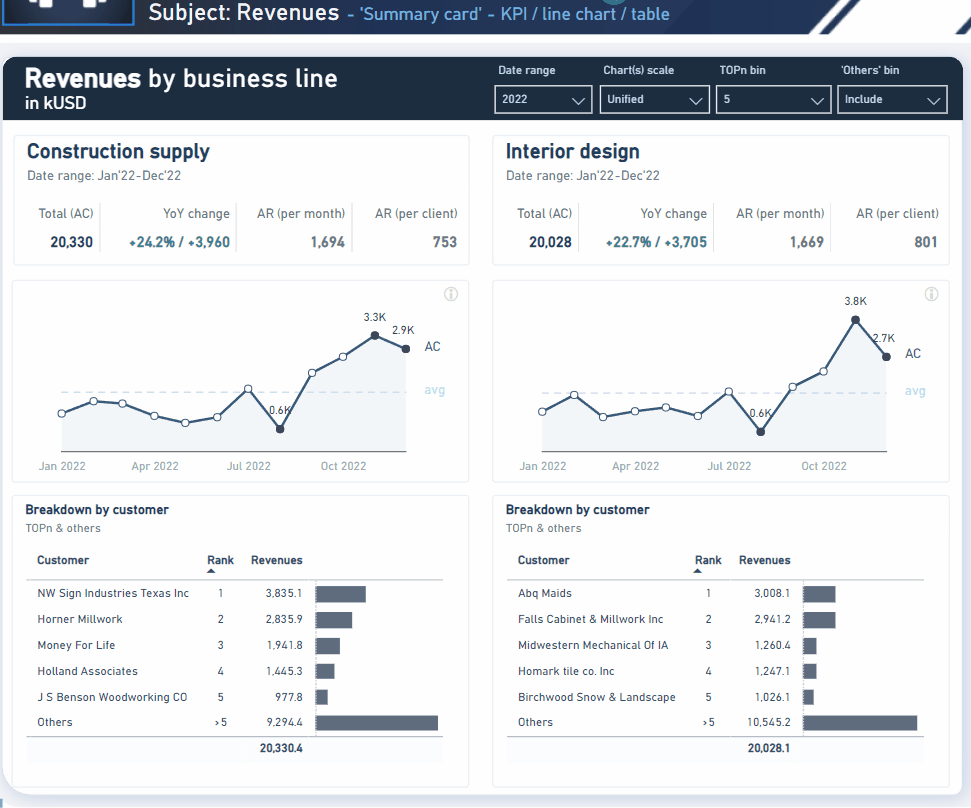
- Total AC = revenues (realization)
-
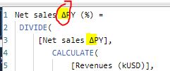
- YoY change = absolute and relative variance ( ΔPY)
-
- AR (per month) = average revenues per month
-
- AR (per client) = average revenues per customer
-
- Dark markers (in a line chart) and dark-coloured columns (in a column chart) are applied to those data point that display minimum or maximum value or which is the last data point in the selected period
-
- Y-axis unification (“extra step”) refers to the line charts and column charts
-
- Selecting given TOPn customers or including / excluding group “Others” should impact only on the bottom tables (‘Breakdown by customer’). All metrics in the upper section and line/column charts should not reflect the “TOPn selection”.
-
- In order to change views between line and column charts - you can click on blue subtitle (workout header, “Summary card”)
Goals
In this workout, using the supplied dataset and reviewing the provided interactive report (link below) we are going to replicate the following set of vizualizations (left section in a report screenshot), including the column charts, scatter chart, table, slicer pane and bookmark navigation experience. Also, please feel free to add any extra visual if you would like to (provided that core visualizations are included in the first place).
007 - Workout - Contractor profitability (revenues).xlsx (110.9 KB)
Core actions (practice) :
-
- Creating KPI cards using native matrix / table
-
- Adding additional lines and series labels to the line / column charts
-
- Applying data highlighting for certain data points (different markers or colors for selected points)
-
- Applying custom tooltips (within a charts)
-
- Applying custom tooltips as an “object” to provide additional comments for end-users
-
- Formatting tables (grids / borders)
-
- Making Dax calculations (TOPn and Others // ‘row total’ calculations in a table, etc).
-
- Setting appropriate interactions across visuals
Submission
Please load the supplied data (xls file) into a Power BI file, replicate visualizations (considerating list of points in the introductory report screenshot and the general design and functionality provided through interactive published-to-web report), and reply to this post including the screenshot (or a gif) of your solution along with the pbix file (please, include name or EDNA forum nick in the pbix name).
Period
This workout is released on Tuesday May 08, 2023, and the author’s solution will be posted on Monday/Tuesday May 15-16, 2023.
Additional materials
Link to the interactive dashboard:
Have a great fun!
Best regards!