How on earth did you all manage to add color between those two lines? Can’t find a place in visual settings responsible for that.
1 Like
It’ is to do with Error Bars, you fill in the space between the Actual and the Error bar
Hello! Thank you for this great content! I would like to ask if it is possible to add more cards like that (ex.:Total Revenues, Total Sales, Margin,…) and combine them all with the same comparison slicers into just one slicer ie vs Target, vs PY. Thank you in advance for your help!
Hello
yes, it’s possible.
We can e.g. have one main table with let’s say ID 1 PY, ID 2 BU,
have a lot field parameters, which will be linked with that main table and this main table will control all the field parameters. It was done that way e.g. in workout related with cost analysis (tabular view).
Best regards,
Gustaw
1 Like
Hi all
Here’s my submission for EDNA workout 4
I integrated additional metrics such as expenses and gross profit to enhance its interactivity.
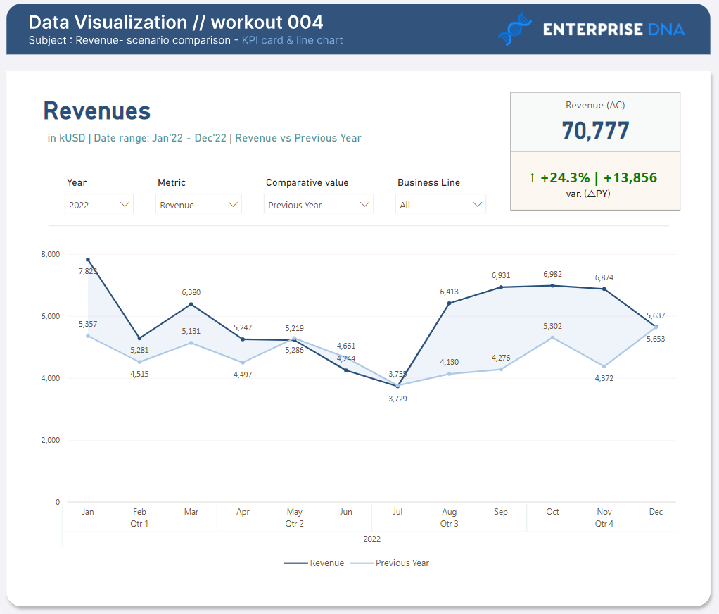
Live Report : EDNA Workout 4
EDNA Workout 4.pbix (310.8 KB)
Thanks
3 Likes
Hi Gustaw,
I am strugling a bit while trying to use the new card visual. I wanted to use a field paremeter as input for the reference label, however it seems to only show the name of the measure and not the actual value. Futhermore, an aggregation is performed on the column that I selected (which is harmless, because only one value is selected, but might be the reason for this behavior).
With an extra measure, I got it to work, but it seems overly complicated this way. Did you encounter the same issue already? Or am I missing something?
004 Workout - Jonathan Moeyersons.pbix (489.6 KB)