Also, the pbix I’m going to share tomorrow (regarding the 004 workout) will additionaly include this sample technique (it can be adjusted / modified on many ways, depending on needs).
Great entry @renata_kulagowska! You’ did it in a blink of an eye!
Awesome work! KPI cards looks great!
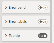
Regarding the error-bar tooltips (which by default, unfortunately appear in our tooltips), we can just turned the off in the error-bar section. But know doubt that you’ve already knew that!
@AngelinaMihejenkova It looks amazing! Nice-looking KPI cards, great use of field parameters!
Also appreciate the added small details like one additional measure within a tooltip!
Congratulations! Thank you for your participation!
Looks so great, @tweinzapfel!
I like some peronalized details that you incorporated into your entry, such modified marker size and 1-letter month names! Cool changes!
Congratulations Tim, and thank you for participation!
Another magnificent entry @windler.nikki !
I like all the adjustments you applied vs origin version i.e. distinguished headers for slicers, additional shadow for KPI card. By placing the main line chart just in the middle of the view - the visualization really stands out!
The entry looks cool @Remi10! The entire set of visualizations is well presented on such canva / resolution. Great KPI cards, clean look of slicers, headers and the chart. Really great work!
Also, awesome to hear that @AngelinaMihejenkova could help with color formula!
Awesome work @rhix !
Very clean and elegant entry, as always! The more it’s similar to the origin version, the less I can say about the entry. It’s just very well done!
Hi @GerardDuggan
Really great to see your entry.
It definitely looks like your style, which is so well-recognizable in the data community!
It looks fantastic - I like all the small details and this background for title/subtitle section looks really powerful (along with an effective application of shadow effect).
Regarding the section between title and line chart itself, you had actually a great idea to raise the max ceiling to get more space. I used separate visual for a line chart and main/upper header.
Hi @Roberto2 !
Really great entry! Amazing job with using “selected lowest value”. I’m not sure if I would use reverse-color error bands and in some scenarios (data-points) some areas overlap each other but the idea and implementation through formula is briliant!
Regarding the tooltip, I used the very minimalistic style (just a white background) with applied additional KPI metric (as a 3rd metric, besided AC and comparative value) using the native “Tooltip” field.
Please let me know if it’s what you are looking for. If not, we can discuss that further.
Wonderful entry, @KimC ! Very sharp (in a positive way) and clean. KPI card and title/subtitle & slicer section looks exceptionally good! To get dynamic category label (within the KPI card) we can use field parameter, analogically to what you’ve implemented within the line chart itself (in case of KPI - it would be the same, but with different metrics within the parameter).
Hi @jtej001
Another spectacular entry. Like everyting here. Great design of KPI card (background + shadow), nice looking title/slicer section, great use of field parameter. Awesome work as always!
Hi @Gustaw , please find my final submission (late one).
I got everything except card card category label. Mine’s changing colors as values but it shouldn’t change colors.
Need help on that.
Thanks!