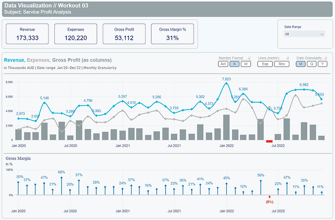
Thanks @Gustaw for your valuable feedback. ![]()
Thank you for your feedback. I think it’s very important for everyone.
Keep up the great work. ![]()
Thank you for feedback. I really appreciate ![]()
Hi Gustaw,
Thanks for the feedback and I agree with the minor details. I wasn’t too happy with the variance line and it needed work. I really like how you present your kpi in workout 4 as it is much cleaner than mine.
hi Gustaw !
thank you very much for the feedback.
The visualization by month without the year can be a serious problem in real life. Thanks for spotting it !
Wow !
You are a source of endless inspiration !
I am findings a lot of “small” things I didn’t notice before.
This workout is very helpful for us.
thanks again !
Hi @Gustaw
I’ve followed the published Power BI link and the Workout 003 page is not appearing. Some of the other workouts are appearing, some partially.
Thanks
DJ
@DavieJoe Thanks for letting me know!
It’s already replaced with proper version of pbix. Should work fine now.
The published-to-web report shared for specific workout should include only a single page.
Best regards!
Thanks @Gustaw I can start comparing my report against your live one. Will hopefully post my effort later today ![]()
Here’s my effort, lots of stuff to learn. thanks again @Gustaw
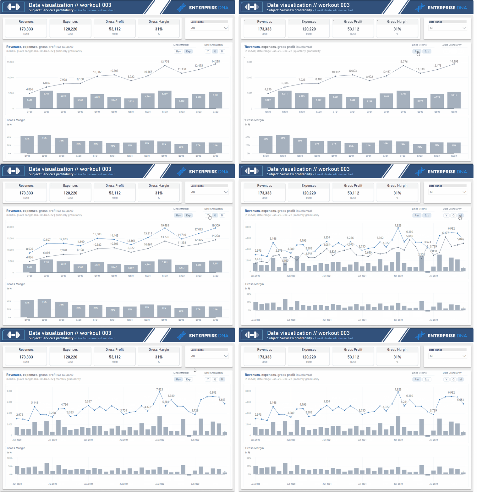
Data Visualization Workout 003.pbix (449.4 KB)
Awesome entry @DavieJoe
Looks like a mirror comparing to origin visual.
Great work! Lot’s of small details included, such as baselines in both charts (0 line), distinctive colors in title / header etc.
Thanks for participation David! Awesome stuff.
It’s a pleasure taking part & improving my skills through your workouts. It also helped me create my background in Figma so pushing my skills there too!
Hello everyone,
This is my first submission here and I really enjoyed with this workout. I’ve completed all but dynamic subtitle measure (y/q/m granularity missing.) I will try to fix the issue. If I have an error again, I will ask your help. ![]()
Thanks @Gustaw for this great workout!
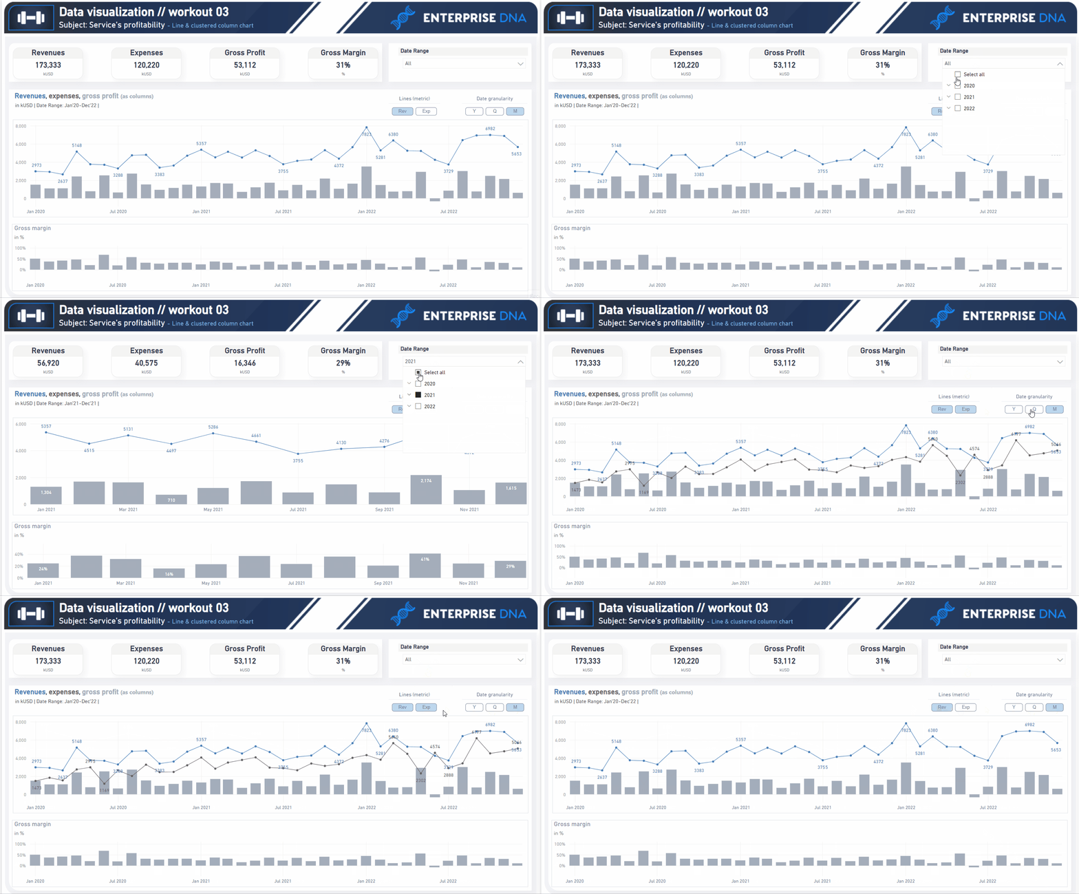
003 - Workout - Services Profitability.pbix (449.5 KB)
@ErmanA , entry looks wonderfull! Very clean look in general, and nice design of slicers! All looks fanstastic. Let me know how it goes with date granularity text.
Great to have you on board! And thanks for participation!
@Gustaw , thank you so much for the kind words! I really appreciate the opportunity to participate in this competition and showcase my skills.
Regarding the date granularity text, I’ll keep you posted on how it goes.
Thanks again for organizing this great workout!
Great Stuff Gustaw, would be great to do a video on solution also
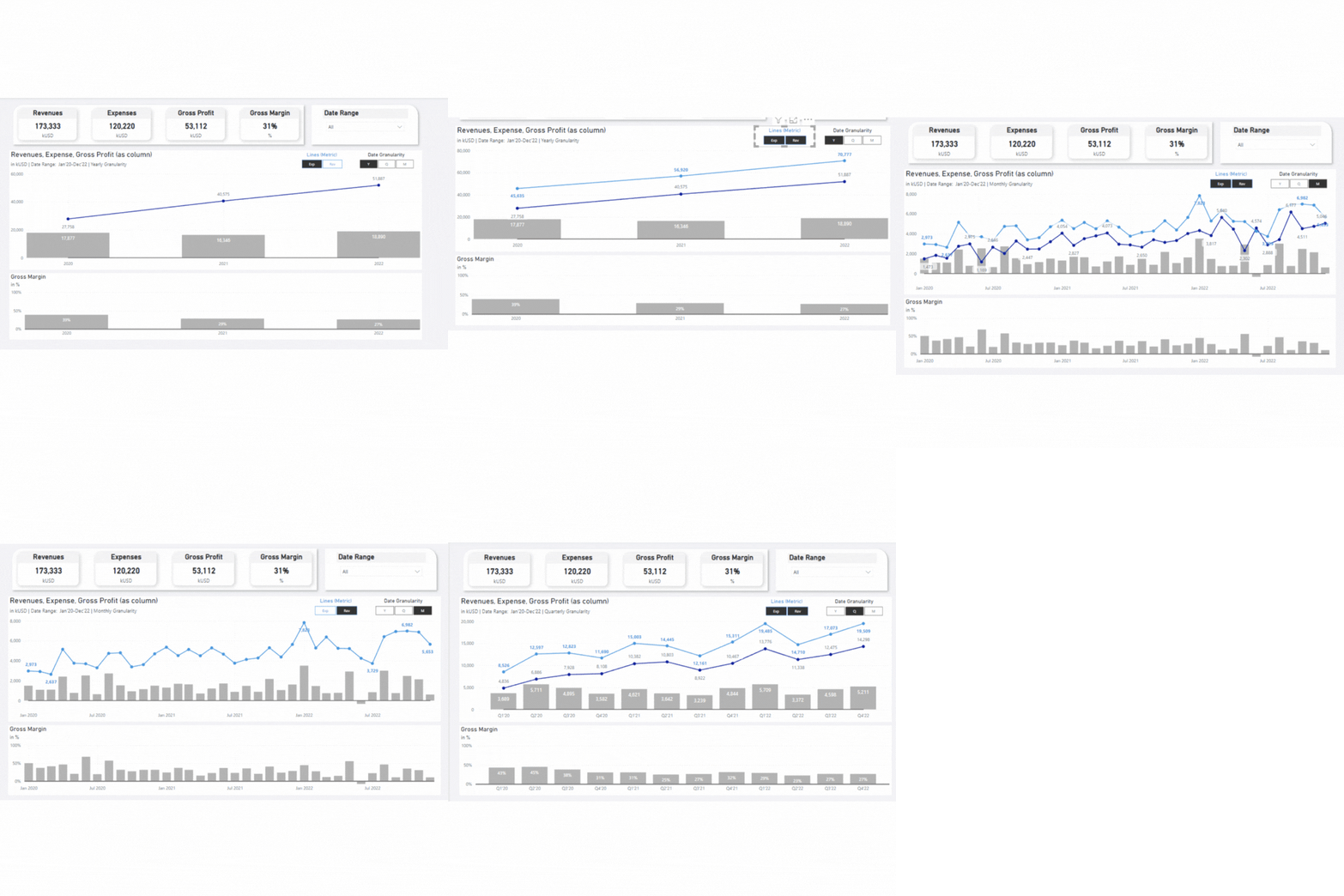
Another late entry.
Each of your workouts are amazing and every time i try one, it thrills me and boosts me up.
This one has it’s owns challenges (especially last one for which i had to see your solution’s logic ![]() )
)
Thanks for such amazing workouts @Gustaw
Another great workout, though I am so late, yet I am learning so much new stuff, really helpful. Thanks, Gustaw
Looks really awesome @shahadathossen.shajj !
Bravo!
My report, thanks for the great workout Gustaw.
Took the liberty of customising a bit, included a number formatting slicer, and also added colour formatting for negative gross margin months and also used error bars for GM% for the lower chart.
Doing the Y axis max in the line chart was tricky, quite a complex bit of dax.
Tim
