Hi Gustaw,
Here is my submission for workout 003
Please Find below attached pbix
Workout 003_Gustaw_Dudek_Ganesh_Doifode.pbix (564.6 KB)
Hi Gustaw,
Here is my submission for workout 003
Please Find below attached pbix
Hi,
Another fantastic workout. I tried to add additional information like variation between actuals and budget and a filter for operations.
Here is my solution:
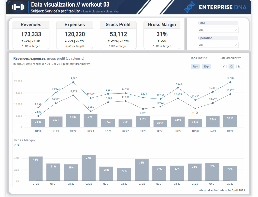
Workout 003_AA_Final.pbix (819.0 KB)
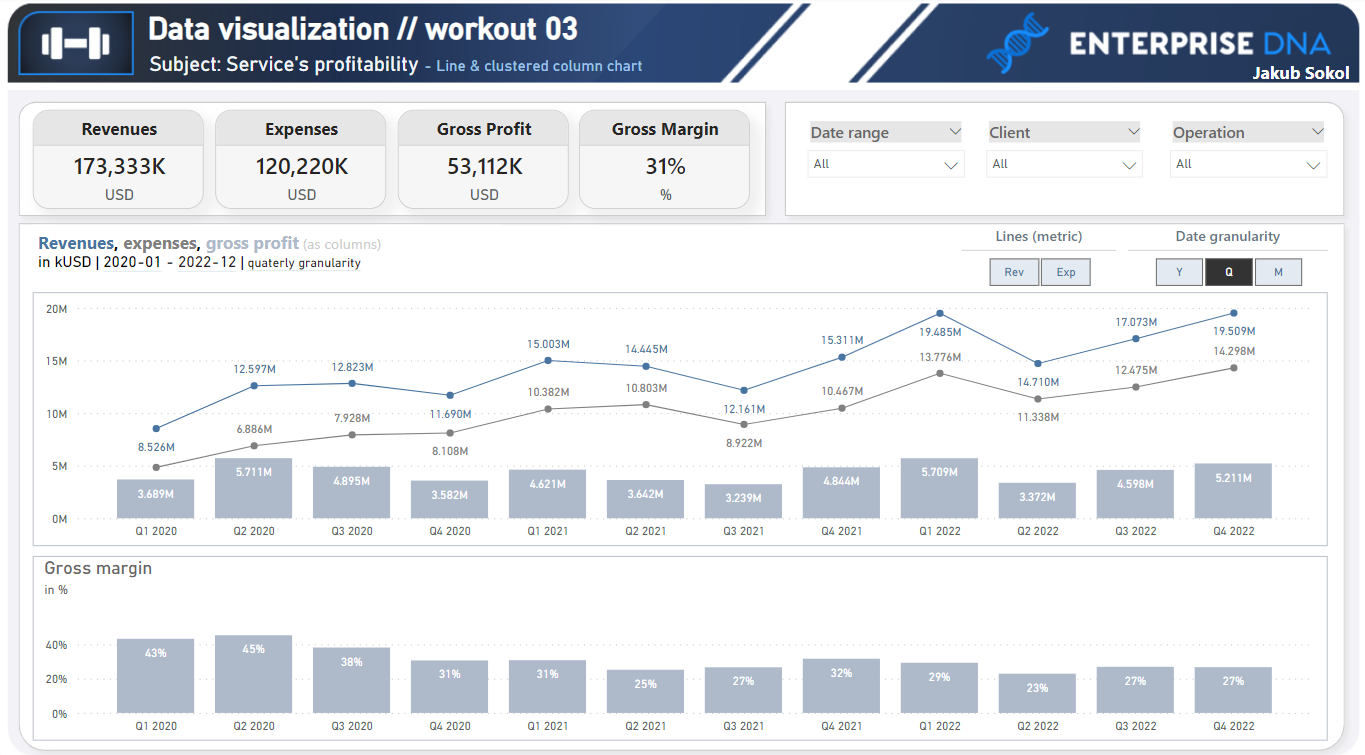
I’m thrilled to have recently stumbled upon EnterpriseDNA and have been thoroughly enjoying the workouts, which have helped me enhance my skills. Observing the creativity and different approaches of others in these exercises has already proved advantageous for my work. Great work and looking forward to the next one!
003 Workout - Jakub Sokol.pbix (490 KB)
@Roberto2
I totally like how you approached the point related with raising the y-axis scale!
Taking into consideration the given granularities and using combination of maxx and values is awesome!
The only one minor thing that we could perhpahs to consider is a potential situation, where expenses could be higher than revenues and the max value while displaying both revenues and expenses could be set by expenses.
Awesome work Roberto!
Another great work @windler.nikki !
Great use of chiclet slicers! I like the overall layout as well as some other small details like displaying units near to metric names. Amongst some minor adjustments, we could perhaps consider adding some kind of legend to give end-user information about meaning of given lines/column (particularly in the top chart), i.e. by applying adequate color in metrics names or by using native chart legend. We could also take some benefit of placing bottom chart “exactly” under the top chart so given timelines will be matched vertically (I know it’s sometimes difficult to achieve, especially when length of y-axis values vary across different charts).
Awesome work as always!!!
Thanks for participation!
Amazing entry @renata_kulagowska !
I like a lot of things here - different colors for revenues and expenses (with adequate colors applied to metric names - really cool!).
I also really appreciate your effort to apply dynamic x-axis category.
I believe that this particular workout actually calls for a bit simpler approach (continuous type of x-axis “cooperates” well with field parameter), but considerating that your aim was to use categorical x-axis - your solution was absolutely way to go! From there, we would be able to apply dynamic subtitle (with granularity indicator) depending on your slicer selection (if it’s “Y” then yearly granularity, if it’s “q” then quterly etc.).
Regarding the really minor things, we could perhaps apply 100% transparency for label backgrounds (providing you want them to be turned on).
Really awesome work!!
Thank you for participation
Awesome work, @naby.khalid !
You present all visuals in a very clean way. A bit of additional practice on creating KPI cards (additional variance section) is much welcome! In the range of some small details - I like how you designed the slicers using native visuals (which should turn out to be more effective from performance standpoint).
Great work! Thank you for participation!
@Remi10
This entry is amazing. It looks very similar to origin one.
Regarding the “unusual” details, I like how drop-down list slicer corresponds to chiclet slicer selections in terms of selection (background) color. Besides, there I can’t spot any other difference (maybe except of included / excluded 0-baseline in both charts).
Great work!
And thanks for participation!
Well done!! So many details included in this visualization. It very closely mimic the origin one. It’s incredible how you approached some detailed elements (use of color, applied 0-baseline, centered titles within chiclet slicer’s headers). Really amazing work!
Thank you for participation!
@PankajNamekar ,
Another great great entry!
You covered a lot of core elements. Distinctive, visible KPI cards looks great! I also like the the color choice in terms of displaying gross profit - that way, it’s placed greated emphasis on that particular metric comparing to rev or costs. There also some details included, such as 0-line in a bottom column chart - great!
Regarding the minot adjustments, we could perhaps consider to use a bit different color for slicer selection (to make distinction between column color and slicer selection, and while it’s not possible with native slicers, maybe be could change a bit the color of columns, i.e. to dark grey/navy blue?).
Regarding the y-axis scale - answering your recent question - I was thinking about raising the upper (max) y-axis value to create a bit of space between the actual highest point (either it’s a datapoint related to revenues or epxenses) and max value of y-axis scale). Sometimes it can enhance the visual effect a bit by reducing the visual clutter (but it was absolutely the “non-obligatory” element).
Great work! Thank you for your participation!
Thank you for your valuable feedback.
Another piece of great work! So much details included - 0-baseline, “custom legend” (using distinctive color for metric names and corresponding lines), nice & dynamic subtitle, nicely centered title of chicler slicers. Amazing work…
I also appreciate your creativity while creating KPI cards! Well done!
Regarding the minor details, we could consider applying thousand separator for revenues and increasing a bit the font-size of “variance section” within KPI cards, and perhaps use similar (close) color of data labels as the color of given lines. What do you think Kim?
Great work!
Thank you for participation!
@Roberto2,
Great entry! I like a lot of design elements here - different colors for metrics, well-applied subtitle with dynamic txts, nicely visible labels in column sections (gross profit), effective use of field parameters!
Well done!
Regarding some minor details, we could think about applying mmm’yy (i.e. as start or end of month) date, as using month category (mmm) may lead to summarization of corresponding months across different years (i.e. January 2020 + January 2021 etc), if having more than one year selected in our slicer.
Great work! Thank you for participation!
Another great entry! Well done with implementing continuous x-axis (and categorical for qq’yy). I Like also many other details such as dynamic subtitle, given colors for respective metrics (with adequate colors applied within the chart title), baseline in the upper chart and grey line which separate top and bottom chart. Awesome!
Regarding the minor details, we could perhaps consider to remove y-axis title from the top chart, so both charts would become aligned vertically a bit more.
Well done!
Thank you for participation!
Amazing work! Great use of given “card” section to create KPI “levels” (metric, actuals, variance, name of comparative values), conditionally formatted colors for variance section, applied 0-baseline for both charts, applied y-axis. and many more! So many great features, presented in a very clean and easy to read way!
Well done! And thanks for your participation!
Amazing piece of work! Many details covered in a very elegant way: nicely formatted slicers (especially considerating these are native - I actually thought it were chiclet slicers ![]() ), distinctive color for given metrics (with respective colors within title section), dynamic subtitle, continuous axis and many others.
), distinctive color for given metrics (with respective colors within title section), dynamic subtitle, continuous axis and many others.
Awesome work!
Thank you for participation!
Awesome entry! All visuals presented in a very clean and elegant way. I especially like extra attention to details, such as applying the same color for fonts as for lines (and respective colors within title section). I like also the idea to use native slicers instead of chiclet slicers. All here is great!
Thank you for your participation!
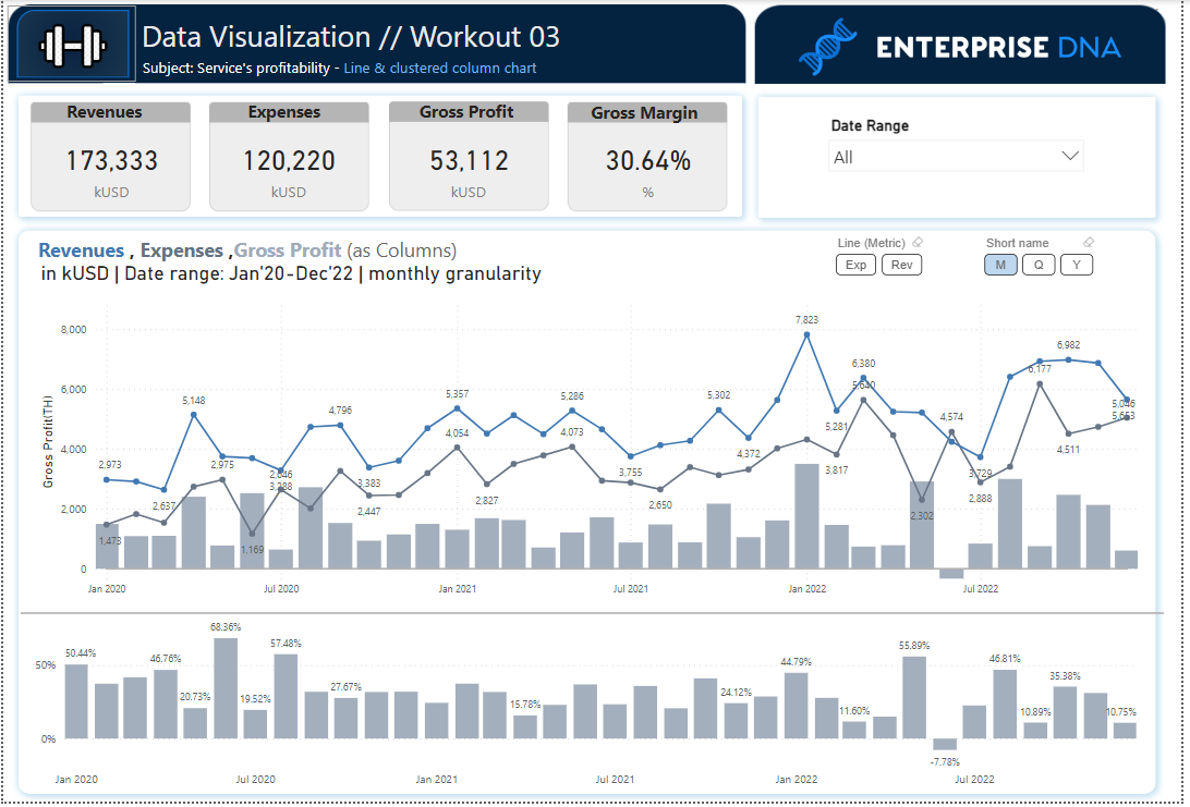
Hello Friends!
Find below my origin visualization set.
003 Workout - Gustaw Dudek.pbix (1.1 MB)
Best regards!
Thanks for kind word wure i will remove that x-axis Title
and waiting forward to new workout