Intro note
This workout combines various visualization techniques and native functionalities (conditional formatting, field parameters etc). The most important part of the workout is practice - entries does not have to include every element or functionality to still be great (and eligible). Please pay attention to the list of functionalities (provided in the screenshoot), which includes ‘basic’ elements (1st-8th points) and supplemental (9th - 12th points) - that can be more engaging. A good starting point is to implement at least a single field parameter and a single conditional formatting option.
Goals
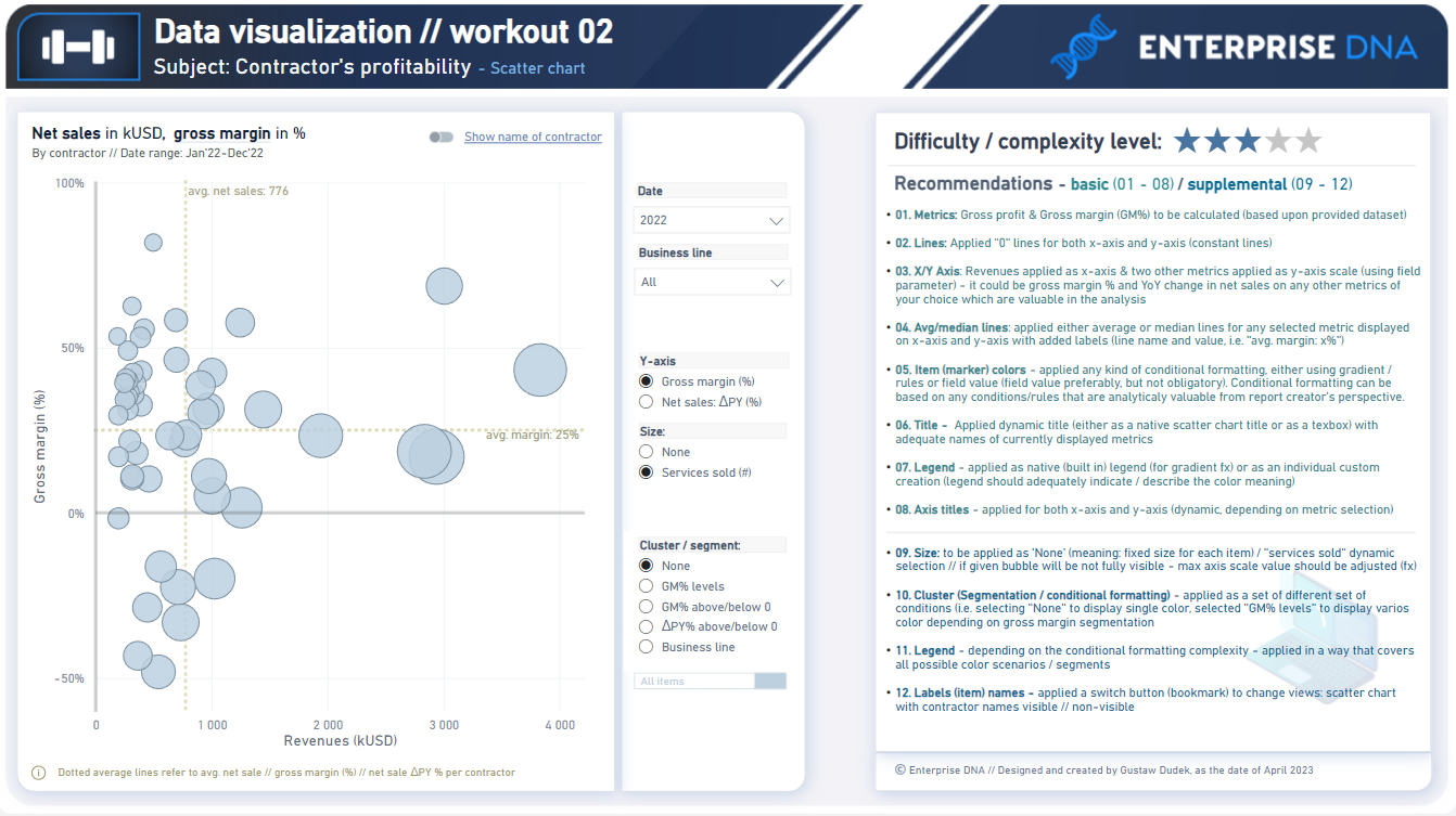
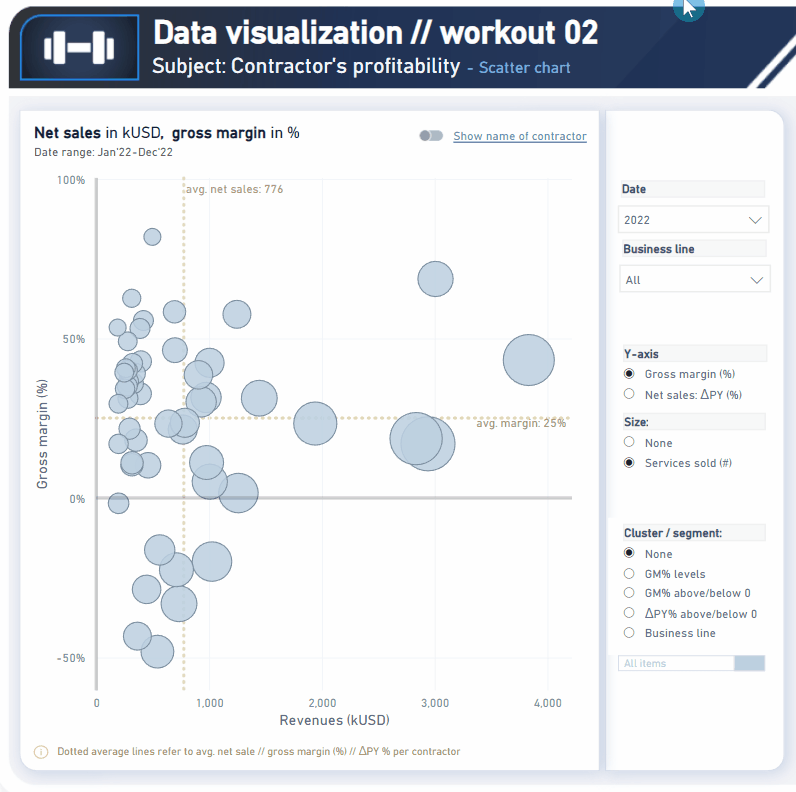
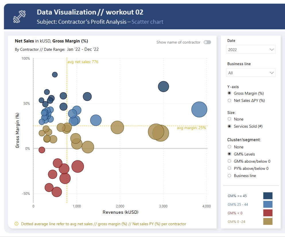
In this workout, using the supplied dataset we are going to replicate the following set of vizualizations (left section in a report screenshot), including the scatter chart and slicer pane. Also, please feel free to add any extra visual if you would like to (provided that core visualizations are included in the first place).
Making basic calculation (gross profit // gross margin)
Getting familiar with scatter // bubble chart visualization
Leveraging field parameter(s) to dynamically change metrics
Using additional analytical features (avg/ / median // constant lines)
Using additional guidelines (axis titles // legend)
Conluding which metrics // indicators are worth to present from analytical standpoint
Submission
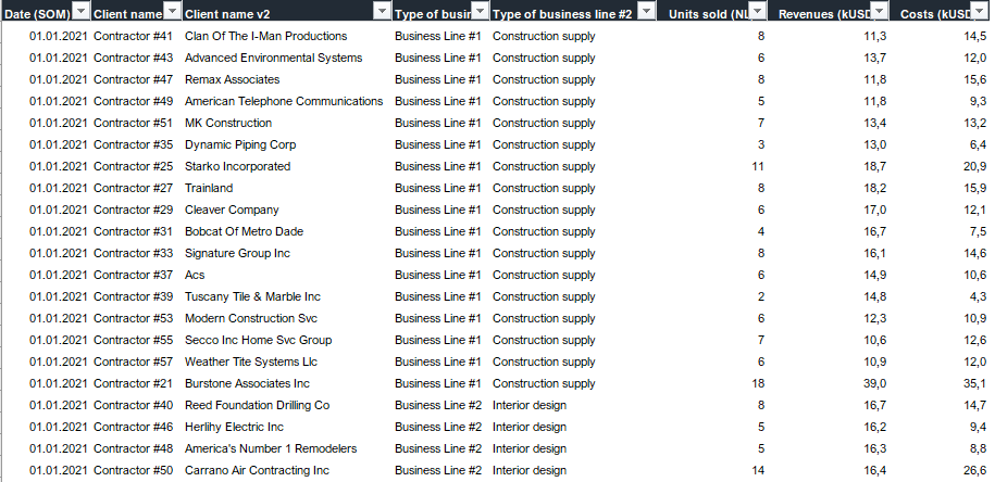
Please load the supplied data (xls file) into a new Power BI file, replicate visualizations (considerating list of points in the introductory report screenshot), and reply to this post including the screenshot (or a gif) of your solution along with the pbix file (please, include name or EDNA forum nick in the pbix name).
Period
This workout is released on Monday April 03, 2023, and the author’s solution will be posted on Monday/Tuesday April 10-11, 2023.
Additional notes
Link to the interactive dashboard:
Oh don’t worry, I’m working on it. A slower entry for me this time as I’m away on holiday so can’t be on the laptop too often or my other half will kick my ass!
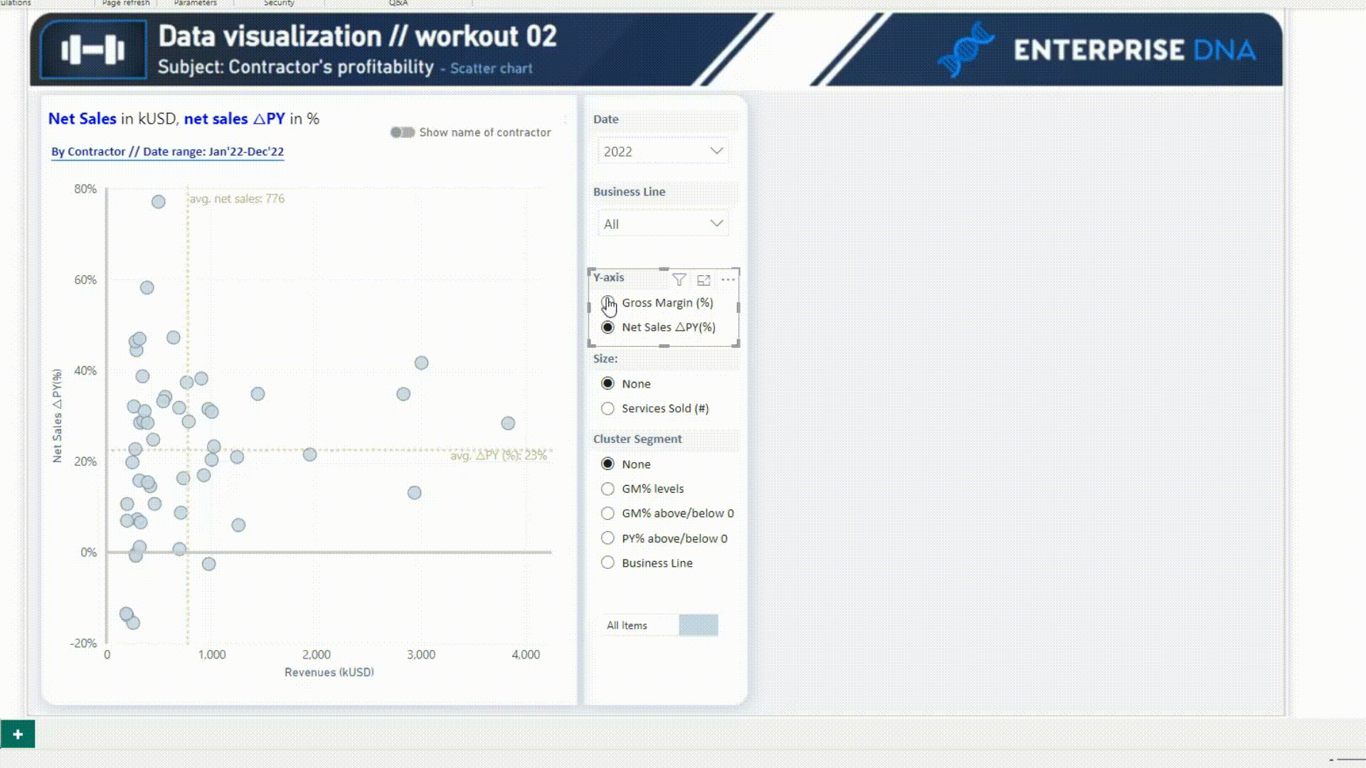
Both fields are numbers. I have googled and spent too long on this, can someone please explain what I am doing wrong? I have added my pbix file as well. Workout Ch2 ScatterGraph KimC.pbix (183.2 KB)
Your scatter chart already looks great.
Find attached pbix below.
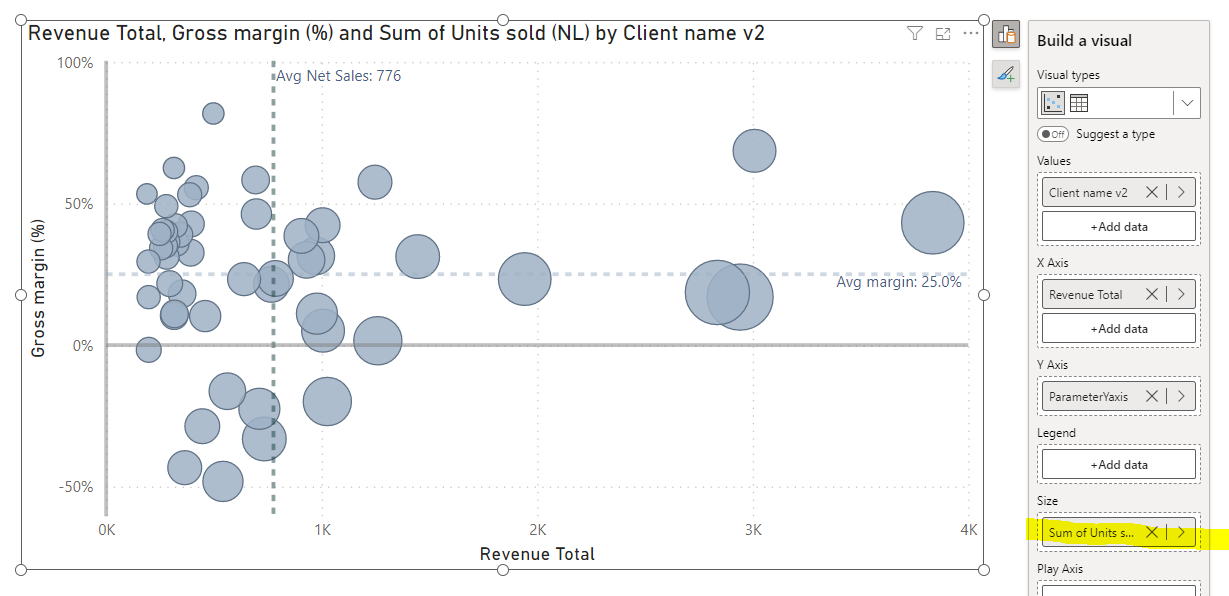
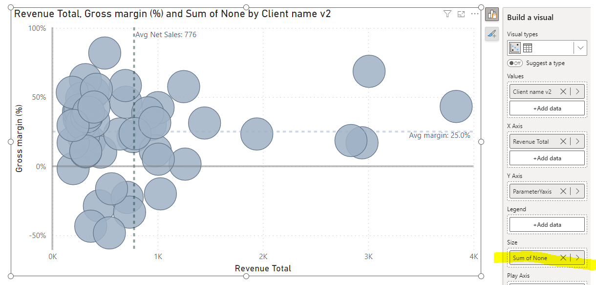
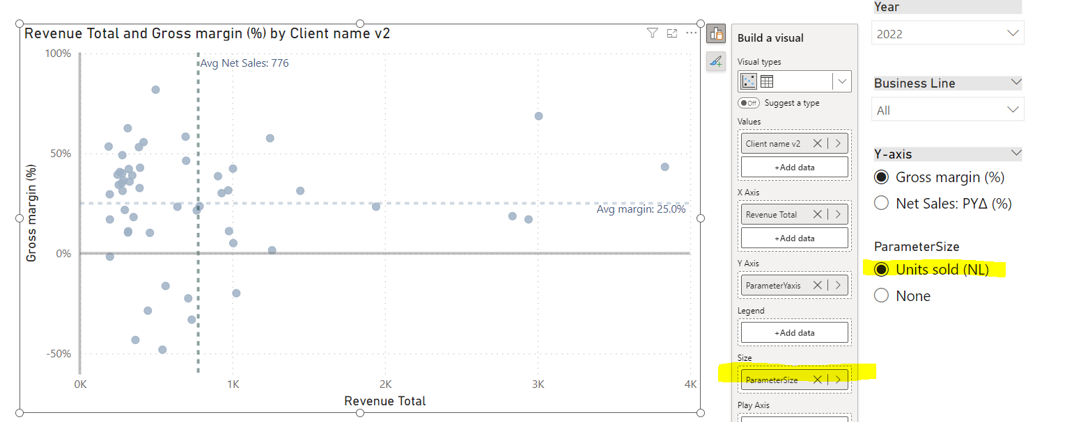
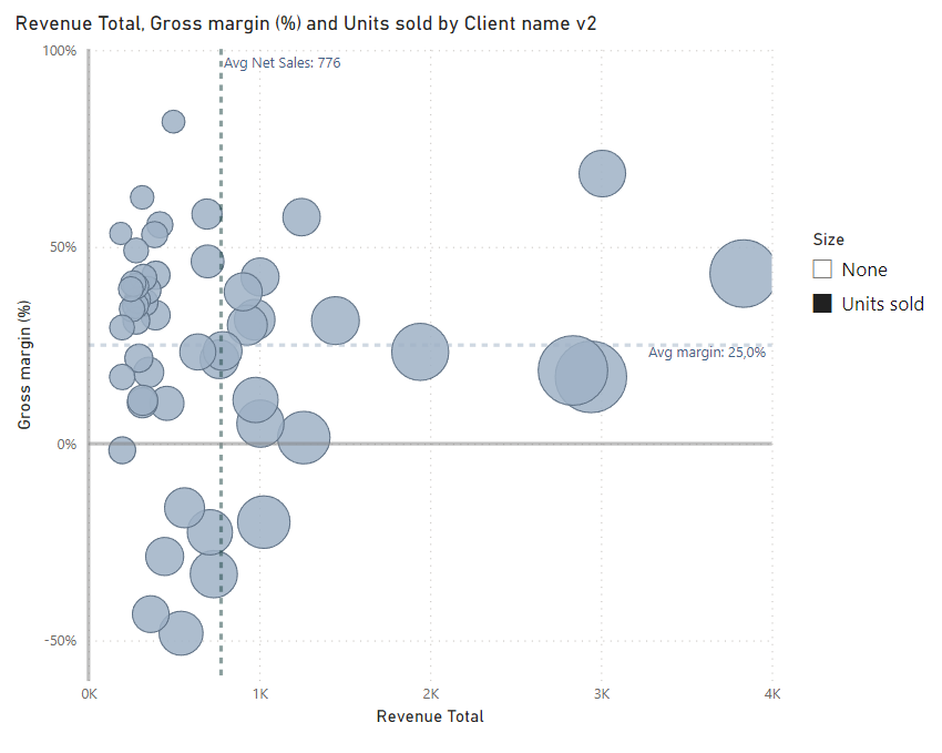
For dynamic size, we might use fixed value (i.e. 1, deriving from a measure, not a column).
The size of markers behave a bit differently when placing the value, which is the same across all data points and differently when we have measure that indicates different sizes for items.
To make it works, we can adjust size of markers manually using the format panel (we just have to find “sweet spot”). In such scenarios, usually negative size in px is required (i.e. -15px).
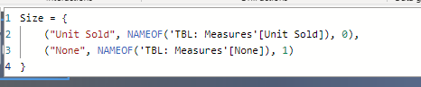
But here is another trap. For i.e. -15px we can get quite adequate sizes for “units sold”, but when selecting “none” - then items will be still disproportionally big. It can be fixed by using negative value in your measure, i.e. → measure none (fixed value) = -1.
Then you can ofc rename it within the field parameter, so you will get a name “none”.
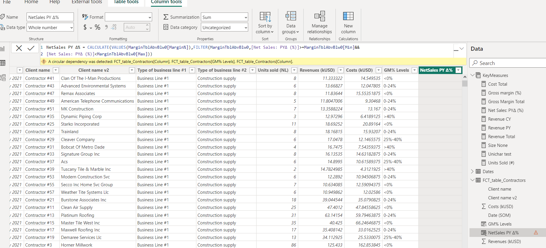
I have been working on the cluster/segments and have got the GM% levels to work perfectly. I have tried to replicate the measure for the other clusters and keep getting circular dependency error. Any tips to fix this?
In my example, clusters / segments rely entirely on measure (without use of calculated columns).
In that case, without further (additional) steps, legend does not filter the specific clusters, it only describe the color meaning. If I would like to incorporate additional functionality and enable filtering clusters by given level Gross Margin %, I would probably go with disconnected table with listed names of given levels. It’s not required in that workout though.