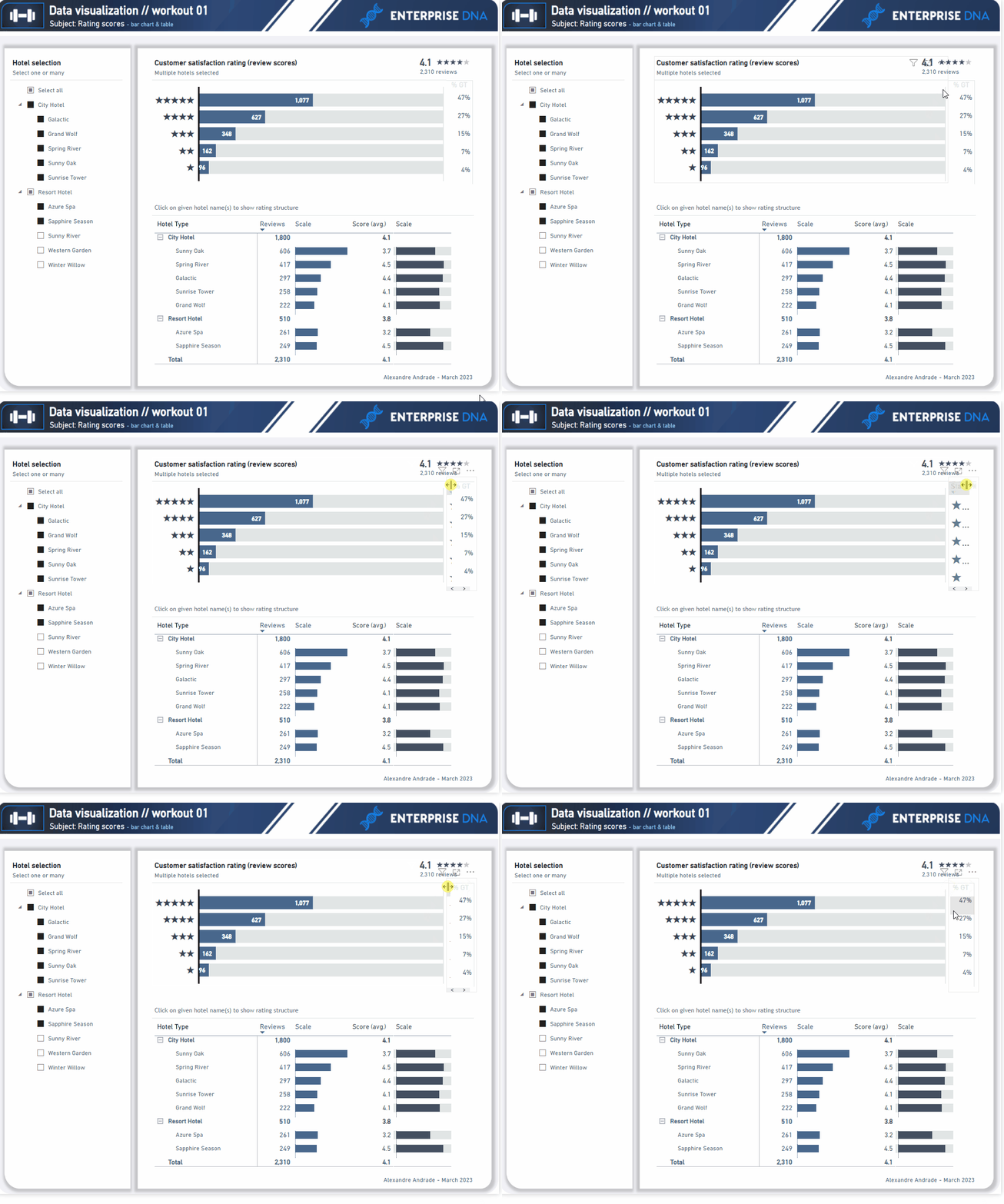
Hi @jamie.bryan
This is amazing entry. It very closely mimic the origin visualization.
It was really cool to see your work / report!
Thank you for participation!
Hi @jamie.bryan
This is amazing entry. It very closely mimic the origin visualization.
It was really cool to see your work / report!
Thank you for participation!
Hi @powerunit
Awesome work! You paid attention to many things (as applying the same color for top card with number of review, bar chart and data bars for review metric).
We could perhaps consider to test turning off the reverse-row color backgrounds within the tables (both in the table with %GT and the bottom one). It could possibily reduce the noise a bit.
Great entry!! Thank you for participation!
Awesome entry!
I like many things here, like added 0-baseline and maximum (end) line in a bar chart.
You’ve made a really clean set of visualizations!
Great job and thank you for participation!
Thank you s much for your kind words.
@Gustaw
You are my inspiration for creating next level visualization.![]()
Hi @jsodhi
A piece of cool work here!
I like the minor change in a subtitle formula which gives the amount of hotels selected (great variation of origin proposition)! All other elements are great too! We could consider to turn off the reverse-row color backgrounds in the matrix and perhaps to lighten the “remaining part” in a bar chart but these are obviously very minor things!
Amazing work! Thank you for participation
Hi @Greg
I really like how you approached this workout.
I presents a very simple/clean style (in absolutely positive way)!
As most report elements are greyish, the main data standout even more that way.
Amazing work!
Thank you for your participation!
It looks like a mirror comparing to the origin version!
Phenomenal work. I really like how much attention you paid to the details! Awesome!
Thank you for participation!
Hi @rhix
Awesome work!
Many small elements reliably applied as in the origin version (grey background in databars, grey-out %GT header etc). I like how you separate the upper title / subtitle / KPI section with a grey line which goes from left to the right.
Amazing entry!
Thank you for participation
Hi @Remi10
Great work! I like many details you applied in your data vis entry, such as tiny white lines between consequtive rows in the matrix table, greyish particular elements). It’s also very nicely done whet it comes to the overall layout design (shadows, upper workout header, etc)!
Phenomenal effort! Thank you for participation!
Hi @Ondrej
Great entry! You used corresponding color in a bar chart and in a matrix table (data bars), with distinguished color for avg. rating score). I really like that, amongst a few other niuances like greyout bars (in the top bar chart). Great work!
Thank you for your participation!
Hi @sedhosen
Awesome make-over! I really like how you utilize the dark-theme color pattern!|
Besides, it’s obviously noticeable that you paid attention to many details (background for avg rating score data bars etc). It’s also great to see the added date-slicer! Really nice addition in the analysis.
Great work! Thank you for your participation!
@KimC - in mine, I went to the Selection pain and made sure that the rating table was below the left visual. So layering will hide things for you.
Edit the length/width of that column. Like this:

thanx a lot sir
You’re welcome
@Gustaw thanks for a great workout.
Here is my solution
Hello @KimC
Thank you for participation in the workout!
This is amazing entry. I’m happy to see how you solve the challenge with upper table (%GT).
I see a lot of small details included, such as grey lines in the bottom table, shortened names of hotels in a slicer, applied subtitle with divider. I really like how you replicate the origin version.
Congrats!