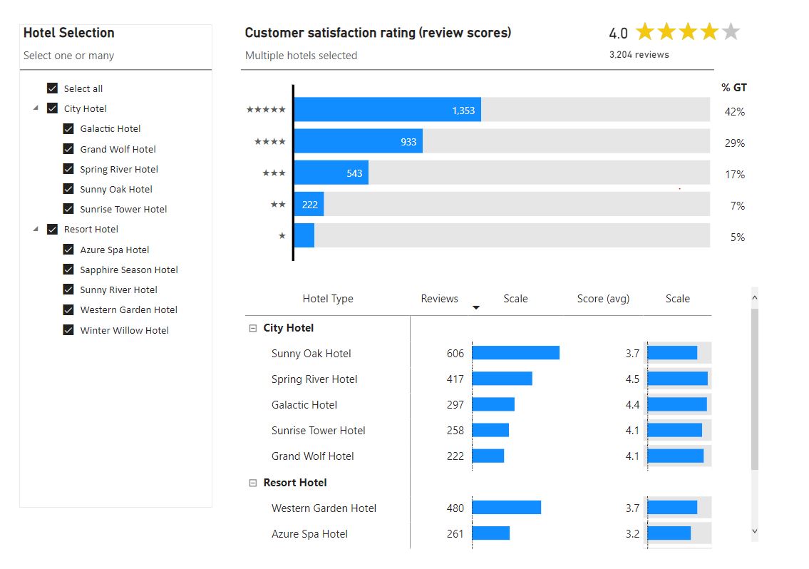
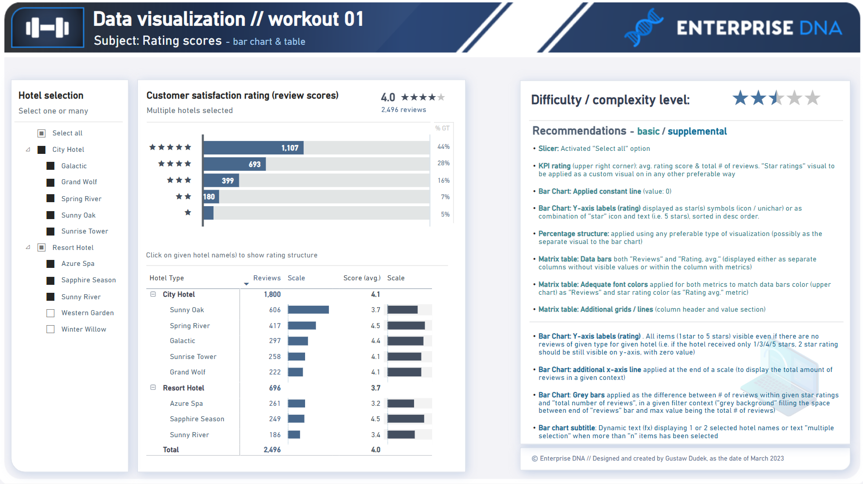
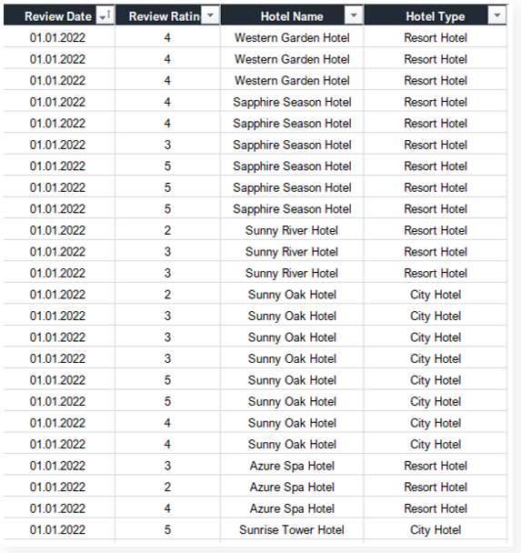
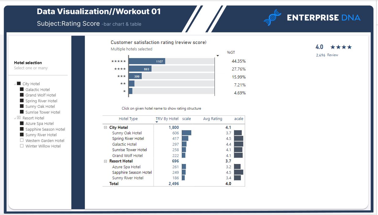
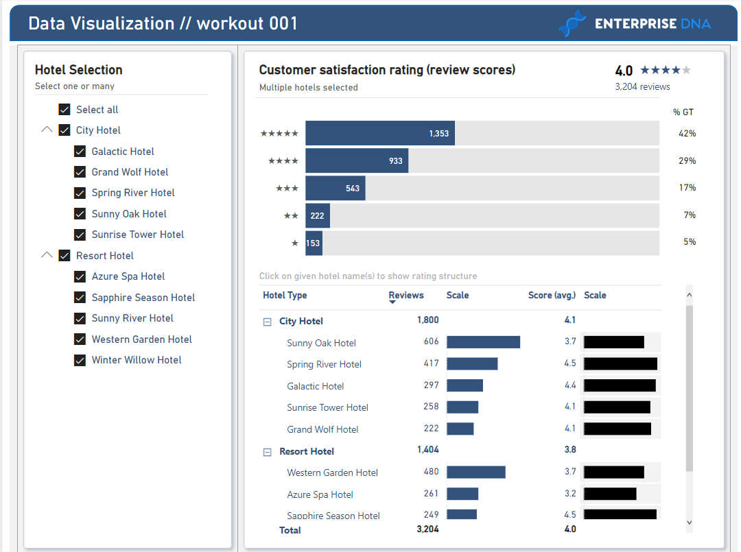
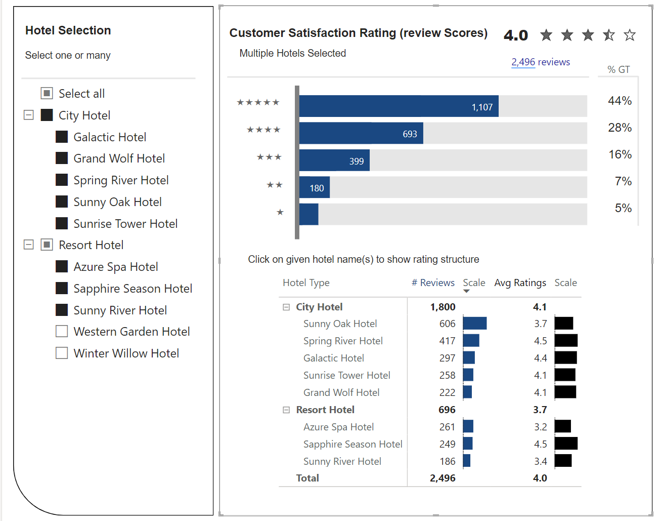
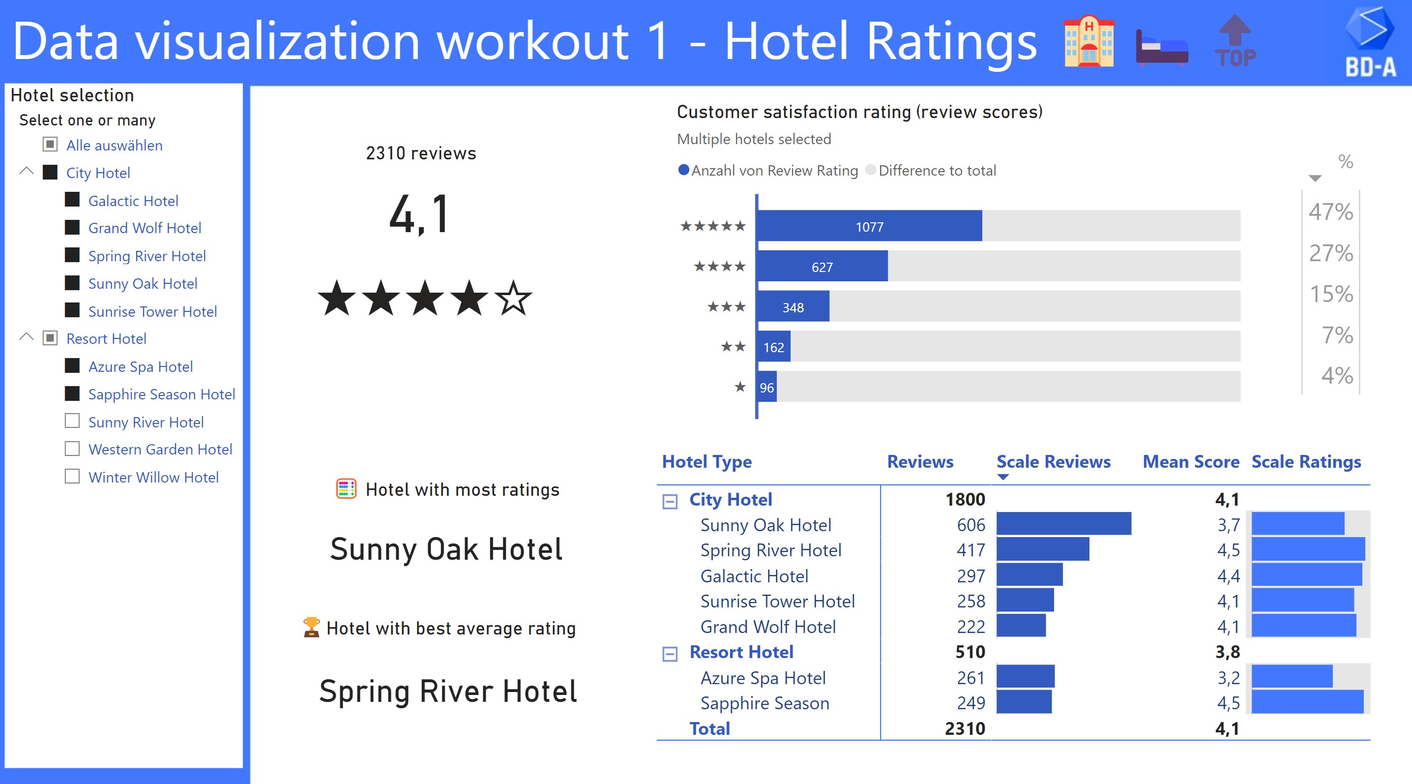
In this workout, using the supplied dataset we are going to replicate the following set of vizualizations (left section in a report screenshot), including a slicer, bar chart section and table section. Holistic solution requires to include each section listed above, but it’s also eligible to provide a solution that will only contain either the bar chart section or the table section. Also, please feel free to add any extra visual if needed (provided that core visualizations are included in the first place).
Creating interactive set of vizualizations (verifying if data is presented correctly after using interactions / slicers)
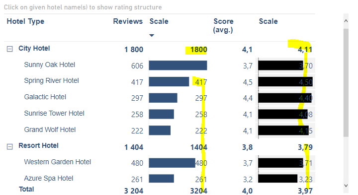
Presenting data in the top-bottom structure (overall metrics / details)
Using supplemental visual elements (unicode symbols / icons)
Writing basic dax formulas to achieve desired visual effects (grey bars in a bar chart, text box with names of selected items)
Enhancing data story-telling by using the combination of chart(s) and table(s)
Submission
Please load the supplied data (xls file) into a new Power BI file, replicate visualizations, and reply to this post including the screenshot (or a gif) of your solution along with the pbix file.
Period
This workout is released on Monday March 27, 2023, and the author’s solution will be posted on Monday April 3, 2023.
Additional notes
Link to the interactive dashboard:
“Exhilarating! Although it presented a challenge, I am grateful for the opportunity to expand my knowledge and skills. I eagerly anticipate the next challenge that comes my way.”
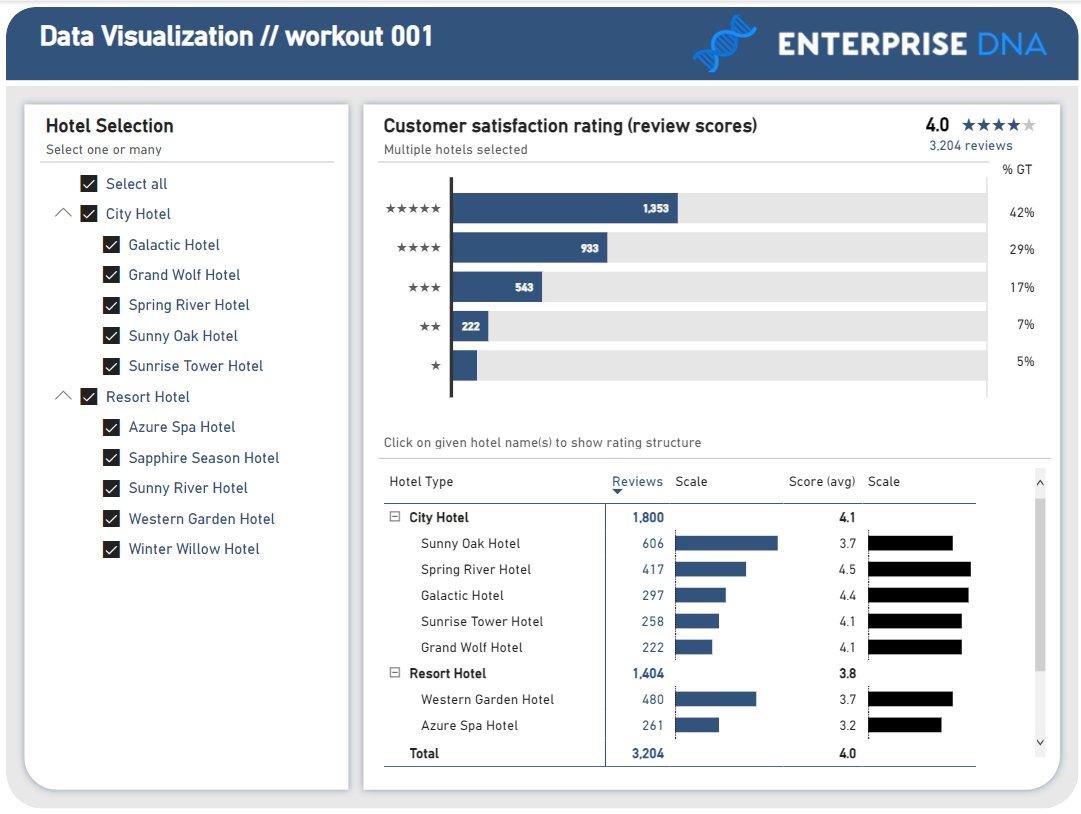
**Updated 28/03/23 -
as @Gustaw has said, lots of little design elements can add up to a great design…woke up this morning and realised how I had missed an element in the table.
By adding white lines, it separates out the grey background of the 2nd scale column to create/enhance the effect of a target data bar. Updated PBIX included also
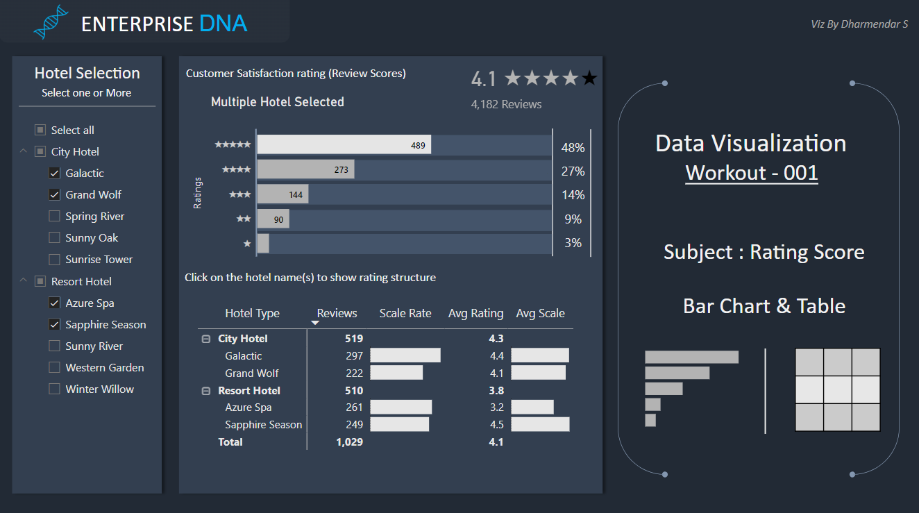
Dear all, thanks for the nice challenge: On first glance it seemed easy, but some features did need some consulting of ChatGPT …
I added also two cards for the most and best rated hotels.
I’ll preface this by saying I don’t have a lot of time this week but didn’t want to miss out. I didn’t try to hit the formatting, color scheme, or the full layout and rather just focused on capturing most of the elements (missed a few).
I think this is similar to skipping the one hour aerobics class and just hitting the treadmill for a few minutes.
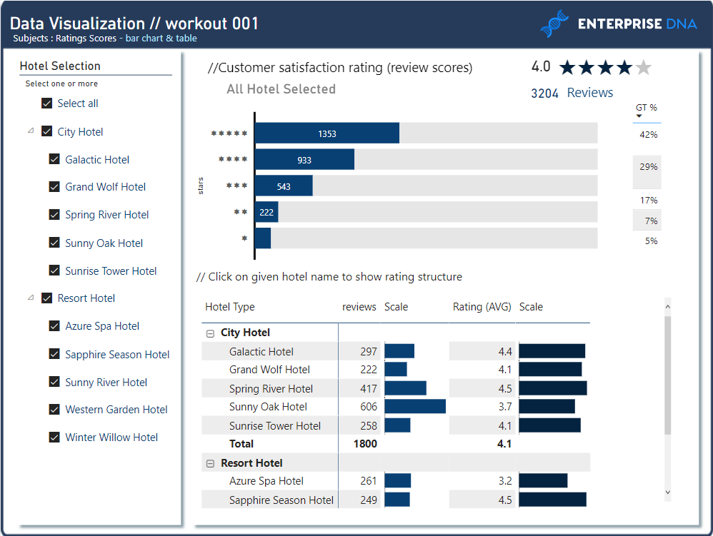
Glad it helped, Gustaw let me know on the couple of bits I missed out on, like the line at the bottom and top of the bar chart. He also, rightly, called out the colour of the Y Star Axis wasn’t the same as the Star KPI at the top.
I genuinely woke up, the day after I posted mine, and my mind went ping…“ah he put white lines on his matrix to create the effect of the light grey being a surround”
You can apply “;;;” format for your duplicated measure (i.e. for Reviews v2, and Avs Score v2).
It’s best to apply format using built-in format pane on the top ribbon, istead of using “format” function.
instead of i.e. whole number, you can rewrite to ;;;
 using Power BI icons only!")