Hi guys
First post asking for help for a while. Plainly not a guru yet
I have a series of time intelligence measures based on a measure [Global].
[Global] looks at two disconnected tables to determine a metric and a product category to arrive at a result.
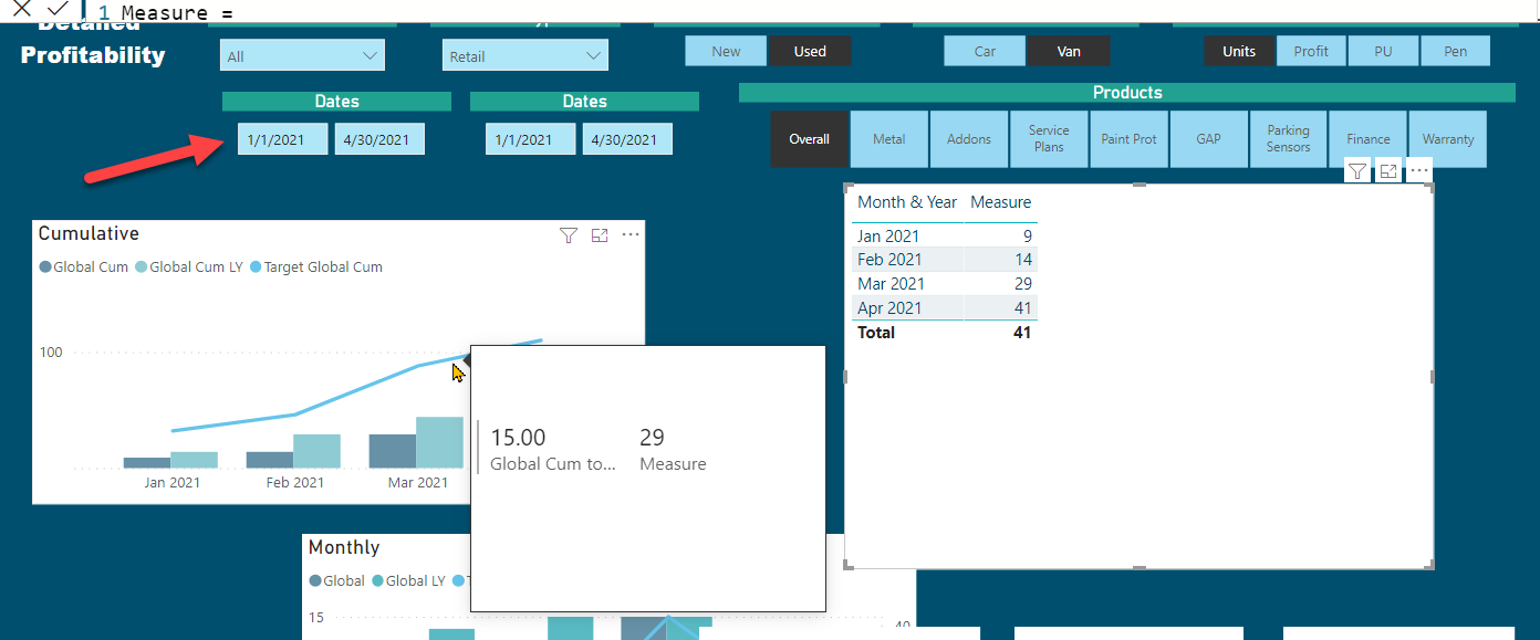
All works fine until I apply the [Global Cum] measure in a tool tip on a line and clustered bar chart. The tool tip then reports monthly amounts rather than cumulative on the cumulative chart.
In the attached PBIX, the cards are showing the correct amounts for the final month, and the chart lines and bars look correct, but the tool tip on the cumulative chart is showing incorrectly.
Interesting problem - here’s what I think is going on. Your card measure works on the main page because no additional context is being imposed on the global cumulative calculation. However, in the tooltip, when you hover over the visual, because you’ve used ALLSELECTED, it is also imposing the month context from the bar chart.
However, before fixing this I wanted to question whether a report tooltip is really the right mechanism here for providing additional detail? The problem with report tooltips is that you can’t interact with them, and given that you have scrollbars and tables that don’t fit the space in your tooltip, that’s going to be a problem.
My recommendation would be to use a drillthrough instead of a report tooltip to explore the details. On that drillthrough page I would synch the slicers from the main page (you can decide whether you want to display or hide them - it doesn’t matter from the calculation standpoint). Once you synch the slicers, you can remove the ALLSELECTED from your cumulative measure and then tailor the measure specifically for that page - i.e., using REMOVEFILTERS on Month&Year to keep it from imposing the monthly context on the cumulative calculation.
Think I’d still prefer tool tip here. When I started out on the tooltip, the plan was just to provide the numbers from the charts, (left hand table on tooltip) but took the opportunity to put a further table in the tooltip analysing by sale type. I am conscious of the scrolling, but for most managers the number of sale types they control won’t result in scroll bars. If it becomes an issue then I will take out the table on the right of the tool tip.
So you might say well why have just the table on the left? Esp when standard functionality provides this Quite simply to get all amounts on one tooltip rather than have to hover over 3 data points.
So unfortunately tech problem is still a thing, but I know how you like teaser on a Tuesday afternoon.
OK, you can still use synch slicers on a tooltip. Given that you want to stick w/ the tool tip, that’s what I’d do - carry over the relevant slicers to the tooltip page via synch slicers pane, hide the slicers (since you can’t interact with them anyway - if you want to display the harvested values, do so via card, multi-card or table). Remove the ALLSELECTED in your tooltip measure and then REMOVEFILTERS on Month&Year (and MonthnYear, if you used the latter to sort the former).
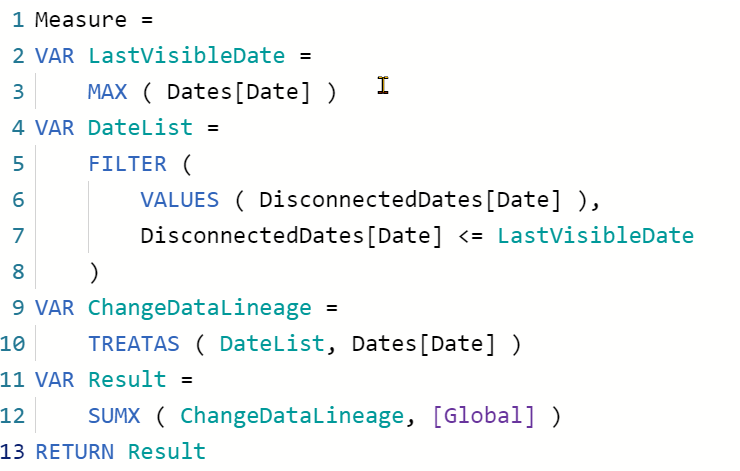
Still struggling here Brian, sorry. Check out attached PBIX measure [Global Cum Tooltip].
All slicers on TT test page and sync’d
Global Cum tool tip =
CALCULATE([Global],
Filter(Dates,Dates[Date]<=max(Dates[Date])),
REMOVEFILTERS(Dates[Month & Year]),
REMOVEFILTERS(Dates[MonthnYear])
)
Understand what we’re attempting to do here, ie remove context from x-axis which is Month & Year.
But above not working?
I’m working on this one, but it is proving unexpectedly recalcitrant. Going to pack it in for the night and hopefully be inspired in the morning. Also, hoping that the DAX Debugger upgrade to TE 3 will drop any day now, which will make this much easier to solve.
I’ve continued to work this one, and I’m going to need to call in reinforcements. I’ve thrown everything I’ve got at this, and I still can’t get it to properly remove the time context in the report tooltip.
Used DAX Studio to create a DUMPFILTERS measure to show all applied filter contexts in the tooltip just to make sure I wasn’t missing anything and still can’t get it to work.
@EnterpriseDNA - please leave this one open while I run it by the other members of the expert team.
Nothing much stumps you @BrianJ so must be a toughy and also implies I am not a numpty
I was working on it as well the other day. If you create a totally fresh model (basic sales data and a date table), then create the tooltip, it does work with a simple measure.
So maybe the issue lies around the disconnected tables being used as slicers. And if it does, still no idea how to fix!
Thanks for the nudge. I was actually on a call with @BINavPete yesterday about another issue, and we talked about this solution. I actually have been unable to crack and so far, but I want to give it one more go before I throw in the towel with the new DAX Debugger tool that’s been added to Tabular Editor 3. Will also send up the Bat Signal to DAXmaster @AntrikshSharma to see what he can do with this one.
If yes, then the column on the slicer needs to be from Disconnected Dates table, as the Filter from the Column Chart(Date Table) to the Tooltip is going to be applied first because of which you are not able to get all the dates between the specified period.
Sorry guys, having got all excited, not sure this this is quite the thing. When I remove the Dates slicer (the connected one), it all goes wrong and we wouldnt expect the user to enter the dates twice?
Does make sense that we lose date coz no Max(Dates[Date]).
But how do we achieve the same with only one date slicer?
@AntrikshSharma - this one isn’t a biggy as I can work the cum chart with default tooltips, but is an interesting technical conundrum. So if you get some time then help appreciated, if not don’t worry
While our users and experts do as much as reasonable to help you with your inquiries, not all concerns can be attended to especially if there are some learnings to be done. Thank you!