Hi everyone, I would greatly appreciate if you can assist me with a PBI problem I currently have. Here is the breakdown:
Context & Problem:
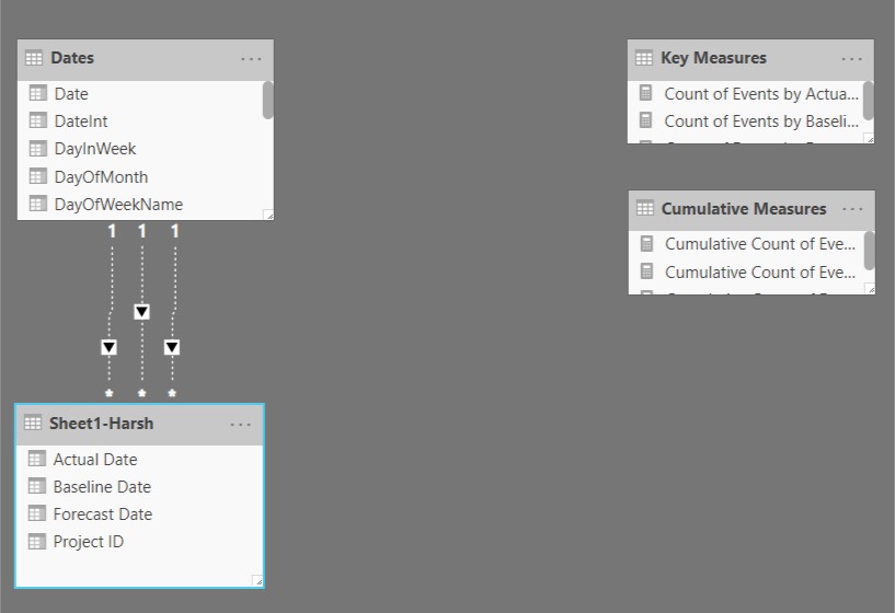
I have a very large data set that includes Baseline, Actual and Forecast dates by Projects (the dataset is well over 22,000 lines). What I am trying to is to chart the following:
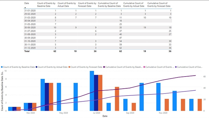
- Bar chart showing count of Baseline, Actual and Forecast dates filterable by Project ID.
- Show cumulative count of Baseline, Actual and Forecast dates filterable by Project ID.
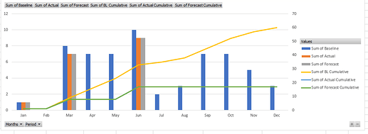
I am trying to show this in a chart where you have 2 y-axis (one for period count and second one for cumulative count) and the period on x-axis (Jan, Feb, etc). Here is a quick example:
I was able to do the monthly count filterable by project id with extra manual steps in excel and load that data into PBI. However, I am struggling to do the cumulative data filterable by project ID. Also, I would like to do all of this in PBI rather than additional pre-processing steps in excel.
I have attached a sample file that includes data, calculation and the graph. Please note that I do not have the project filter on this file.
Cumulative Data.xlsx (29.6 KB)
I would greatly appreciate if you can help me build this. Thank you in advance :).
Cheers


