Hi all,
Wanted to post this in the visualisations topic but the platform said I’m not “allowed to post in that topic” ?
Anyway, I’ve been playing around with error bars and I’ve managed to get an OK looking variance chart. This post is partially to show what I’ve managed to create, as I don’t think I’ve seen it done elsewhere in PBI with native visuals and partially to get ideas for improvement.
PBI file is here
Error Bands.pbix (1.6 MB)
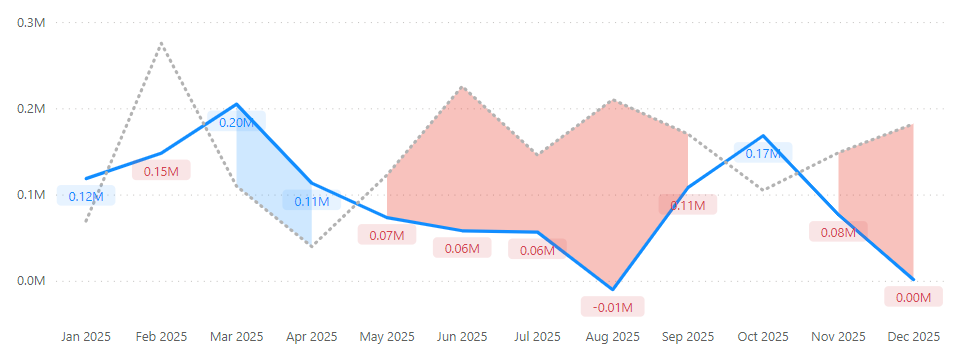
It’s for monthly sales, issue is when there is a negative month followed by a positive month (or vice versa) the blue (postitive) colour doesn’t show, neither does the red (negative), until we get 2 months of negative or positive variance.
I know why this is happening as I’m using variance measure that only show if there is a positive or negative variance, like so:
Var Sales To LY - Only =
IF(
[Var Sales To LY] < 0,
[Var Sales To LY],
BLANK()
)
But are there any ideas on how we may make this look a bit better by filling the variance spaces where there is no colour?
I have tried to solve this by making it a MAT sales, daily chart, and while this does fill the gaps (all of the variances are either blue or red) the issue here is that the labels are daily labels, which is messy, as there are too many labels.
I’m happy to hear any suggestions on how this could be made to look better.
Thanks,
Tim