As I don’t have BI service, I have not published the report.
If you want to send a copy of your PBIX file to me at brian.julius@enterprisedna.co, I’d be glad to publish your report on our tenant and send you back the Publish to Web link to include in your posting.
@FPastor Mind blowing analysis, theme and colors in the report. Setting up a cover page doesn’t take a lot of time but it does give a great first impression as we do “Judge the book by its cover”. I really do love the white color in the default tooltips that really blends in well with the overall theme of the report.
My only advise would be to submit your report at the end so other participants are not daunted by your amazing submissions.
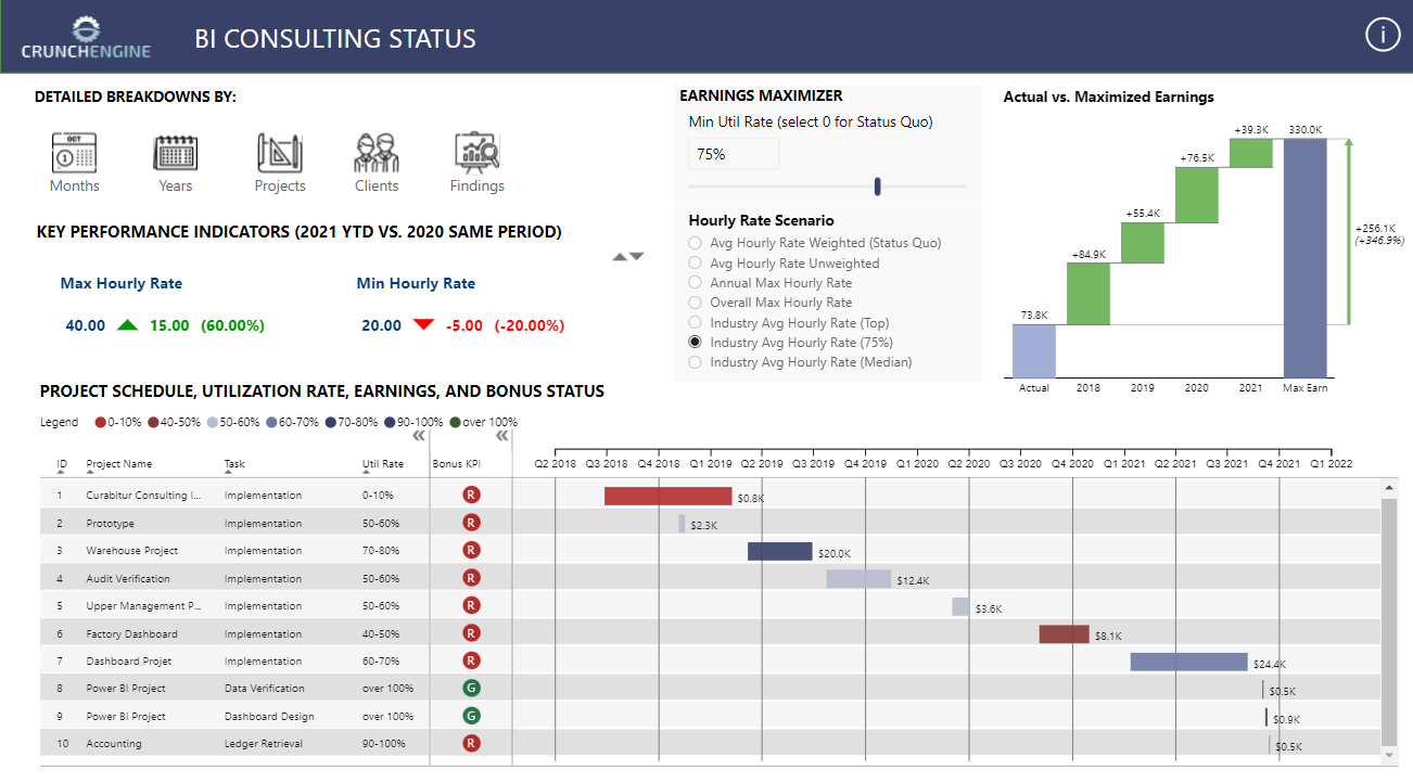
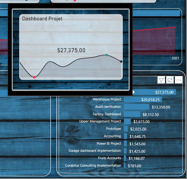
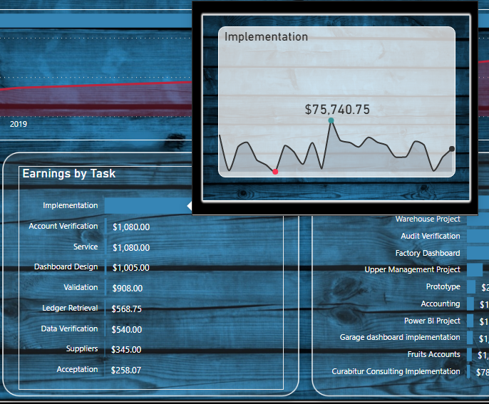
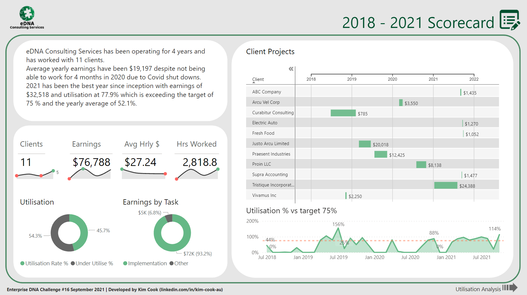
Notes on my report. Single page report, I’m very happy with results. More work then I thought but will be very useful for analysis of my consulting business.
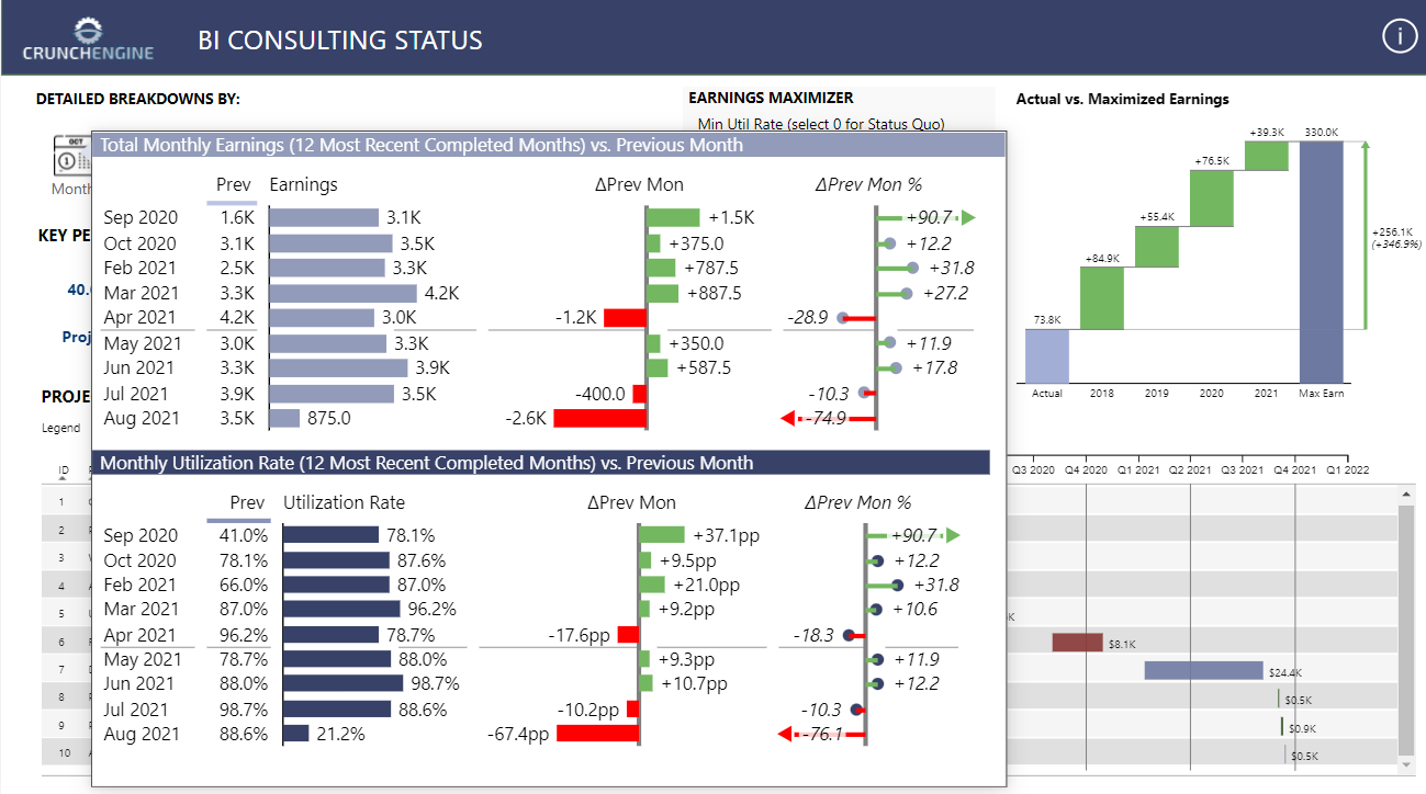
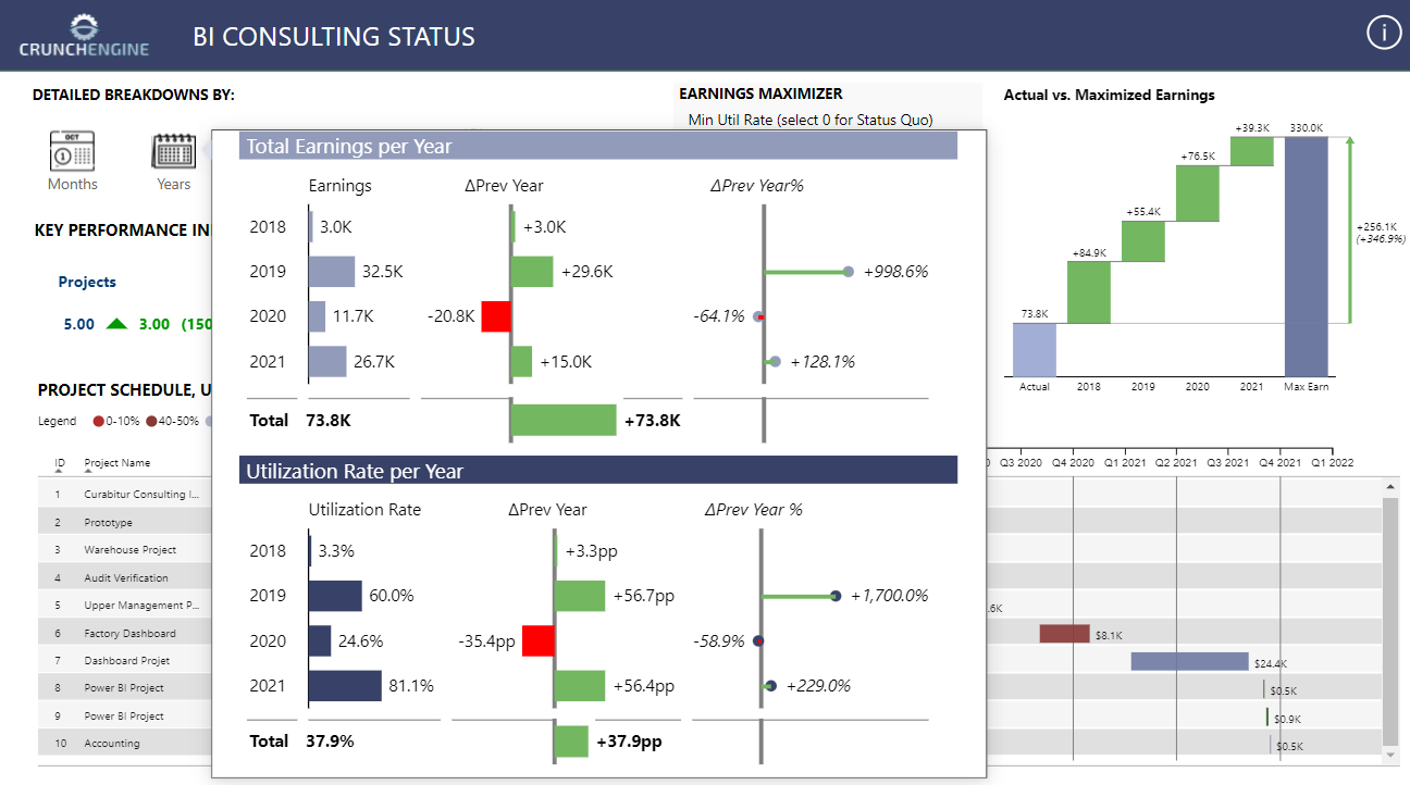
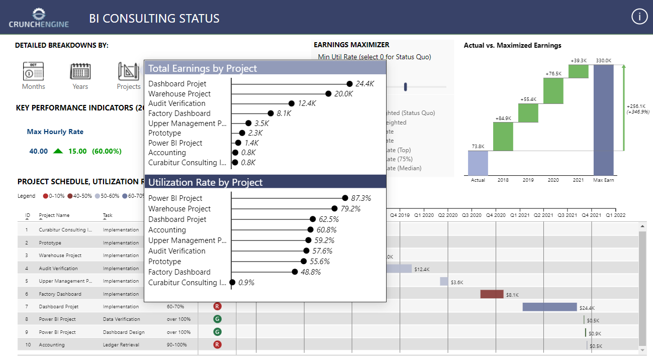
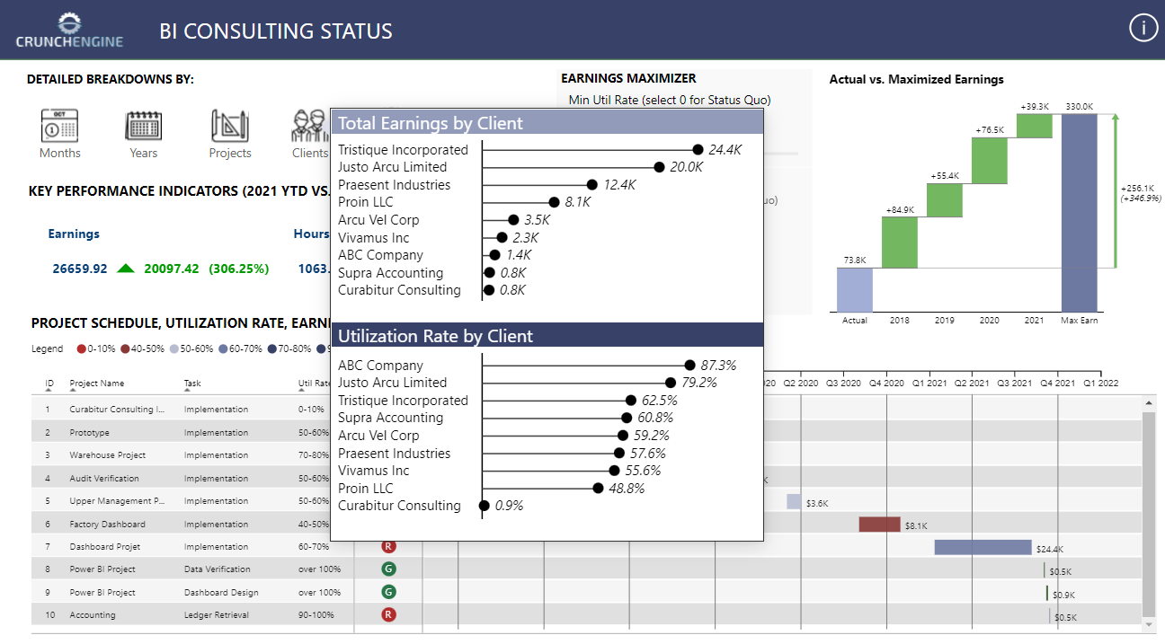
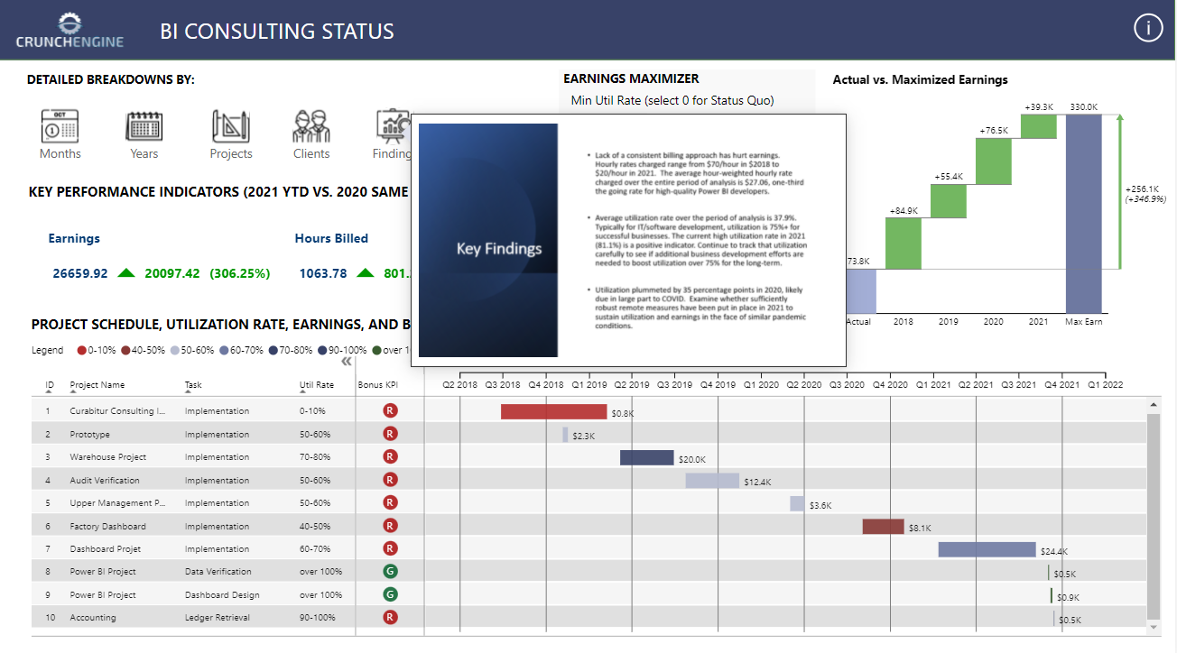
The things I like the most the the large utilization graph on top that shows how busy or not the consultant is. Also, that everything is on one page and you see everything at once. Drill down and the tool tip is something very useful.
@MudassirAli Thank you for your feedback, very encouraging words.
I take in your advice on submission time, I do like to present my reports as soon as these are finished for 2 reasons a. encourage participation and b. don’t like to be seen as copying ideas from others.
Below is my submission for Challenge #16. Thanks to @haroonali1000 and @ericet for a great Challenge topic and dataset - I really enjoyed this one.
MY LEARNING GOALS FOR CHALLENGE #16
While I am in awe of the artistry of folks like @MudassirAli , @alexbadiu , @Gustaw and others in their report designs, I have neither the creativity nor the patience to build reports that look like theirs. Thus, my goal for this Challenge was to improve the design of my past reports (which are a bit blockly/clunky, except for the ones on which I collaborated with the JMAP team) - generating a sleeker, better looking design (along the lines of those developed by @datazoe and @Greg ) that I could use in my “real world” reports. OUTCOME: I think I succeeded, but eager for feedback.
Experiment with the new UX features provided in the 2021 September PBI Desktop update, particularly the custom icon/button enhancements. OUTCOME: Succeeded.
Try to build an entire report using only visuals I’ve never used before to evaluate their utility for “real world” uses. OUTCOME: Succeeded.
Learn Deneb to build awesome KPI cards similar to those designed by Kerry Kolosko on her blog. I thought Deneb might be easier for me to learn given that I already know ggplot2 and the are somewhat similar conceptually. Whether that’s true or not is unclear, but what is clear is that learning Deneb in the short period of Challenge while also trying to complete a fairly complex entry was definitely a bridge too far for me. OUTCOME: Failed.
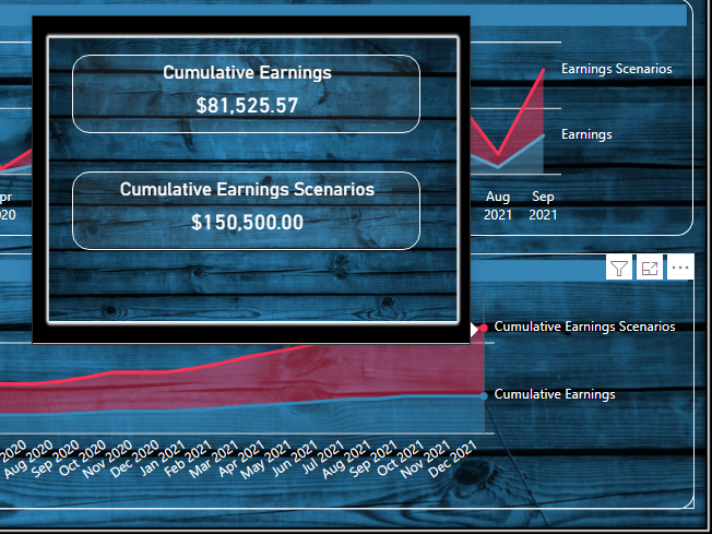
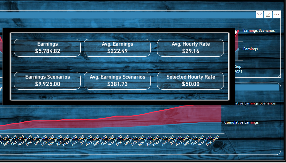
I have been hugely influenced by @MudassirAli’s philosophy of minimizing the use of slicers, which take up space and provide little or no meaningful information, and instead using visuals to crossfilter each other. I was able to avoid the use of any slicers in this report, and using @sam.mckay 's awesome invisible card trick to trigger tooltips, I was able to also sidestep the use of bookmarks and page navigation buttons, instead building a true one-page report using only mouse-over triggers for the six accompanying tooltips. There is one parameter selector that I guess could be consider a slicer, but I’m going to evaluate this one as OUTCOME: Succeeded.
OK, so here’s my report. Will provide a full writeup on the methodology this week for those interested.
(NOTE: for some reason, my report publishes fine but when I Publish to Web it fails to show my icons for the detailed breakdowns… )
After missing the last couple of Challenges due to work on Accelerator and other eDNA projects, it feels good to be back in the game. Eager for your feedback.
All,
Here is my entry for this Challenge Didn’t have a bunch of time to allocate to this, but got something completed.
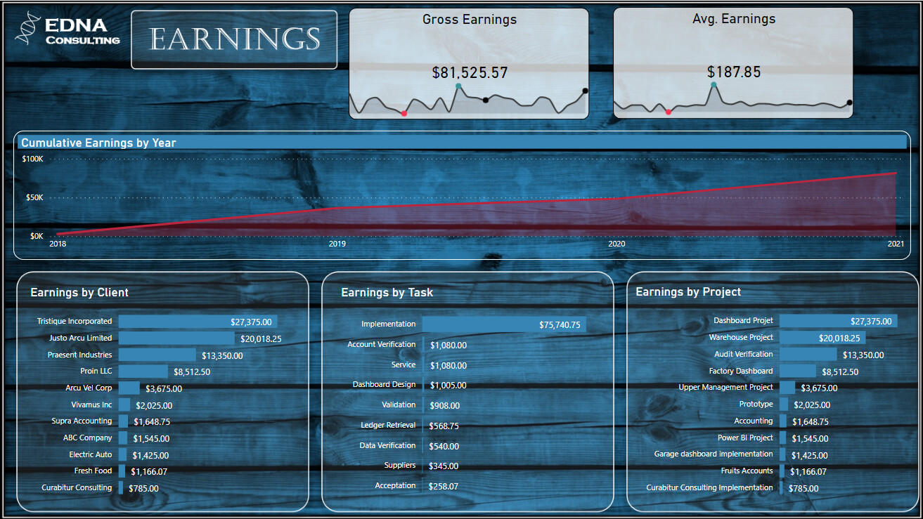
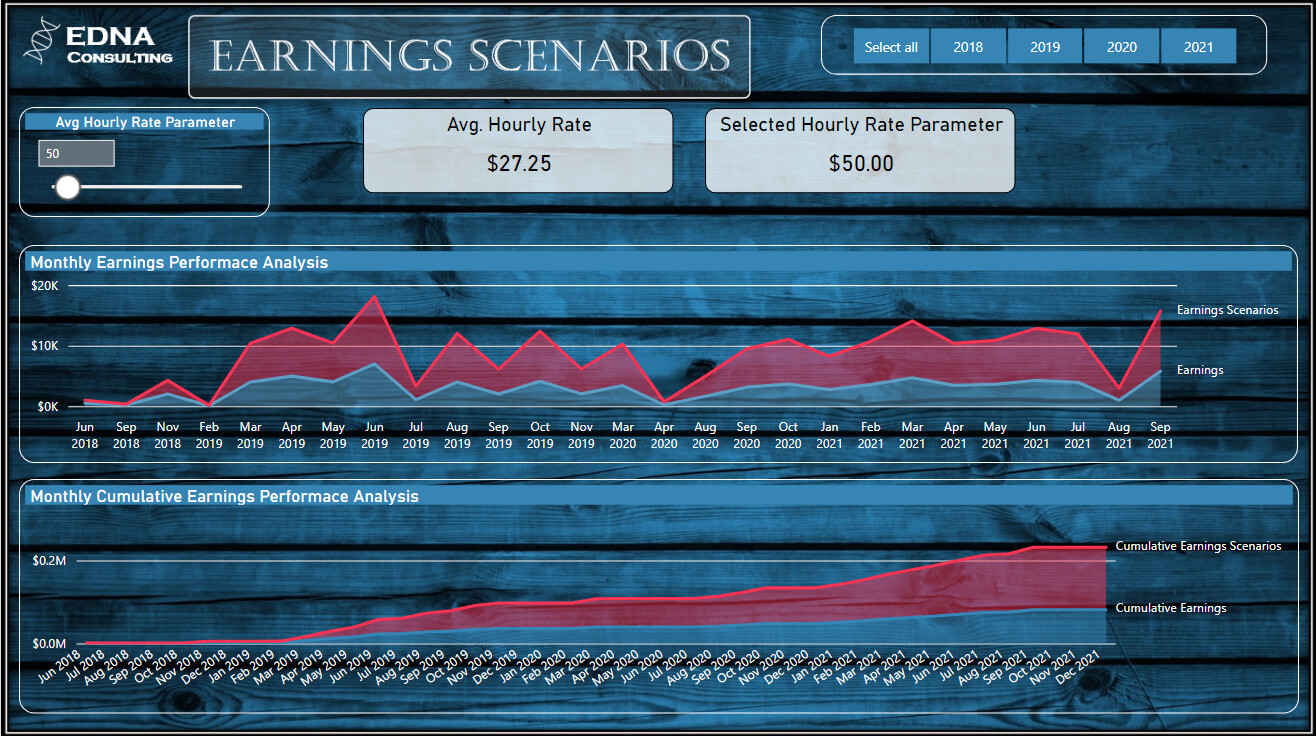
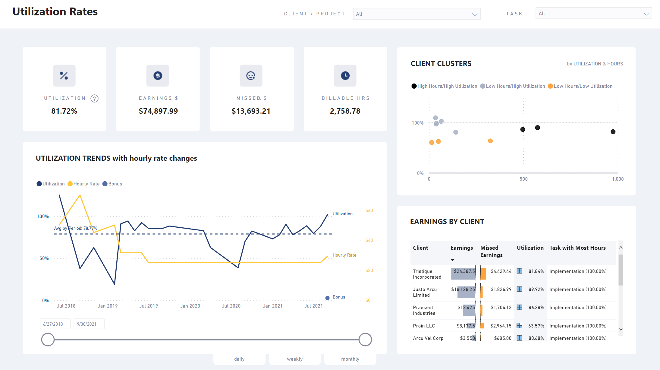
Had a hard time getting to exicted about this dataset. I’m sure the dataset numbers were skewed a bit, because I don’t know how someone could make a living charging the rates that this consultant did. As a full time consultant myself, I always try to charge a “Package Price” per project, instead of an hourly rate. Most clients always pick the package price, when they see how much the hourly rate is.
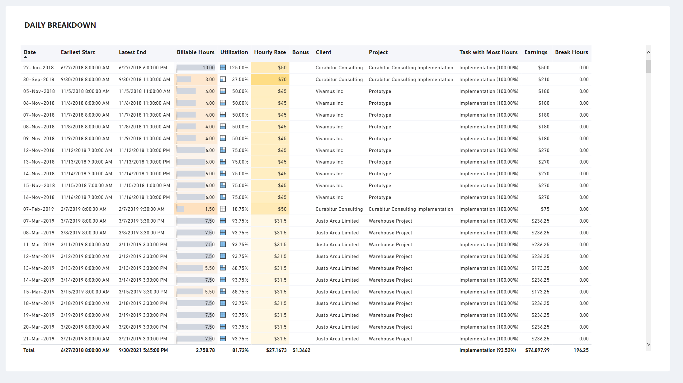
I got rid of all the break data, since as a consultant, you only get paid for billable hours. It might be nice to track how much time you are spending on breaks, but it is up to you to complete the project in a timely manner so that you get paid! I concentrated on Earnings for this entry, and included some what if analysis to see how much more this consultant could have made if they charged a higher hourly rate. I did think his was a great exercise to see the possibilities of how we could improve our business as consultants.
I did have to clean up the data a little bit: rows 326-345 I corrected the end date to match the start date. I also de-duplicated the data (most likely those rows ha, but I didn’t check).
@BrianJ nice to see you back! I used the gantt chart too and I thought about using colours but ran out of time so I am going to study your report. I particularly like the look, how the KPI’s scroll and your usage of tooltips. Overall outcomed “Succeeded” Look forward to your write up.
Yes, the hourly rate was a little low, for me I always bill by the hour and I actually need to make a timesheet for my work and the timesheet is weekly but the billing is monthly. That is what my customers want.
In the data, you did not need to worry about breaks etc. The column Duration was the only important one. No need to do anything with Break. The dataset looks like that because of the iOS atWork app that I use to track my time. So, I used the export to structure my dataset.
Also, nobody noticed a gap in the data ? Yes, when COVID-19 Hit Canada everything was shut down. The gap started in April 2020 (2020-04) and business restarted 3 months later.
Thanks @BrianJ, nice report. I’m wondering how you did your moving Key Performance Indicators display ? I want to learn that trick. Is there a video somewhere that’s shows how to do that ?
Yes, the dataset is generally pretty good but the rate a little low, I agree, there was also a duplicate in the data that @DianaWill spotted.
I made the error the error in the dataset.
2019-06-07 8:00:00 AM
2019-06-07 8:00:00 AM
I’m happy to see the participation of the eDNA community. Thanks everyone for your creativity and efforts. Really great to see the different visions on the same data.
Thanks! I have always loved the clean, streamlined look of your reports so I definitely tried to emulate that in mine. Really like how you took a very different slant on the analysis, particularly the timing analyses and the client clustering.
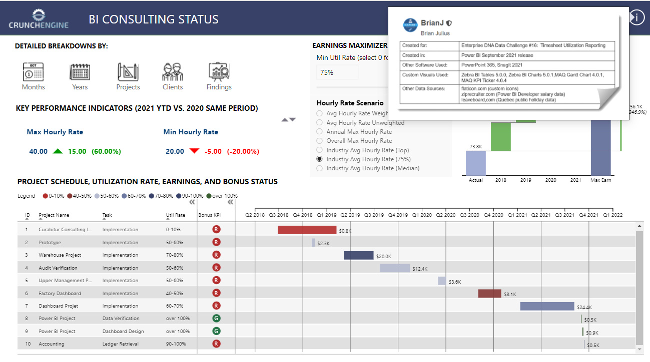
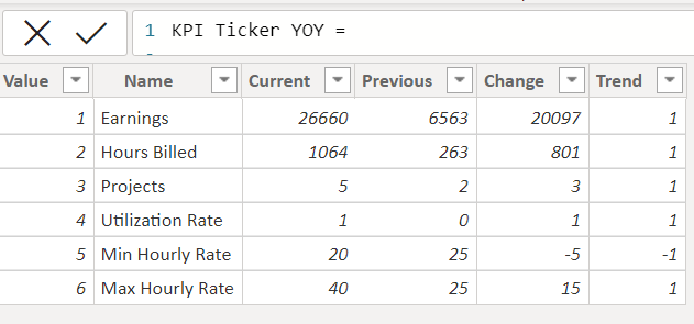
That trick is done with a custom visual called MAQ KPI Ticker. It works great when you have one column with a lot of observations – for example downloaded stock price data. However, when you are trying to get it to display a whole bunch of different calculated metrics, it’s a pretty heavy lift. Just to get those six metrics in my report to display in the ticker, I had to write 34 separate measures and then the code for the calculated table below, which was nearly 100 lines of DAX, bringing together all 34 of the branched measures.
I do think it’s a pretty cool effect, but except in pretty homogenous cases like a stock ticker or an exchange rate ticker where you can download the key data directly, it’s probably not worth the effort involved IMO.
Here’s a video that walks through the simple case of how to apply the visual.
Here is my entry for Challenge#16.
Overall I am happy with my entry and learning progression.
Likes:
Smart Narrative. First time using this feature and I love it; it really helped to tell the story and tie my visuals together. Thanks to @Greg for his video
focused on a simple colour scheme
Dynamic page headers
Other new features I tried were: Gantt, Tornado & Sparklines.
Dislikes:
I am too slow and I have spent too much time on this dashboard.
Brevity of data and it took me some time to decide how to present report. However, this was also a like as I couldn’t get distracted with too many ideas like I usually do.
Thanks for your comments. I agree that the KPI ticker effect is pretty eye-catching, but per my message to Eric above, making it work in this particular case was somewhat of an exercise in lunacy.
The Gantt chart seem to fit the needs of this report really well. However, I have yet to find the perfect Gantt visual. The MAQ visual I used comes the closest IMO, doing about 80% of what I would want, but it loses points on the assignment of resources and showing percent complete by project. The Microsoft Gantt visual on the other hand does both of those things really well, but falls down on some of the basic display elements that the MAQ excels at. If there were a way to create a Frankenstein of those two options, I think you’d have pretty much the perfect Gantt visual.
I like everything about this report - from the rounded scorecard theme, to the simple colors to the varied choice of visuals. I think it’s really well organized and very effective. I agree that the SmartNarrative visual is a perfect fit here. I had planned to use it as well for my Findings tooltip to make them dynamic, but that was the last component of our report to be completed, and by that time I had run out of time and gas. But I think it works really well here.
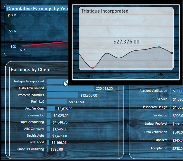
I think you also did a really terrific job of editing yourself. As you say, there are a million ways you could have gone with this analysis, and my temptation as well was to pack as much of those into the report as possible. But I think you smartly resisted that temptation and made excellent choices about what to keep. (Love the sparklines – are those OKViz?)

 Look forward to your write up.
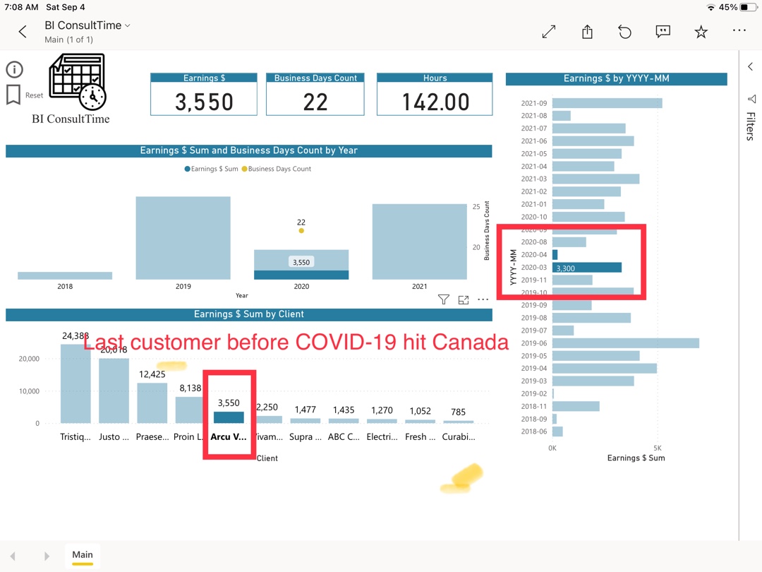


 It does look impressive though.