Welcome to the eDNA Data Challenges - fantastic debut entry! I really like how you fully embraced your personal style in your entry from a design standpoint. This is the first time I’ve heard of Procreate (the common tools that pop up here frequently are Powerpoint, Canva and Figma), so I’m eager to learn more about that.
So much great stuff in this one. Excellent job on the scenario analyzer - really liked the way you focused this on the story of financial independence and extended beyond the bounds of the data provided to incorporate external factors like taxation. (I’ve also got a scenario analysis central to my entry so it will be interesting to compare notes.). Love the tutorial overlay feature and the overall navigational structure/UX of the report.
Thanks for participating - wonderful entry and can’t wait to see more from you in the future.
Brian
P.S. I think reports always “show” best when people can view them live. If you don’t have access to Publish to Web, you can just email me your PBIX file (brian.julius@enterprisedna.co) and I can publish it to eDNA tenant and add the link to your postings.
P.P.S. Also, thanks for the terrific support you’ve been providing on the forum. Much appreciated!
Sabine, very nice and very creative. Yes, the hourly rate $ is too low. Brian actually told me the rate was too low but the Challenge files were published without warning and no time for me todo a last tweek to it before publication.
In the data has a 3 month dead spot when COVID-19 hit our part of the world. Just to reassure you. I do earn a living with my Power BI consulting business and I don’t need another job, but the data is not real and making a real “fake” data set is not easy.
I’m really impressed with everyone’s submissions, and I’m also glad everyone like the idea of this project. I pitched it to Brian and he saw the potential of it, so in turn he suggested to Haroon. Who accepted
Thanks to all your participation, I’m really thankful and happy to see all your ideas and that you enjoyed doing this challenge.
This is my first challenge also, plus it’s my idea, so I better deliver something useful and nice. It’s also something I will use with my real data. That will be awesome to see my real numbers on my Power BI and hopefully other consultants will use it also to look at how their consultants business is doing.
My submission is almost ready. Doing some last minute modifications. Looking forward to releasing it, for all of you to see. It’s a little intimidating because this crowd are Power BI Pro’s, so the level is way up there. I don’t even show this to my wife who really does not care of my Power BI projets, she just knows I work late at night on Power BI…
No worries, just remember I just could not put my real data for the world to see. But I’m sure glad EDNA is running this Challenge it’s very positive for everyone involved.
Ok thanks, I use Photoshop Éléments on my Mac. I also test my Power BI dashboard on my iPad. I love Power BI on iPad. Plus I make sure that I design a mobile version that I test on my iPhone. Just love this stuff in on all these devices.
The Data model has been expanded with some minor dimensional tables - mostly slicers and what if parameters tables.
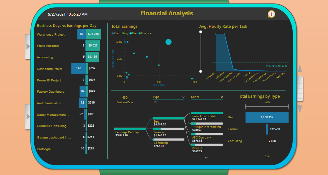
Projects are focal points of the report. They have been divided into 3 main types: Consulting, Finance, Development.
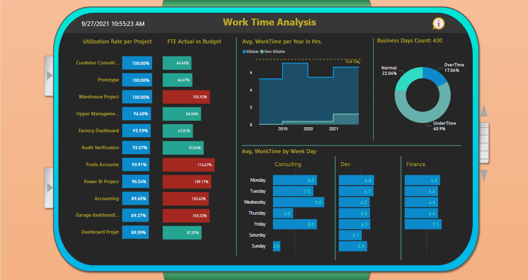
Due to many gaps and high inconsistency of dates time intelligence analysis is rather simple.
This is also the reason for selected Utilization Rate formula. I decided to simply take into account only work and break time
as the base of available time per project, because project-oriented operations are much more versatile than steady 9 to 5 jobs.
I have decided to include FTE calculations for extra insights. Budget FTE is calculated as follows:
(Business days per project * 7.5) / 37.5 which is a standard US formula. Then actual FTE is simply: The actual Work Time per Project / 37.5
Altough, hourly rates and booked billable hours could be perceived as cost for the organisation,
thus compared further on with earnings - this idea has been rejected, because I wasn’t sure if that’s a good lead.
Instead, more pressure has been put on the earnings/revenue part in different scenarios.
Design:
Since the topic of the challenge is time analysis I decided to design a smartwatch-like report, which in the end is pretty satisfying.
Overall UX shall resemble an actual smartwatch, thus all the buttons and navigation are easy to folow.
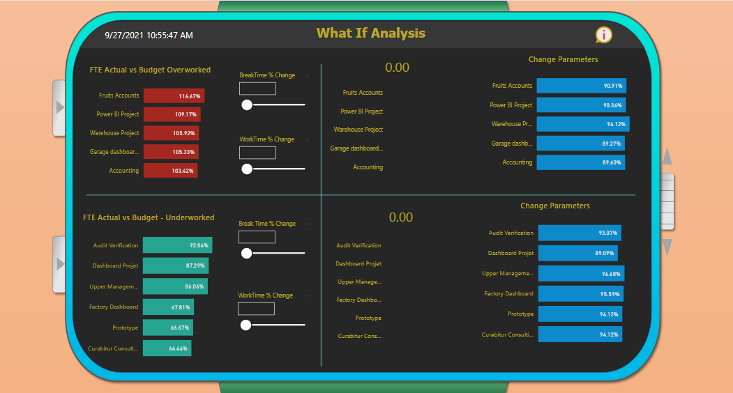
What If Scenarios:
Some of the projects have no booked non-billable hours (breaks) - there is an optional choice for user in the settings to fill the missing
gap with 6.25 % of the work time per project, since normally 0.5 hours of break in 8 Hrs.day would be this much.
Break parameters don’t affect Earnings, only Utilization. WorkTime parameters affect both Earnings and UR.
When a user changes this parameter - appropriate measure evaluates each of the Earnings per Hour value in the given project context and then sums everything together.
I accepte the Power BI Challenge - Challenge 16 - Timesheet Utilisation Reporting
Here is my Report:
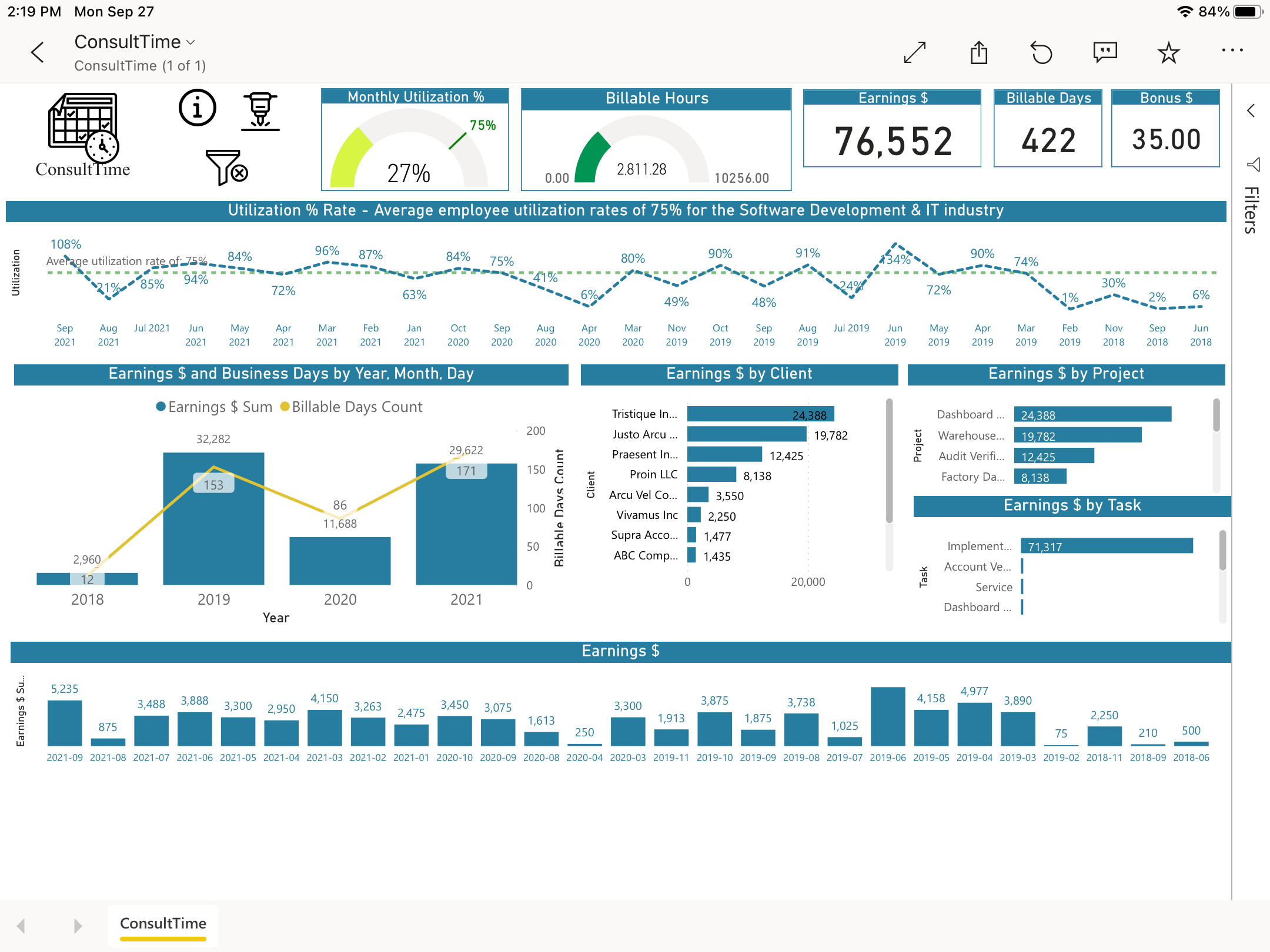
ConsultTime, Timesheet Utilization Tool for Consultants.
This dashboard is for consultants who want to track their business. You can have multiple customers (clients) and hourly rates.
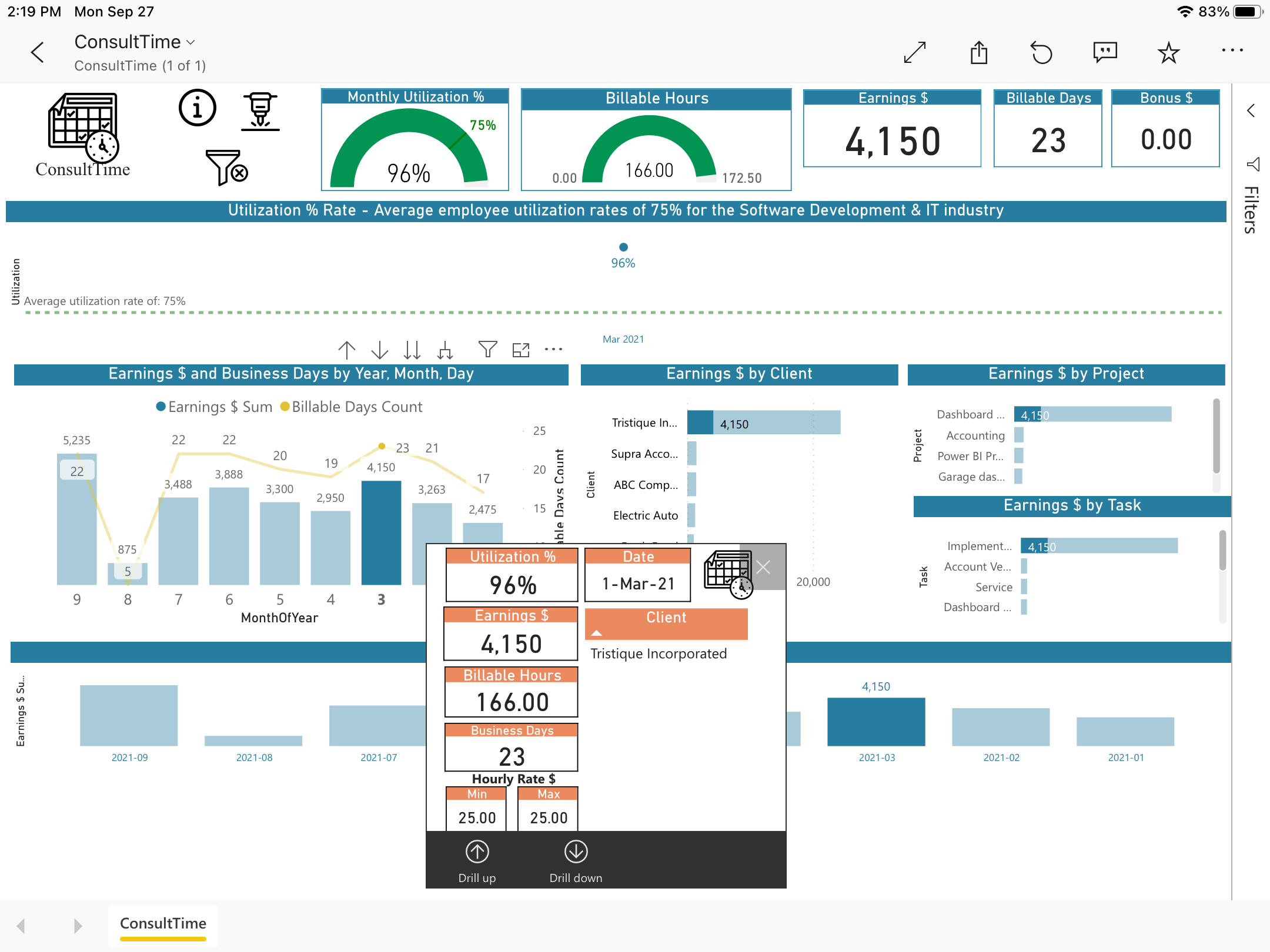
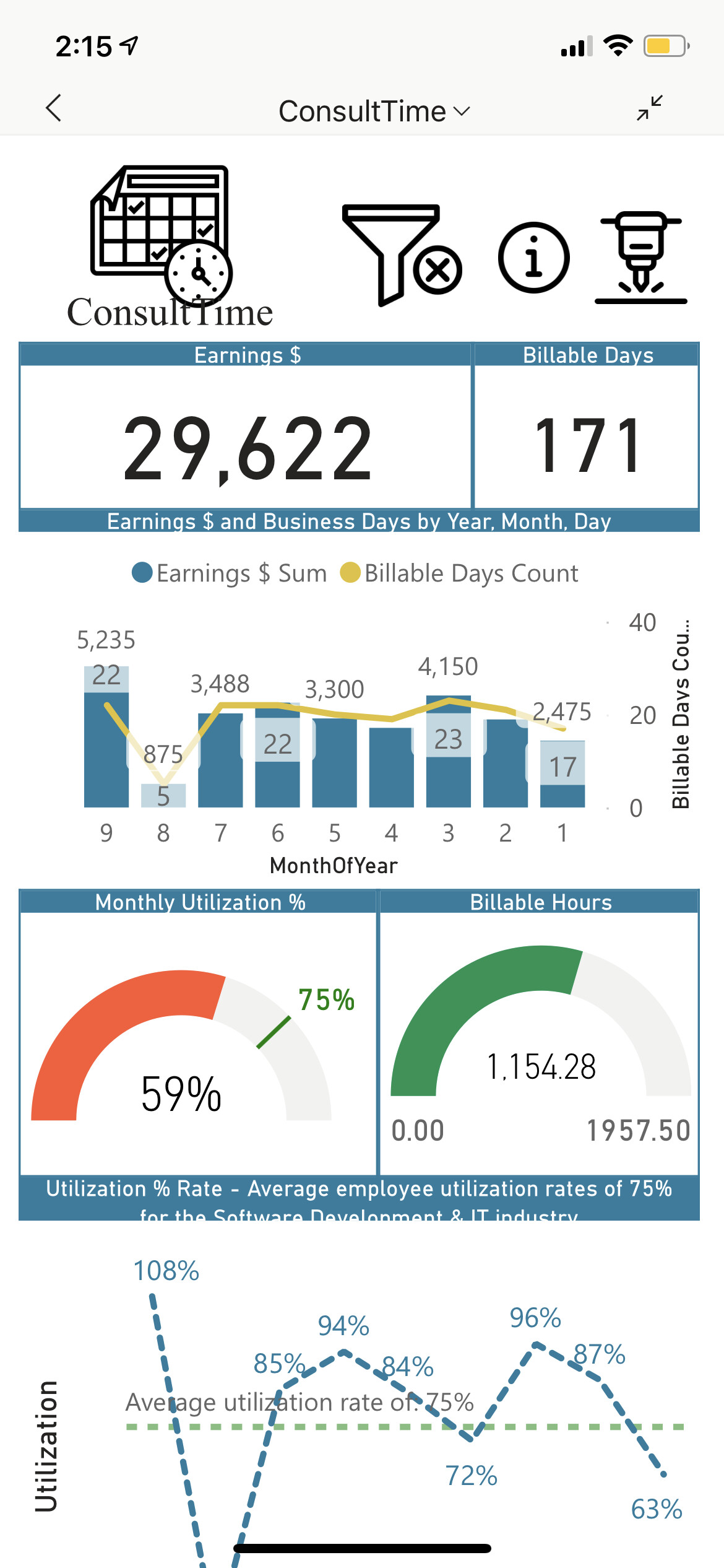
Fully interactive report, drill down on many visualisation.
Utilization % Rate KPI to clearly see how the consultant is maximising his time and billing.
This report is based on a monthly period, consultants usually bill monthly.
I use atWork Timesheet on iOS to track my time.
The export data file format is easy and require small modifications on the header and footer of the file. I also added an extra column. Hours per Day was added to the original data file. Not all customers have the same day definition. 7, 7.5, 8 hours per day. The regular work day was added to be able to calculate utilization % rate.
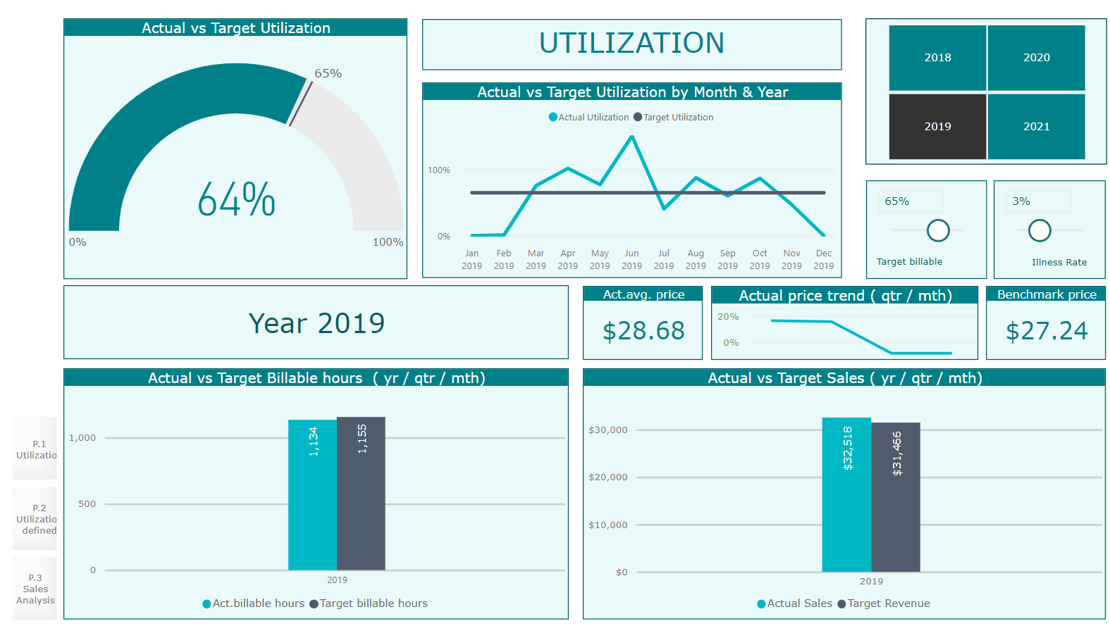
Utilization KPI Definition
Utilization = Billable hours / Total hours X 100%
Utilization target is set at 75%. Which is the average employee utilization rates for the software development and IT industry
Please receive hereby my workout of the Challenge 16 - Timesheet Utilization Reporting.
It is a three page report: Utilization, Utilization defined and Sales analysis.
Straightforward Data Model
The data model exist of a date table, connected to the provided “ActualWorkData” of one consultant.
A date column is added, derived from Start(time) for the connection with the date table, the Revenue column is deleted and calculated with a measure (Work * 24 * Hourly Rate + Bonus)
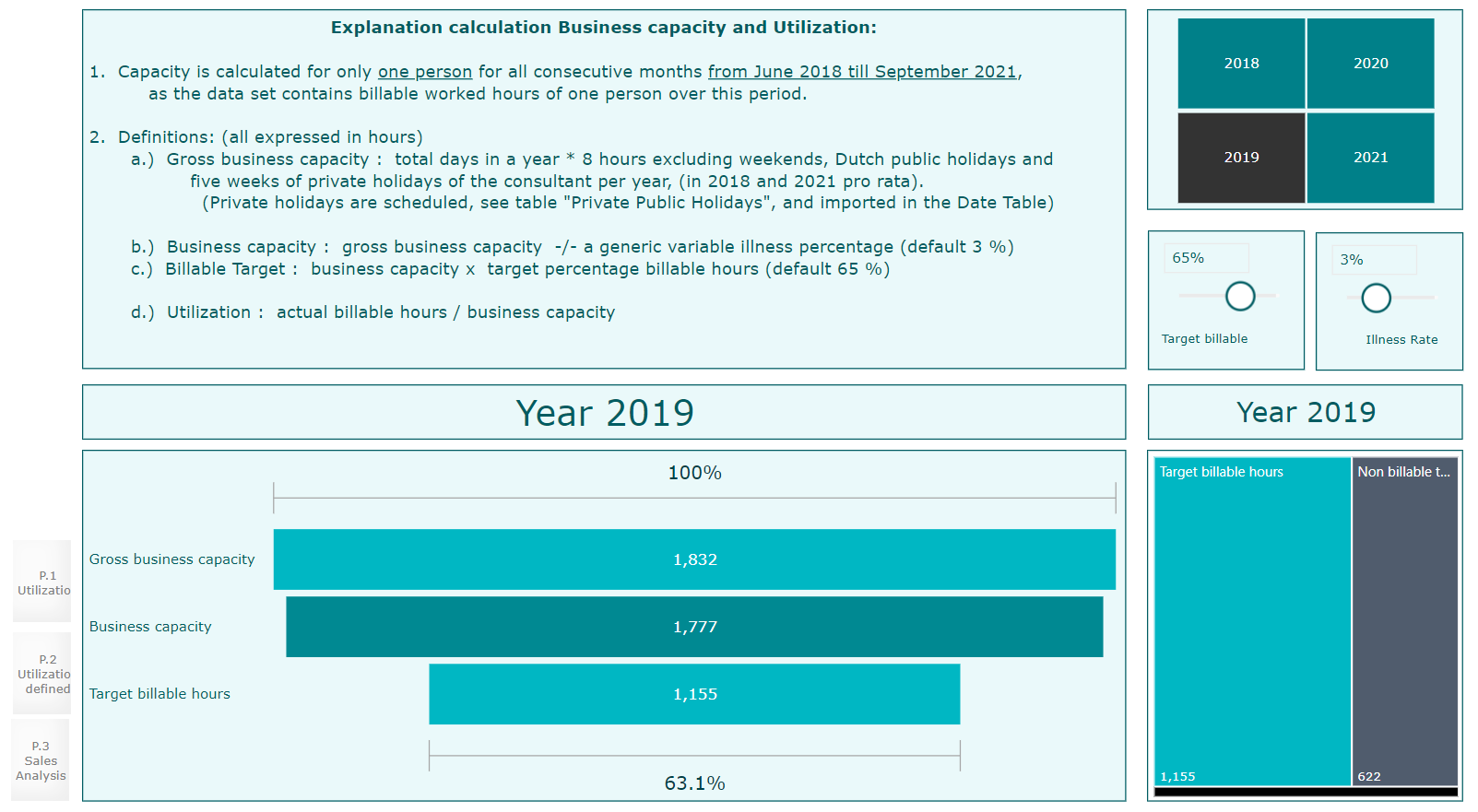
"Utilization defined" explains Business capacity and Utilization, with the Target settting.
Capacity is calculated for only one person for all consecutive months from June 2018 till September 2021, as the data set contains billable worked hours of one person over this period.
Definitions: (all expressed in hours)
a) Gross business capacity: total days in a year * 8 hours excluding weekends, Dutch public holidays and five weeks of private holidays of the consultant per year, (in 2018 and 2021 pro rata).(Private holidays are scheduled, see table “Private Public Holidays”, and imported in the Date Table)
b) Business capacity : gross business capacity -/- a generic variable illness percentage (default 3 %)
c) Billable Target : business capacity x target percentage billable hours (default 65 %)
d) Utilization : actual billable hours / business capacity
(Capacity Measures setup accordingly)
"Utilization" reports actual billable hours against target, with rate trends and revenue development
Main KPI is the utilization rate (gauge report), comparing actual versus target utilization.
The target billable hours can be varied by changing the Target billable (default 65%) and the illness rate.
Actual Sales is calculated at “worked” hours x hourly rate + bonus.
The Avg act.sales price is derived from the Actual sales divided by the actual billable hours and is dependent on the chosen period
The Benchmark price is calculated as total actual revenue over four years divided by total worked hours, and is used for target revenue, being the benchmark price x target billable hours.
Act price trend is calculated as the percentage price difference between Avg act. sales price and benchmark
Actual / target comparison in the two clustered column charts at the bottom have drilldown possibilities, starting with annual figures to remain overview.
The year, or multiple or all years can be selected, which is valid for all three pages
(Actual and price measures set up accordingly)
"Sales Analysis" gives insight in billable hours, price and sales per client
Focus is set on customer sales analysis.
Insight in sales per customer, ranking on base of sales, average price per customer and actual billable hours per customer, important to know if high utilization delivers also high price and sales.
Possible future utilization insights
Comparison with previous periods
Comparison utilization with other colleagues
Utilization per project or task
Actual billable hours versus average price per customer
Nice! Really thorough and attractive report. I particularly like the incorporation of the what-if parameters in the analysis, as well as the scatter charts. I think there are some very interesting conclusions and recommendations that could result from the bottom right scatterchart in terms of why the subject is not seeing the typical downward sloping demand curve.
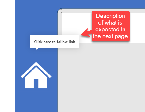
I can see you have packed many good insights in your report. I like the assumptions section at the bottom right of the report but unfortunately don’t know what “Click here for report” does as there is no link to web report.
You can further fine tune this report by distributing your analysis in different pages so the anlysis is not clustered with many visuals on a single page. Another advise would be to use less # of colors in the report. It is always good to use different colors that belong to the same family so try to target 2 to 3 colors in your report. Moreover, for great ideas, you can look into previous EDNA challenges reports where you can see how the participants have used 2 to 3 colors to produce amazing dashboards.
I would love to see you participating in future challenges and you will surely see the big change in overall PBI skills beacuse this is the platform where you can unleash your creativity.
Once again great job in presenting great analysis !
@DianaWill I really commend you on your report especially the “What-if” analysis section. You have gone one step ahead to predict the earnings rather than just relying on presenting historical data. In addition, the separate page to note down assumptions really do help in understanding the analysis presented.
To further fine tune the report, you can remove the tree map visual as the same information is already being presented with the help of bar chart.
Finally, it is better to write the description in bookmark’s tooltips as it tells the end users what type of analysis are presented on different pages.
Overall a great report and thanks for participating in this challenge.
Hope to see more of your predictive analysis in future challenges
I have linked to detailed report page using page navigation in ‘click here for report’. As I don’t have BI service, I have not published the report.
As regards colour and multiple tiles in a single page…yes, I too thought of it after going through other submissions. As advised by you, I will go through previous reports to get better idea.
I want to learn more… so I definitely I will participate in future challenges. With all your support, I could enhance my skills in this platform… To be very frank, I am getting addicted to PowerBI…
Thank you once again for your advise which motivates me to learn more and implement my learning in the reports.
As I don’t have BI service, I have not published the report.
If you want to send a copy of your PBIX file to me at brian.julius@enterprisedna.co, I’d be glad to publish your report on our tenant and send you back the Publish to Web link to include in your posting.
@FPastor Mind blowing analysis, theme and colors in the report. Setting up a cover page doesn’t take a lot of time but it does give a great first impression as we do “Judge the book by its cover”. I really do love the white color in the default tooltips that really blends in well with the overall theme of the report.
My only advise would be to submit your report at the end so other participants are not daunted by your amazing submissions.
Notes on my report. Single page report, I’m very happy with results. More work then I thought but will be very useful for analysis of my consulting business.
The things I like the most the the large utilization graph on top that shows how busy or not the consultant is. Also, that everything is on one page and you see everything at once. Drill down and the tool tip is something very useful.
@MudassirAli Thank you for your feedback, very encouraging words.
I take in your advice on submission time, I do like to present my reports as soon as these are finished for 2 reasons a. encourage participation and b. don’t like to be seen as copying ideas from others.