Hello everyone,
Here is my submission for the Challenge #16.
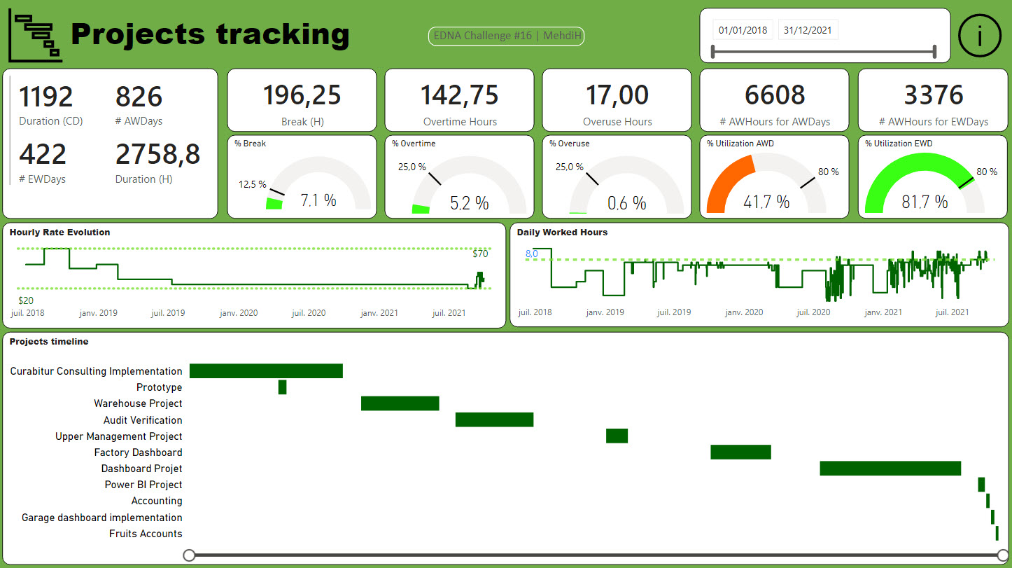
All the report stay in one page + an information page
What was interesting in this challenge is working with duration and get a better overview and understanding of Utilization.
Notes :
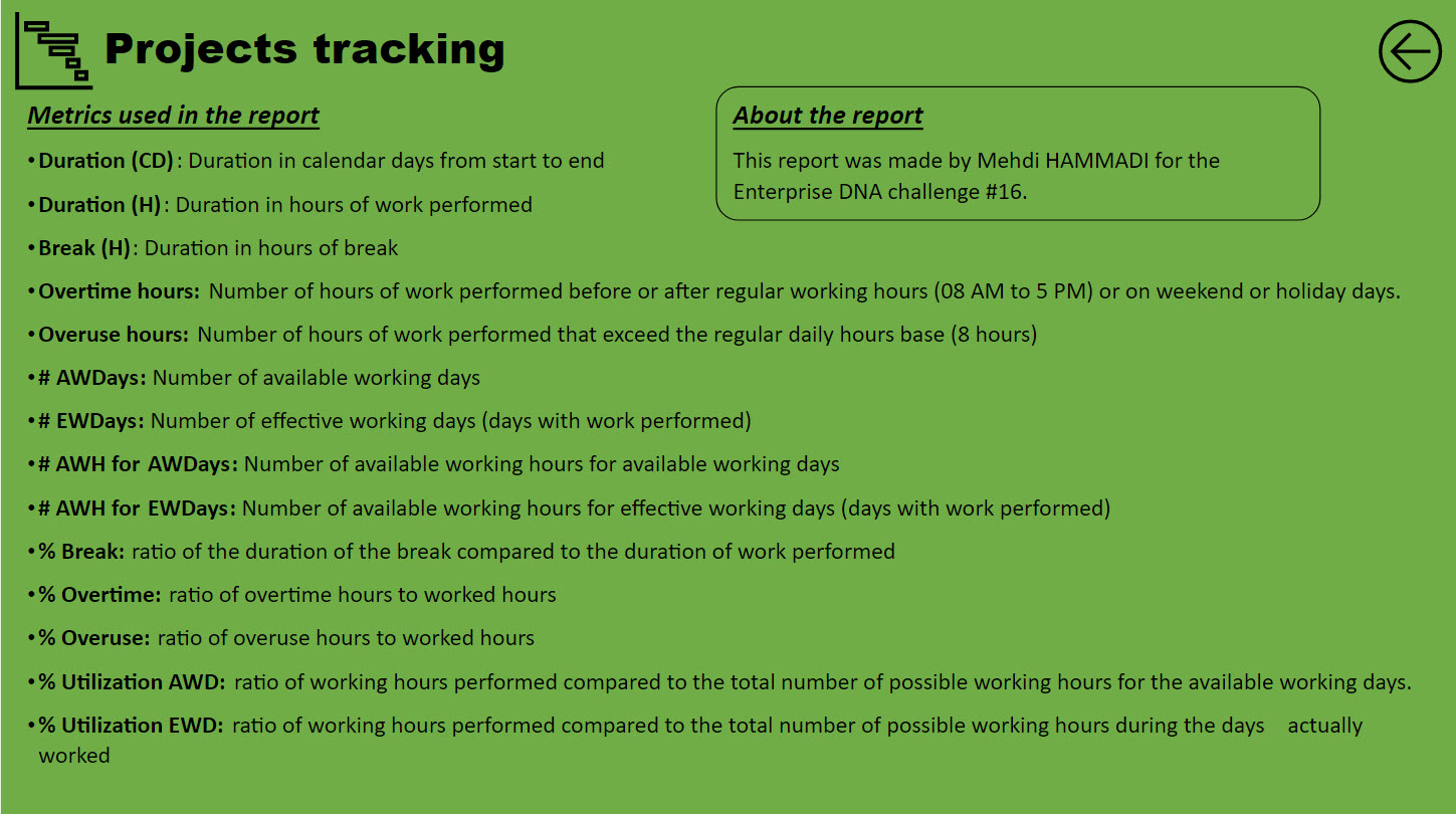
For the analyze, I made the following assumption
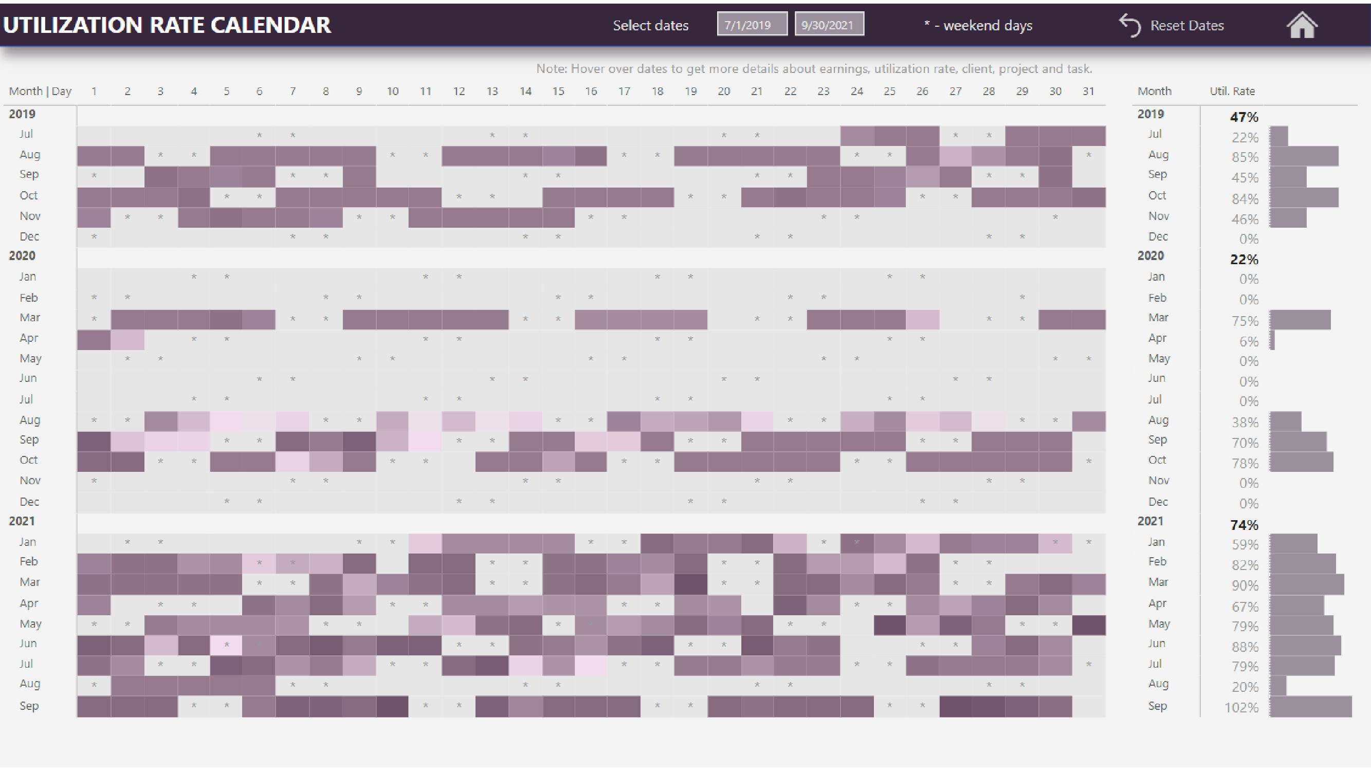
Regular working period is from 8 AM to 5 AM with 1 hour break from Monday to Friday. So it is 8 hours work per day. Saturday and Sunday are days off and I also considered 10 holiday days (US Holidays 2021 us-public-holidays.com)
Overtime hours look at work done on non regular working period.
Overuse hours look at working load that is more than 8 hours a day.
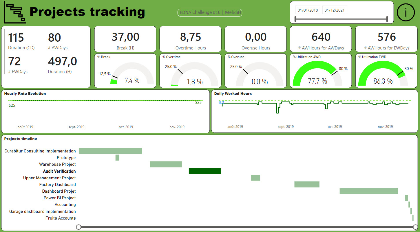
For the “Projects timeline” visual
I initially tried is to create a custom visual with Charticulator but I was not flexible as I wanted so I switched to a bar chart and used an old excel trick
Terrific report! I really like the custom created Gantt chart with the Zoom slider, and using that way to slice projects provide so much more information than a straight Projects slicer. I also really like the extensive use of cards and Gauge visuals at the top of the page – it makes it very clear what you think the important aspects of this data are, and gives the viewer a very clear picture of what’s going on right away.
There are just a lot of very thoughtful elements in this analysis – one particular example being the use of the stepped line rather than the traditional line chart. For the elements you’re depicting, that’s just a much more accurate representation. The conditional formatting applied to the gauge visuals is another example of how small elements add up to a very polished presentation.
A couple of very minor suggestions:
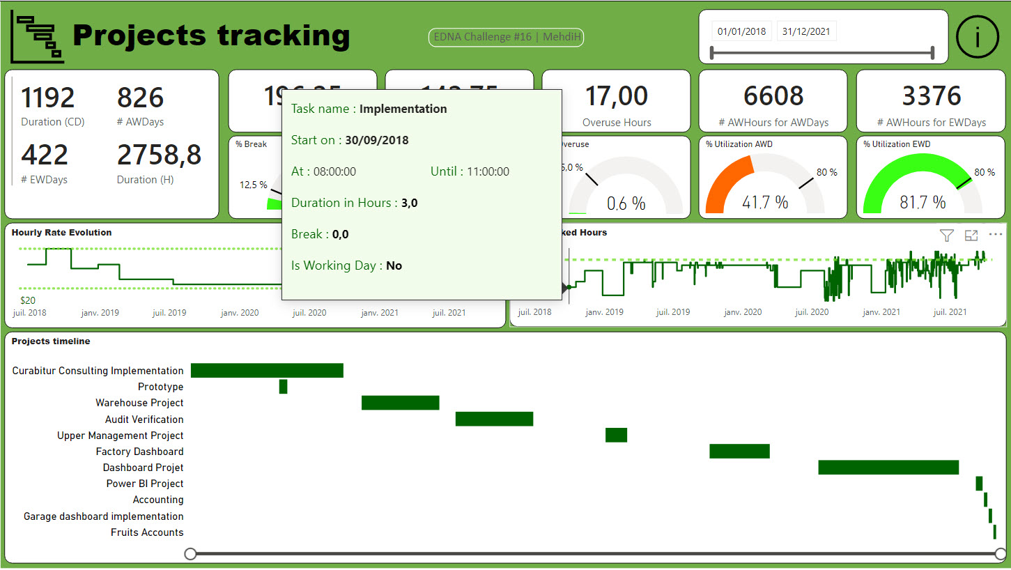
for the tooltip on your Gantt chart, I would recommend using the Modern Visual Tooltip, rather than the traditional one. I think it’s just a lot cleaner look, given that the modern version picks up the color theme used in your report, whereas the black background tooltip is a little jarring.
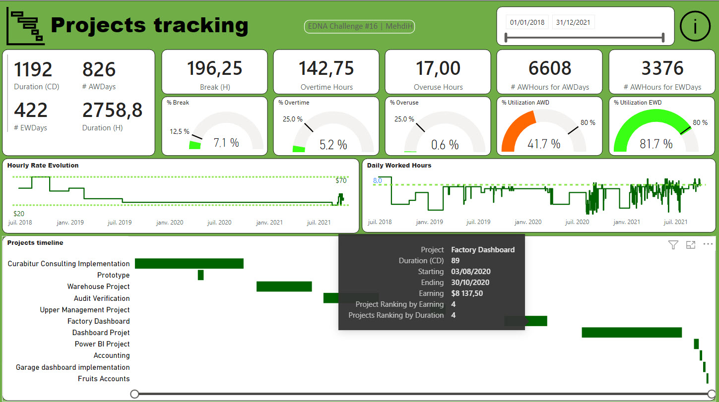
I think a visual cue that there is a tooltip associated with the daily worked hours would be helpful - otherwise I think a substantial number of users may never find that nice feature of your report.
But these are very minor points, and overall I think this report is excellent!
Really appreciate your consistent participation in every Challenge and Accelerator round, and I think both your reports and @KimC’s are clear evidence that “putting in the reps” really pays off in terms of rapidly expanding skills. Keep up the great work!
Awesome report Federico!
I love your theme and the way you use the color to create blocks for KPIs and catch the attention of the audience to what is important. The utilization Rates page is my favorite! I could totally see a mobile report using a similar layout!
Congrats !
Awesome report @KimC ! The subtle use of colors, the order and choice of visuals and the context given with the Smart Narrative makes your report very clear and easy to follow.
Thanks - I really appreciate that! Especially since I feel like I send a similar message to you every month about your entry.
Brian
P.S. I’ve posted the PBIX file in the Expert chat. Also, for those interested in seeing the PBIX files for this or any of the other entries, the @EnterpriseDNA team is working on cataloging them and posting them to the Data Challenge Showcase section of the portal. I will check with the team tonight as to when they expect to have those available for members.
Grreat job here @KimC . I really love the report colors and the Gantt chart that is used in conjunction with the area chart. Moreover, you have neatly divided the report in two sections i.e. Scorecard & utilization and didn’t cluster the report with too much analysis. Here is my response to your DISLIKES section:
" I am too slow and I have spent too much time on this dashboard." Response: Same here
" Brevity of data and it took me some time to decide how to present report." Response: Same here
Conclusion
The report is amazing and would like to see more of your submissions for sure.
Offer
In future challenges, whenever you think you need some help, I would be more than happy to help anyone. You can reach me on my direct cell # 911.
Thank you @BrianJ for your kind words and encouragement. The participation in the accelerator challenges is certainly helping my Dax and to think we still have 5 rounds to go…
Sparklines are OKViz.
Home page should be most interesting and storytelling piece of work. Need more practice.
Our analysis must highlight important findings and recommendations that would stem from them - In my work, analysis is present however there is a lack in highlighting important findings and recommendations - On my must have list for all reports.
Interaction between visuals is a key. There should not be a blank in your visuals - Double checking is key!
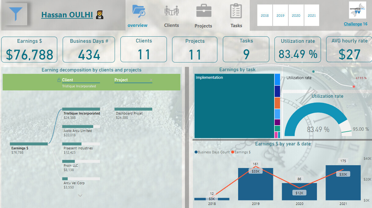
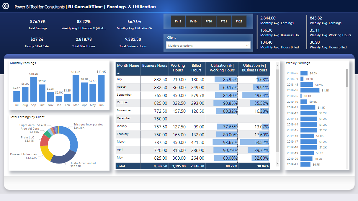
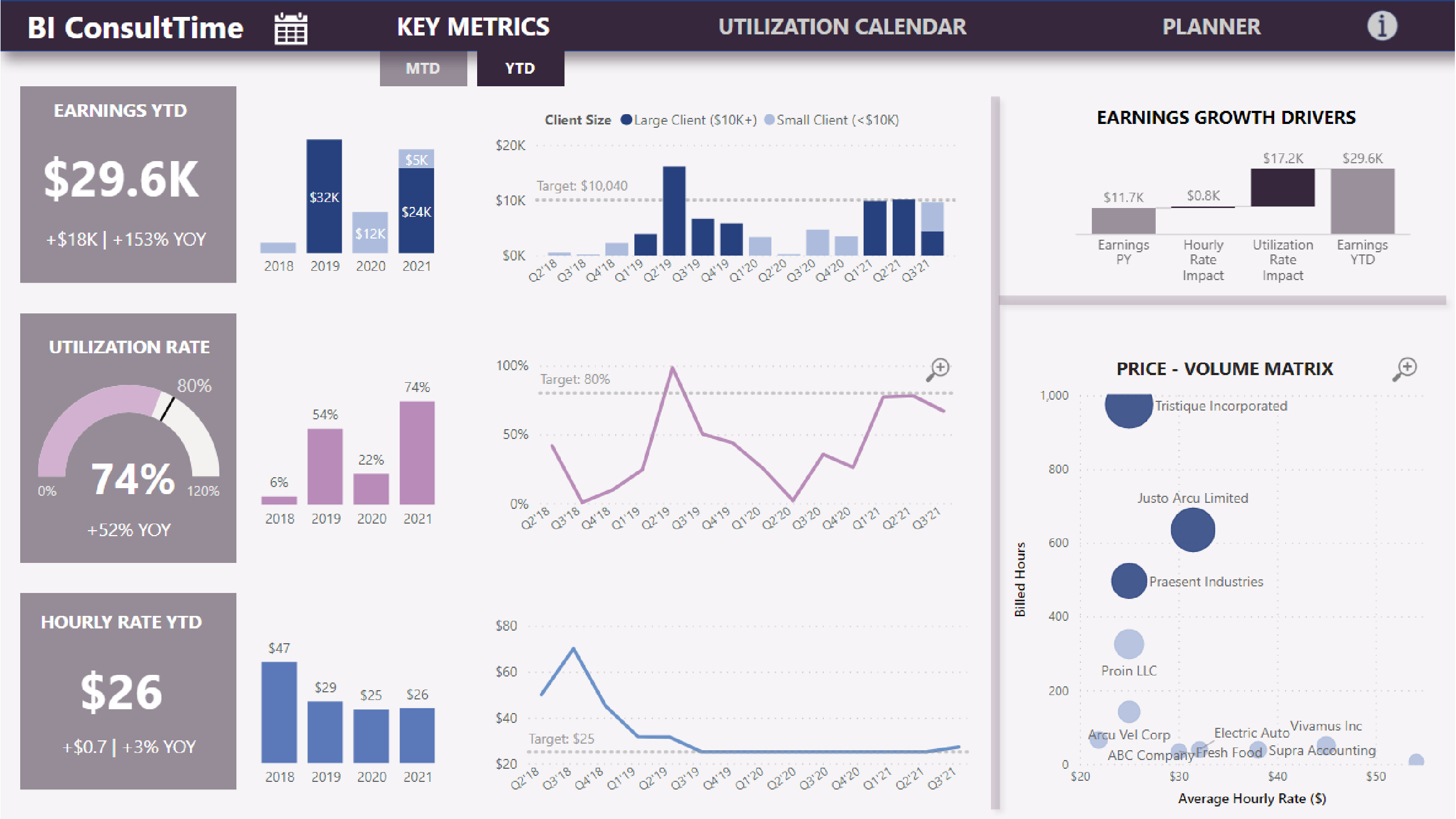
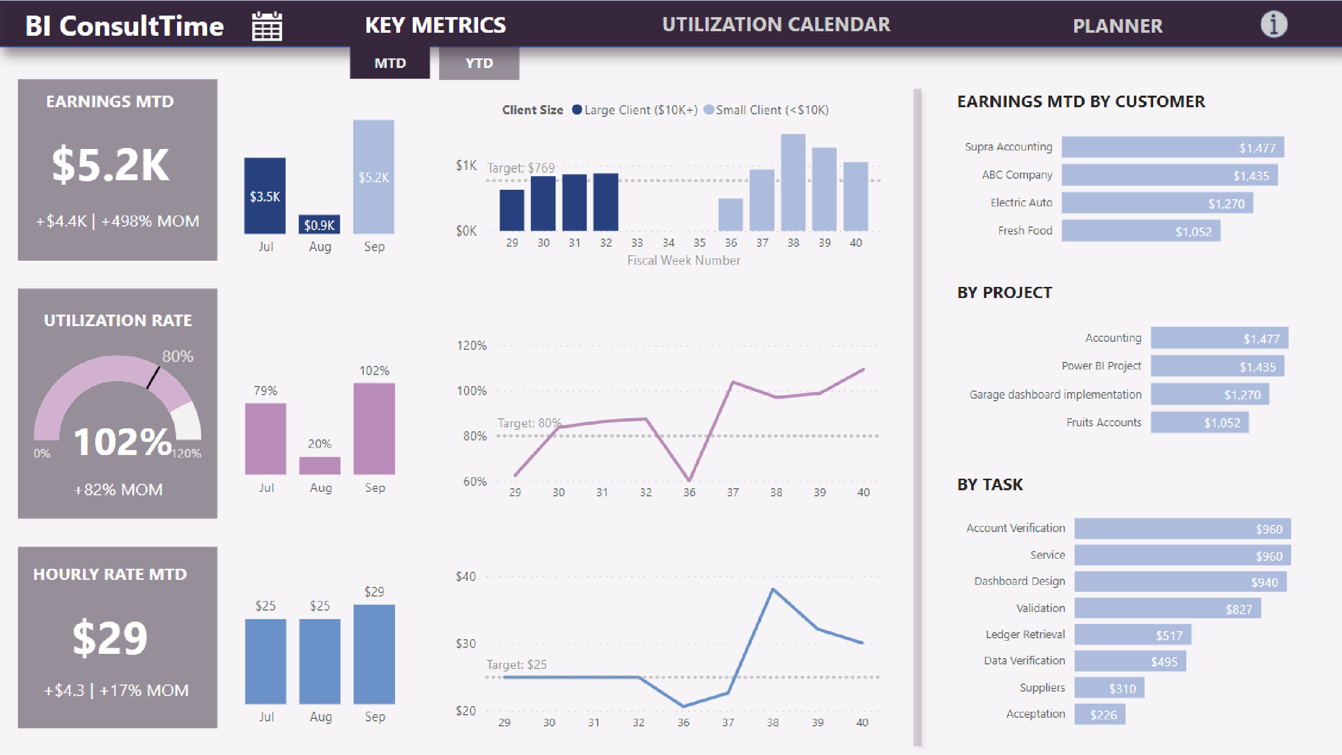
The report focuses on both short term (month-to-date) and longer term (year-to-date) performance to support both strategic and tactical planning. Both views provide context, trends and additional details to better understand earnings drivers.
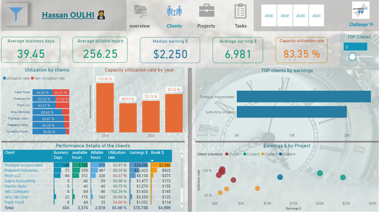
I have introduced a new dimension – client size: small (< $10K annual sales) and large ($10K+) as high utilization rate were highly correlated with big clients / projects. Therefore focus on large projects should be motivated.
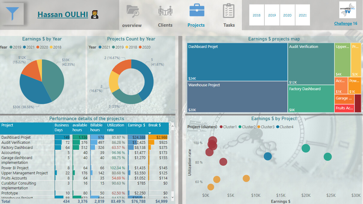
The Price – Volume matrix illustrates the current pricing structure where small and big projects tend to have the same hourly rate. The company should re-evaluate it’s pricing policy and implement a pricing structure that is volume-driven. In addition, it should evaluate implementing a dynamic pricing model similar to airlines and hotels to maximize utilization rate and average rate per available hours.
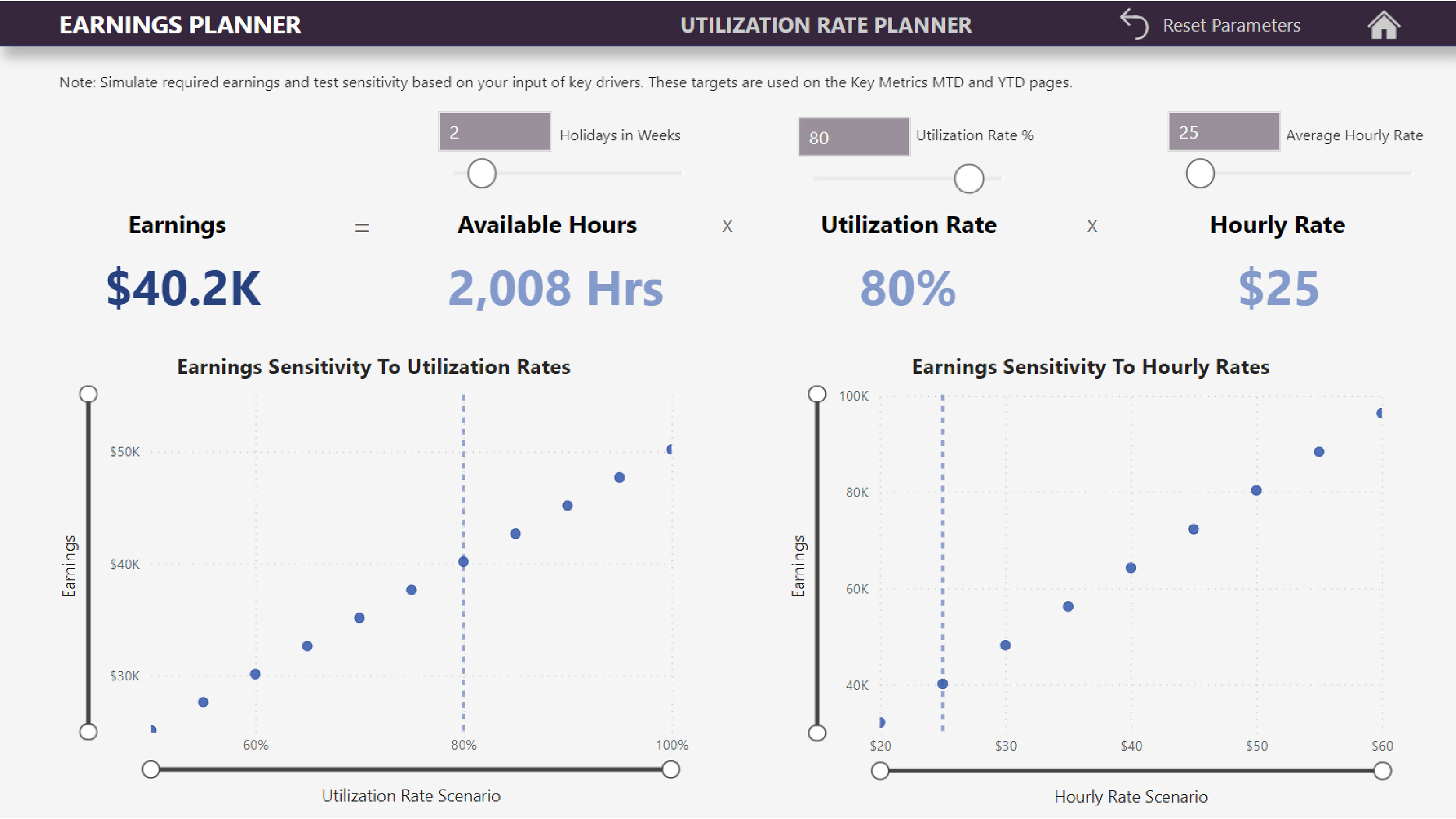
My objective was not only to create a classic report that only provides historical information, but to use it also a strategic planning tool . The Planner allows users to play with the various variables and see not only the result but also the sensitivity of results to variances in inputs. These new targets are then used to track performance over time. As the environment is changing, these targets can be adjusted accordingly, thus providing management the ability to adapt quickly to market reality instead of a rigid annual planning process.