I am a fan of the minimal design, and I wanted to do that here again, but also try and surface as much information as possible, so you can kind of see what’s going on at a glance.
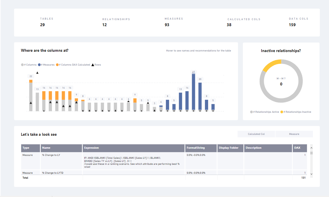
So we have the numbers about the report across the top, and I thought about going back and adding icons but I kind of liked it without the icons.
The main viz is the combo stacked chart, giving details about the columns in each table the stacked column (I made a Power BI pun!) and the rows in the triangles. I chose grey for data columns as while it is important you not have 1000 columns in a table, otherwise it’s ok, and mostly information. The measures are blue because they are good to know where they are but still also generally fine. I wanted that visible so that you can see if they are kind of all over or like in this one, neatly grouped in measure tables. The calculated columns being of most concern are in yellow, as a warning. I did have the table names on the x-axis at first but they were kind of long, especially those auto generated date tables, which distracted from the viz so I removed it. I wanted people to use the tooltip anyway so that helps direct them to that, so they can see the name then. Adding row data to the viz was tricky as I wanted it has context but not take over, so I settled on the triangles (which is a line with line width of 0).
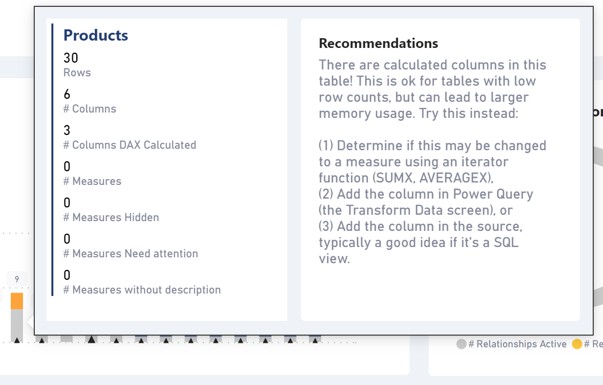
The tooltip again giving more depth and also the recommendations provided by the documentation tool on the auto generated date tables and my version of the calculated columns one. I am liking the little heading trick on the multi-row card. I put in x fields then simply take out the first and the second goes that darker blue.
In my end user documentation I never usually include info about the relationships in the model because honestly it’s better as an image of the model view, but I liked the idea of highlighting 3 things about them in the pretty donut chart. The “M-M?” for the many to many count I would probably have done differently if there were any in this report, making it highlight in yellow or red with a way to get to the Microsoft docs on alternatives to making them, and which cases are valid (bridge, extended tables, etc). As it is really for more advanced folks I just left it as a nice looking side viz.
And at the bottom we have the meat and potatoes, the DAX table! Many times this is the only way an end user can see the logic directly, so I always include it in a table form. There is a slicer panel too, that was cut off in the screen shot above that will allow you to search for a specific one. I typically like to put those slicers near the table, but I liked the uncluttered look here.
They are all searchable drop downs, and I so I also included the DAX itself so you could look for dependencies that way too.
So that’s it! I do create reports like this a lot, though it’s typically just that lower table and I am very good about creating descriptions on at least all my measures. I usually recommend that the descriptions start with the verb. For example, instead of “This measure is…” I will say “Sum of daily sales” or “Average of monthly profit” or “Percentage of rows as calculated columns in the table”.
Thanks for taking the time to read my write up and have fun with Power BI!

 Thanks!