Hello all,
First of all, I would like to thank @haroonali1000 for organizing this challenge.
When I read the topic for #C13 I was excited as it did not cross my mind to document a Power Bi report using another PBI report. I also learned something new. I was not aware of the existence of the external tool “Document Model”.
DATA STORY & USER JOURNEY
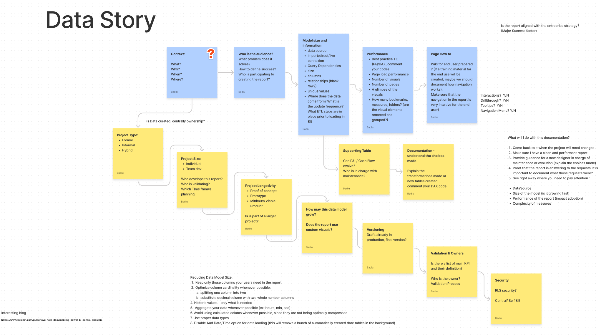
To document a report it is not an easy task. Where do you begin? What information do you present, in which order? Where do you take the data from? and how on earth can you make a documentation visually appealing?
I started with the beginning :
Who is my audience?
I decided that this report will be made for myself: BI Manager.
What is the purpose ?
-
Come back to the documentation when the project will need changes
-
Make sure I have a clean and performant report
-
Provide guidance for a new designer in charge of maintenance or evolution (explain the choices made)
-
Proof that the report is answering to the business requests. It is important to document what those requests were and the various validation
-
See right away where you need to pay attention :
DataSource
Size of the model (is it growing fast)
Performance of the report (impact adoption)
Complexity of measures
Approach
Based on these decisions I started to look in detail at the existing report. How can it be improved? What is missing?
I was quite impressed by the report. It really shows the most important information. I wanted to improve it my making it more engaging.
Before starting working on the project I did some research. What are people documenting in Power Bi? What information is important? What are the questions they have? I read several blogs, questions on forums, videos on youtube. I wrote my ideas down. It helps me understand where I wanted to go with my ideas, a sort of brainstorm of ideas that eventually find their place and order.
I decided to improve the report by improving the Data story and user Journey.
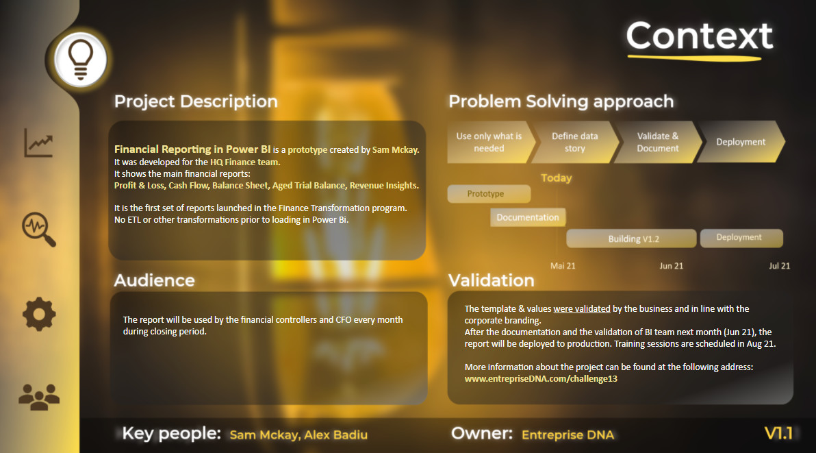
I thought that what is missing is the context. I wanted the report documentation to have a wider scope. I believe that the reports have to be aligned with the core vision and strategy of the company in order to really have an impact. It has to be clear for everyone why the report is built, have an identified audience, a well identified need, a sponsor, an owner, validations, a macro planning.
I wanted to include this in my report because I wanted to make the report more engaging! It is not just a report, it is a solution that will have an important impact at enterprise level, will help many people do their work better. It gives also that “official” stamp to the report 
So, first page - info around context
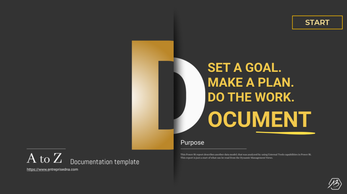
Also, in order to give that official and professional look to the documentation, I decided to add a landing page. Something simple but appealing. And also send a message:
“Set a goal, make a plan, do the work, DOCUMENT”. I believe it sets the tone, it makes the viewer interested to discover more. The words are also well thought. All projects start with a goal, a business need, a plan, a strategy before jumping and creating the report.
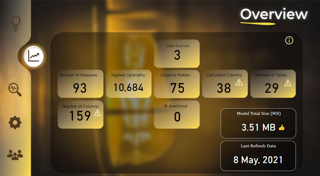
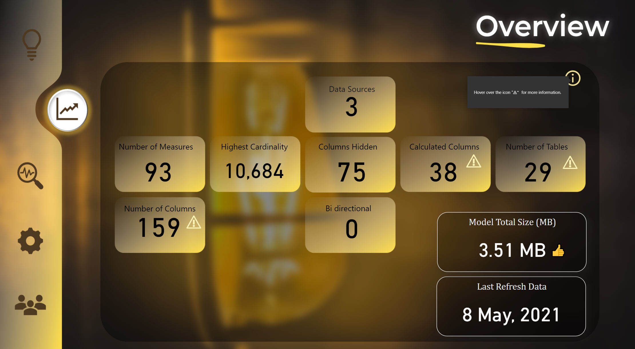
OVERVIEW
I did not want to jump right away into the details of the documentation. I wanted the user to be introduced to the big KPIs first. I thought about the most important KPIs I would like to see at a glance and came up with these ones:
Than I thought: So what? Are the numbers good or bad? I therefore added warning cards with tooltips. I also added an info button to make sure the users will understand that they can find additional info if they hover over.
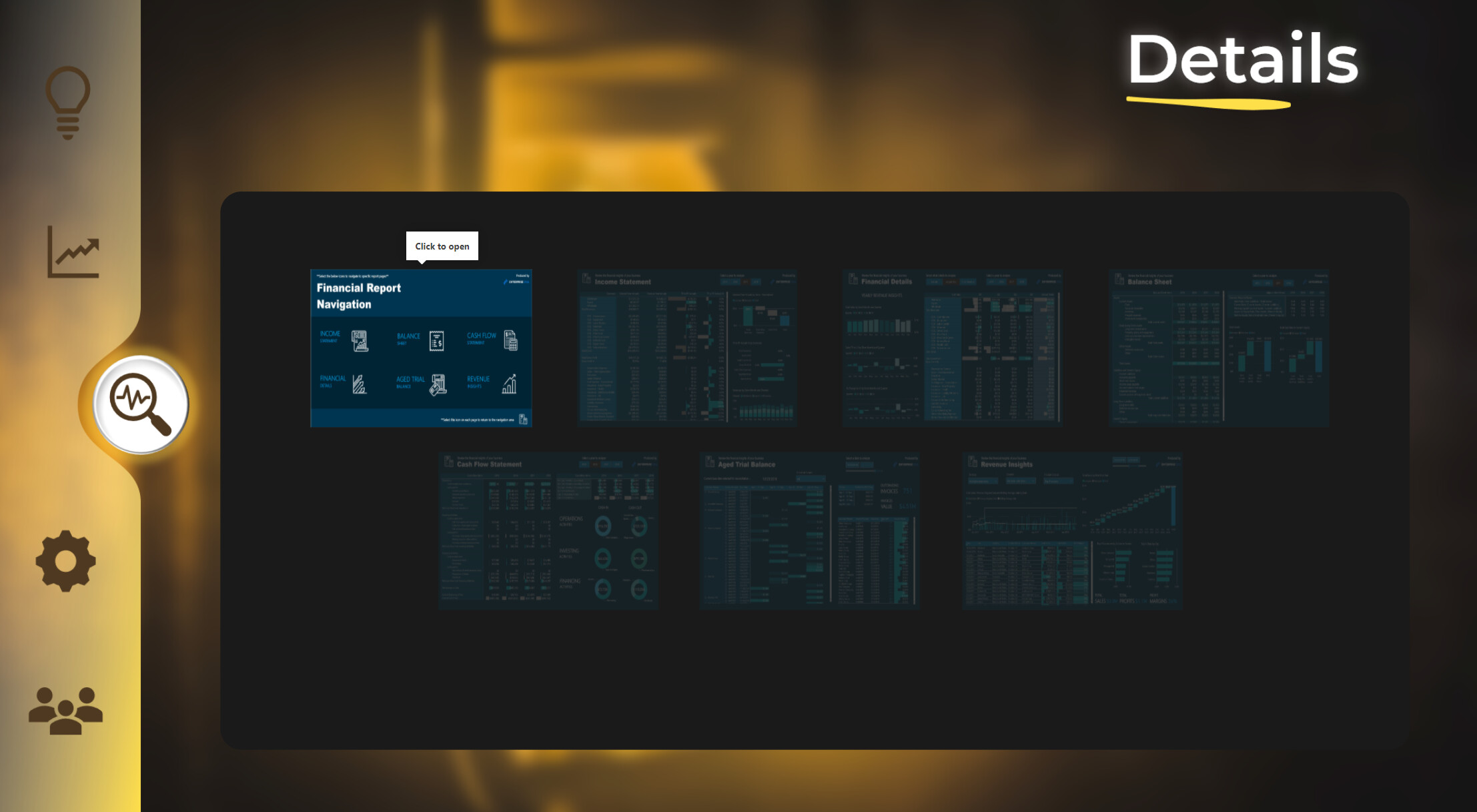
DETAILS
Now we go into the details. The viewer is already introduced with the projects, knows the main figures, now they look to go deeper into the report.
I created 6 categories. All of them grouped in a specific order so that the first thing we look at is the model and the relationships and the last things we look at are the measures and the actual pages existing in the report.
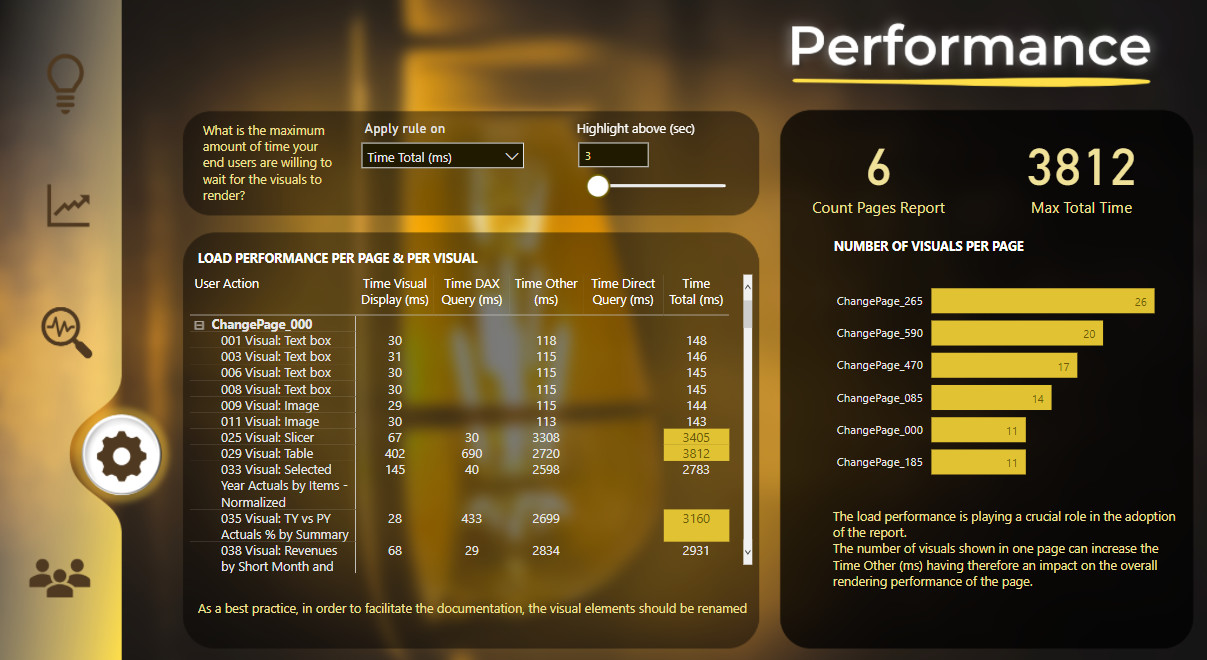
PERFORMANCE
This was not in the original model, but I thought it would really have its place into the documentation. I wanted to make sure that the report documented is also performant. I used Performance Analyzer and went through each page before exporting the json file. My first approach was to take each page individually but I thought of some reports I saw with +60 bookmarks. I wanted this approach to work also for pages & bookmarks.
Problem encountered: there is no report page information inside the json file.
I added in this page the possibility for the end user to choose what is slow as the definition of “slow” can be different from one person to the other. I also wanted to make sure the end user knows the importance of performance on adoption.
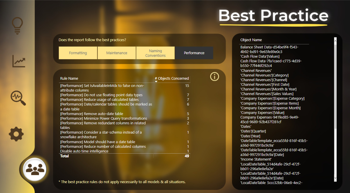
BEST PRACTICE
The cherry on the cake! The good way to end up the documentation. It makes the bridge between documentation and governance. It is the ultimate audit, it makes you check different aspects of your report so that it is top notch before implementation & validation. Not all rules apply to all the models though. I wanted to mention that in my report.
Even though the challenge is over, I will continue working to improve this report. I already have some ideas, and some good tips from Michael Kovalsky. For ex, I will add information about the number of memory gain if unused columns are deleted, I will add the description for the best practice rules & I will harvest the text for my Project Information page with the help of an excel inside a SharePoint that harvests the answers inside a Forms. Or maybe I will build a Power Apps. Who knows? (There is a lot of power inside the Power platform)
I went freestyle on this report and tried to really make a report documentation as I would dream to have. It is not fully automated, it needs some manipulation and changes but I think it can be a good start.
It was a pleasure for me to work on this report for this challenge and I am open to any suggestion or ideas of what else is missing to make a great documentation.
Thank you,
Best regards,
Alex