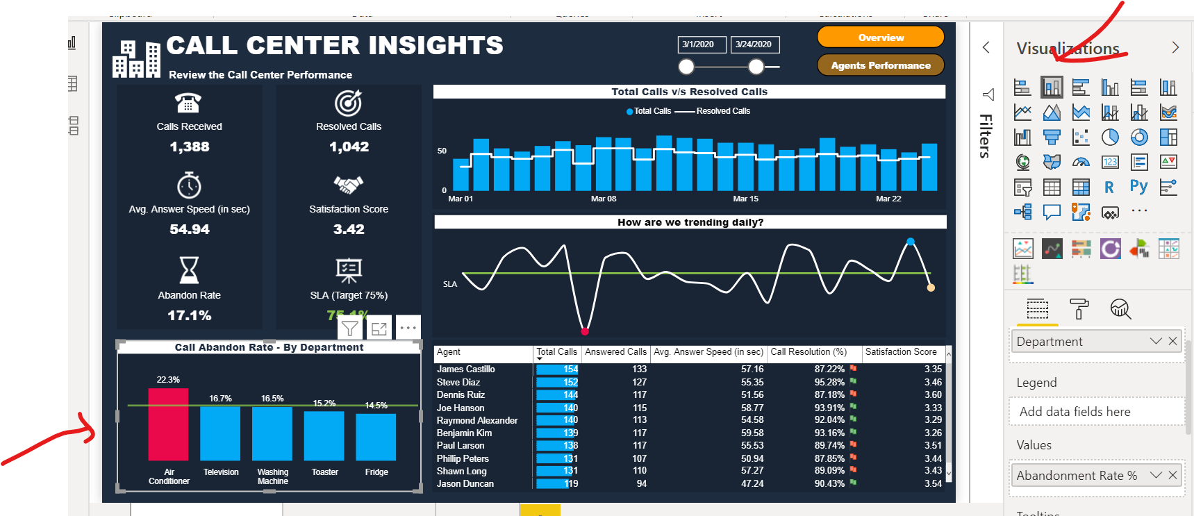
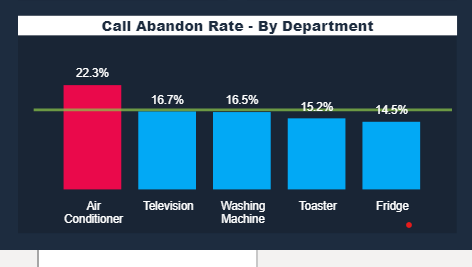
I am trying to replicate this showcase and any insight on how to add green line in the below bar chart.
Thanks in Advance!
I am trying to replicate this showcase and any insight on how to add green line in the below bar chart.
Thanks in Advance!
Select the Line and Custom Column chart from the visuals
Create a measure and place that in the field for the line value
Thank you for the quick response, Melissa!
Looks like I am missing something. I couldn’t find the mentioned chart in custom visuals and also in the show case, stacked column chart is selected for the bar chart.
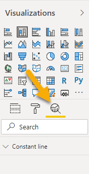
Okay so Select ‘Analytics’ there you can enter a constant line
Got it and was able to replicate. Thanks, Melissa!
To the contributor of this post. Thank you for sharing your experiences around Power BI, please don’t hesitate to add more discussion or add value to wherever you think you possess the experience or knowledge that can help others in our Ecosystem Groups. You can also help us in improving the Support forum further by answering the Enterprise DNA Forum User Experience Survey. We appreciate the initiative and your help in this group!