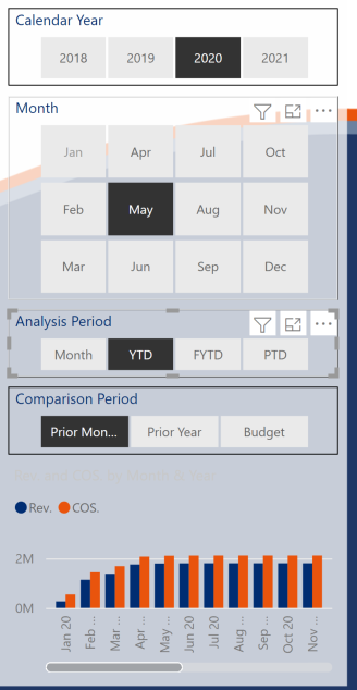
Hi, i have created some analysis slicers “Month”, “YTD”, “FYTD” and “PTD” which i am using in conjunction with the month and year slicers from my date table to showcase actuals against budget etc for the specified analysis period, this all works well no problems here.
But i want to showcase some of the values in a bar chart so for example when i choose “YTD” i want the bar chart to show the values up to the selected month. So if i have “May-20” selected i want the graph to show the values by month up to May-20 but becuase i have a date slicer on my page when i load in my months from my date table the graph as you would expect filters down my graph just to the month selected. I tried turning off interactions between my month slicer and my graph (see pic below) but then all the months show which isn’t correct either, now that i am wrtiting this out i’m thinking i need a seperate date table is that right? Any help would be much appreciated, thanks.