Hi. Hoping that someone much better at DAX than me can help with my issue.
I have a Fact table (TBL_Supplierdata) that holds data regarding suppliers and whether they deliver goods on time. We have 40 suppliers and each one delivers once a month, to supply one or more ‘Projects’. There are 4 ‘Projects’ which I have named Red, Blue, Green and Purple (changed due to sensitivities of data). The table has 4 columns - ‘Month/Year’ which is entered as first day of the month, ‘Project’, ‘Supplier Name’ and 'Reported Late (Y/N). Due to data sensitivity, Suppliers have been called A, B, C, D etc.
Example data below
| Month / Year | Project | Supplier | Delivered Late (Y/N) |
|---|---|---|---|
| 01/01/2024 | Red | Supplier A | N |
| 01/01/2024 | Red | Supplier B | N |
| 01/01/2024 | Blue | Supplier C | Y |
| 01/01/2024 | Blue | Supplier D | Y |
| 01/01/2024 | Green | Supplier T | Y |
| 01/01/2024 | Purple | Supplier F | Y |
The table holds a similar set of data for 01/02/2024, 01/03/2024 etc… I need to work out the % of suppliers who delivered on time (so ‘N’ in Delivered Late column) for each Project by Month. I then need to calculate the YTD Average by Project.
The resultant table visualisation would look like the below
| Month | Project | % Reported on Time - Month |
|---|---|---|
| 01/01/2024 | Red | 50 |
| 01/01/2024 | Blue | 70 |
| 01/01/2024 | Green | 80 |
| 01/01/2024 | Purple | 65 |
| 01/02/2024 | Red | 60 |
| 01/02/2024 | Blue | 40 |
and then calculate YTD Average based on the value above. The example below shows the desired output (and shows two Projects ‘Red’ and ‘Blue’
| Month/Year | Project | Montlh % on Time | YTD Average |
|---|---|---|---|
| 01/01/2024 | Red | 60 | 60 |
| 01/02/2024 | Red | 50 | 55 |
| 01/03/2024 | Red | 40 | 50 |
| 01/01/2024 | Blue | 80 | 80 |
| 01/02/2024 | Blue | 98 | 89 |
| 01/03/2024 | Blue | 76 | 85 |
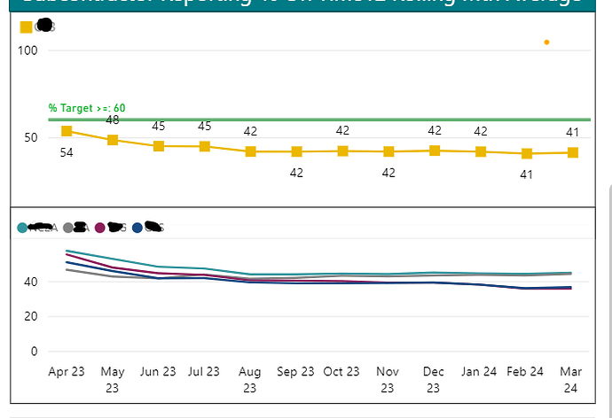
With this I need to create two visualisations, both line charts with Month/Year (Jan 24, Feb 24 etc.) on the x-axis and YTD Average on Y axis with Project as the legend (or I could create individual measures and use ‘Project’ as a filter, if its easier and then add the four measures to the visual).
The second line chart visual is an overall for the business, so as per the above but not split by Project. Second upload shows what I need to achieve (but with only YTD months on x-axis).
I have done lots of reading around and tried lots of different things including AverageX with a ‘summary’ table inside but I’m not getting the correct results. I have also tried giving values to the ‘Y’ (0) and ‘N’ (100), in case that made it easier but didnt help me much. The more I think about it, the more confused I’m getting! IPBI file upload.
Thank you so much in advance, feel like I am going slightly mad. Please let me know if you need anymore information
Supplier Reporting.pbix (205.0 KB)
