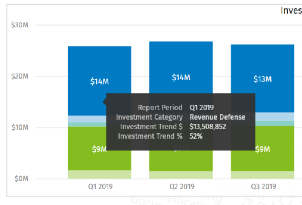
Is there a way to show $ on the Y axis but have the Data label be the %.
I have 2 measures so that I can get the % of total within the category but management wants to see that % in the data label not in the tool tip. However, they want the $ on the Y axis.
Have you tried layering visuals? The scenario in this video differs from yours but perhaps you can apply the same techniques and see if this solves your problem.
Maybe there’s an acceptable alternative… like have the % on the data label and a grand total $ on top that way you don’t need the axis to match perfectly
Thanks Paul. I do know how to do the totals - They don’t want a grand total on top unfortunately. They want the data label to show % even though the Y axis shows dollars. They present themselves very differently in ratio if you use $ or % therefore the hack to layer won’t work. I think there is no solution for their ask in Power BI at this time.