Hi everyone,
I have been working through this model and have posted on various topics over the last month. Thanks to everyone that has responded and helped me move towards building a better model.
Just to give context before the problem I am tracking daily passenger numbers from the US TSA (https://www.tsa.gov/coronavirus/passenger-throughput). They recently changed the format to add 2021 figures. The date shows the respective traffic on the same weekday in 2020 and 2019.
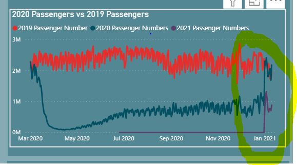
I want to show 2019, 2020 and 2021 in the same period. When I use the actual date I get the following chart:

This chart naturally follows the dates out into 2021 (Note the first date of date was 1 March 2020 so there is a data gap for 2020 and 2019 from 1 Jan to 1 March).
As I am really trying to see relative performance in the chart I wanted to layer them on top of each other in a month (agnostic of year) but I want to keep it daily.
I used the amazaing date table guide that @Melissa put up in 2020 Creating a dynamic Start-/EndDate for the Date table as a base.
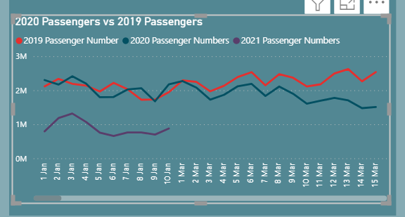
Within this table I created a new 2 new columns one being day and month and then daynmonth as a sorting column. This all worked perfectly until I swapped out the date on the x axis for my Day and Month column in the date table:

It gives me exactly what I want except that the scale is now completely off and you have to scroll across to get the full picture.
Does anyone know a way to get BI to scale this new date column to one year period. I have gone down the route of just having months which works but it gives you the average for the month rather than the movements and less trend analysis.
Alternatively someone might have a better way altogether to compare these data sets on a Jan - Dec Basis agnostic of year.
Thanks in advance
Ronan
