I would like to create a waterfall chart showing y-o-y changes in sales dollars by customer as follows:
-
top n largest y-o-y changes - show each customer’s individual y-o-y change
-
bottom n largest y-o-y changes - show each customer’s individual y-o-y change
-
all customers not in top or bottom n y-o-y change summed into one category called ‘other’
Any thoughts on how to execute?
Hi @captainjamesmisson, we aim to consistently improve the topics being posted on the forum to help you in getting a strong solution faster. While waiting for a response, here are some tips so you can get the most out of the forum and other Enterprise DNA resources.
Use the forum search to discover if your query has been asked before by another member.
When posting a topic with formula make sure that it is correctly formatted to preformated text </>.
Use the proper category that best describes your topic
Provide as much context to a question as possible.
Include demo pbix file, images of the entire scenario you are dealing with, screenshot of the data model, details of how you want to visualize a result, and any other supporting links and details.
I also suggest that you check the forum guideline https://forum.enterprisedna.co/t/how-to-use-the-enterprise-dna-support-forum/3951. Not adhering to it may sometimes cause delay in getting an answer.
I recommend adding some data or an example file to get help on this.
Sam
What you are mainly looking at here is dynamic grouping techniques.
See below
Many more examples here
https://forum.enterprisedna.co/search?expanded=true&q=%23enterprise-dna-online%20dynamic%20grouping
Work through these and you’ll see quickly what you need to do
Sam
Hi @captainjamesmisson, did the response provided by @sam.mckay help you solve your query? If not, how far did you get and what kind of help you need further? If yes, kindly mark the thread as solved. Thanks!
Close, but not quite.
I only want one group.
For instance - I want to show the five customers with the largest positive YoY change in sales, but I want to show them individually on a waterfall chart, not as a group.
I also want to do the same for the five customers with the largest negative YoY change in sales, again showing those changes individually by customer on a waterfall chart.
Lastly, if a customer wasn’t in either the top 5 or bottom 5, I want to sum their YoY changes in sales and group this number into the ‘Other’ bucket; this would show up on the waterfall chart as a single customer labeled ‘Other’.
So, if in the top or bottom 5, show me the individual changes with each customer’s name as the label; if not in the top or bottom 5, sum and group into ‘Other’ and label as ‘Other’.
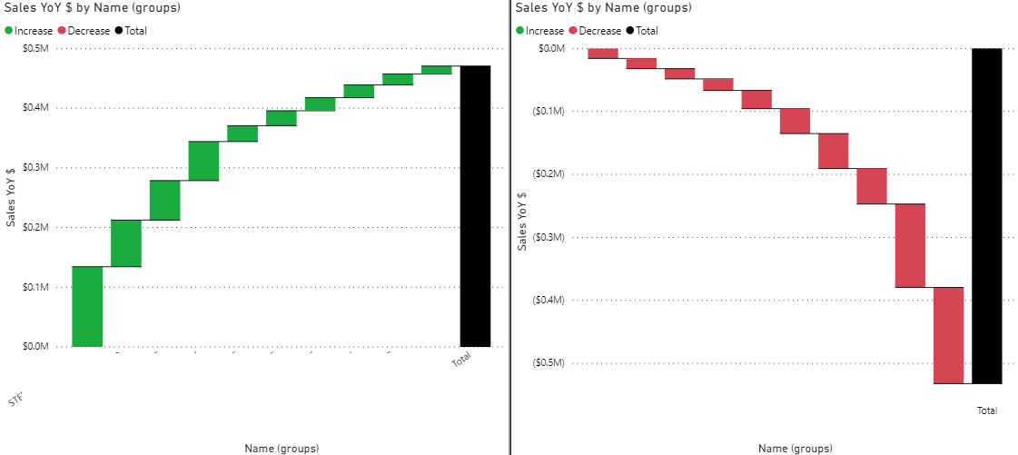
Here’s an example using the top and bottom 10 customers by YoY sales in the current FY.
I use two separate charts - one for the top 10 and another chart for the bottom 10. Each bar is a customer name.
I’d like the top 10 and bottom 10 to be combined on one chart, and if not in the top or bottom 10, group everything else into a bar labeled ‘Other’.