Hello, Team,
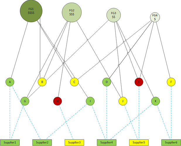
I’m looking for some advice on how to set up a visualization that shows the relationship of components to finished goods and components to their respective suppliers. The data is for a monthly meeting to review the status of critical materials. Ideally I’d like something in line with this example I drew up:
At the top are the Finished Goods, their size representing their revenue.
The Critical Materials are next, color-coded based on an internal risk analysis. For example, the red ones might be single-sourced or just particularly hard to get.
Finally the Suppliers, again color-coded based on an internal ranking.
The objective would be to select any item and see the linked items highlighted. Selecting FG4 would highlight Materials C, D, E and F and Suppliers 4, 5, and 6. Conversely, selecting Supplier 3, for example, would highlight Critical Material H and FG2. The same with selecting any of the Critical Materials.
I haven’t been able to find a suitable, easy to implement visualization. Any advice would be very much appreciated.

