Hi @Roger
Using DataMentor/EDNA AI tool built within the EDNA
I copied your question into DataMentor
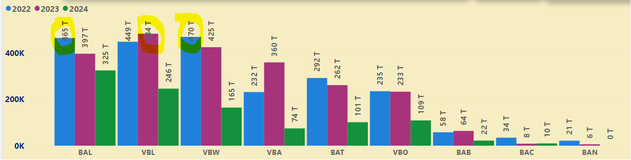
I’m struggeling with a visual and showing the data labels.
is there a way to change the position of the data labels ?
I know you can choose from different option like inside, bottom…
but here it would be nice to have the labels inside the bar and a color white for the large column bars and outside for the smal ones

is it possible and do I need a measure for it?

thanks in advance
Yes, it is possible to customize the positioning and styling of data labels in Power BI, but to achieve dynamic positioning and coloring based on the size of the bars, you will likely need a measure and some conditional formatting. Here’s how you can achieve this:
Step 1: Create the Measure
Firstly, create a new measure to determine the position and color of the data labels based on the value. Here’s an example of a measure that sets the label position and color based on a threshold value.
LabelPositionColor =
IF(
    SUM('YourTable'[YourColumn]) > [ThresholdValue],
    "InsideWhite",
    "OutsideDefault"
)
Step 2: Add Data Labels and Conditional Formatting
- Add Data Labels:
- In your Power BI Desktop, click on your visual.
- Go to the Format pane.
- Find the Data Labels section and turn it on.
- Conditional Formatting for Labels:
- Go to the Data label color settings.
- Choose to format it by Field value and select the measure
LabelPositionColor.
Step 3: Dynamic Positioning
Power BI doesn’t directly support dynamic label positioning in the same way it does for colors. However, you can use tricks like using Custom Visuals (such as the Enhanced Scatter Chart) or overlapping multiple visuals if exact positioning is crucial.
Here is a workaround:
- Create two visuals: one with labels inside and another with labels outside.
- Adjust their transparency and layer them together.
Example with DAX Measure
LabelPositionColor =
VAR Value = SUM('YourTable'[YourColumn])
RETURN
IF(Value > [ThresholdValue], "#FFFFFF", "#000000")
This example changes the color of the label to white if the value exceeds a threshold, representing larger bars, and black for smaller bars.
Final Notes
- ThresholdValue should be defined based on your specific requirements.
- Custom Visuals might offer more flexibility with label positions and conditional formatting.
By employing these techniques, you should be able to achieve the desired dynamic behavior with your data labels.
Deneb might be the answer for you.
Please give DataMentor/EDNA AI tool built with the EDNA Platform.
I hope this helps.
Keith