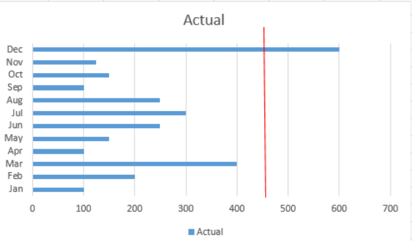
I am trying to add a vertical target line to a horizontal clustered bar chart but can not find any options or advice on how to do this. There are the the line and clustered chart option but looking to show this as a horizontal bar chart as have a long narrow space on my dashboard.
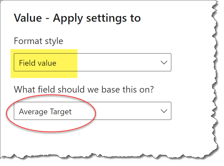
in the attached file want to show the target column on the chart as a line using the primary axis so that can see whether the horizontal bars are above or below target.
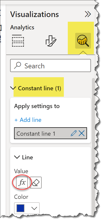
For now even being able to do this as the same value each month (see image below) would work but ultimately needs to change by month. I looked at the anlaytics section but want this to be dynamic based on filtering e.g. i filtered on cost centre then it would change (the target line would be populated in the source data) to reflect the target relevant to that area.
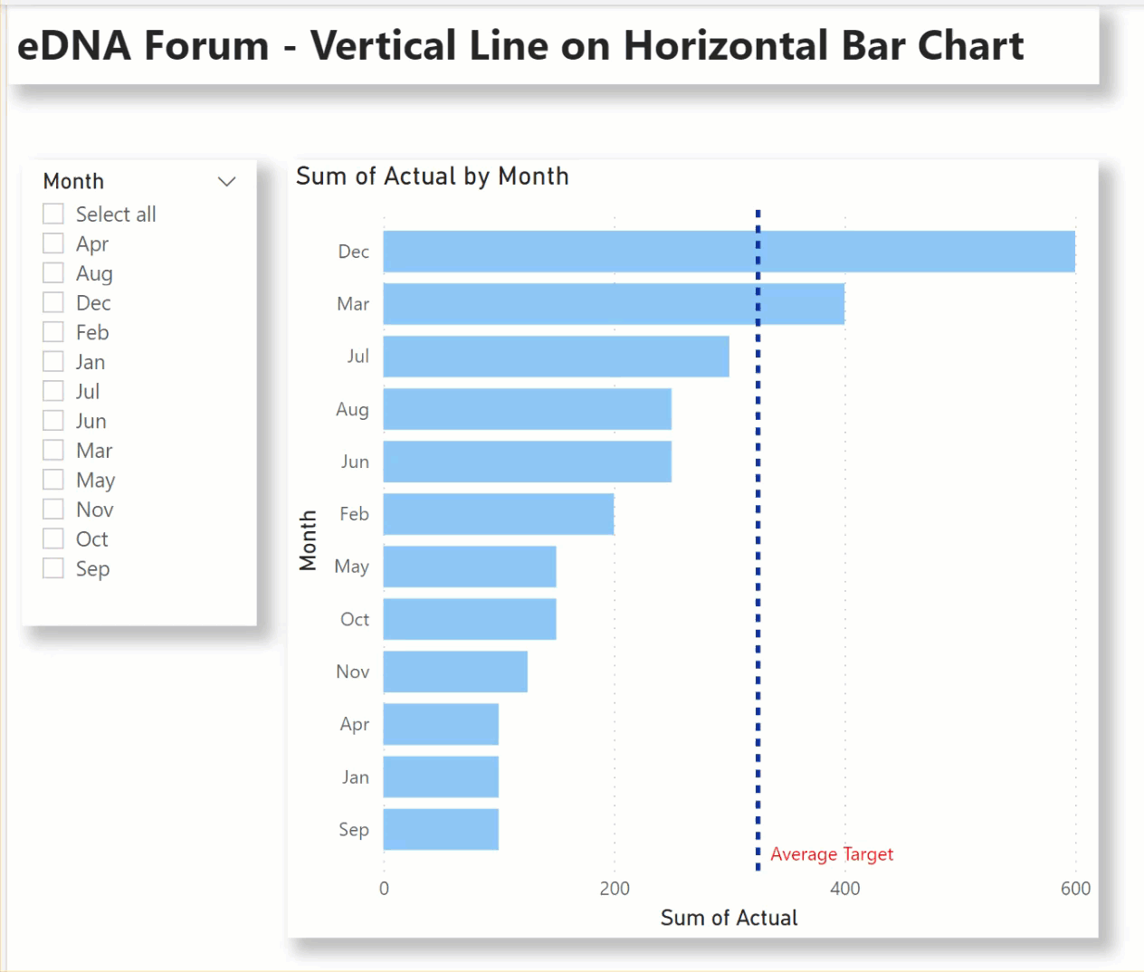
I have uploaded how to do it. Basically what you can do is go to Insert then go to Shapes and on Basic Shapes select the one with the line. Once selected you can rotate it to be vertical. To change the color go to Style and then go to Border and change to Red.
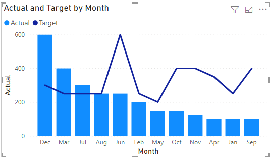
Hi, thanks for your suggestion but I need this line to be dynamic i.e change depends on what gets filtered. Ultimately it also needs to change by month like the suggested target data. i.e like the below but for a horizontal bar chart.
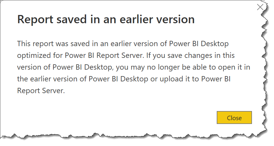
NOTE: When I opened your sample file, I received the notice below that the example was prepared using Power BI Desktop for Report Server; I’m not familiar with the capabilities of Power BI Desktop for Report Server, so this method may not be usable for you.
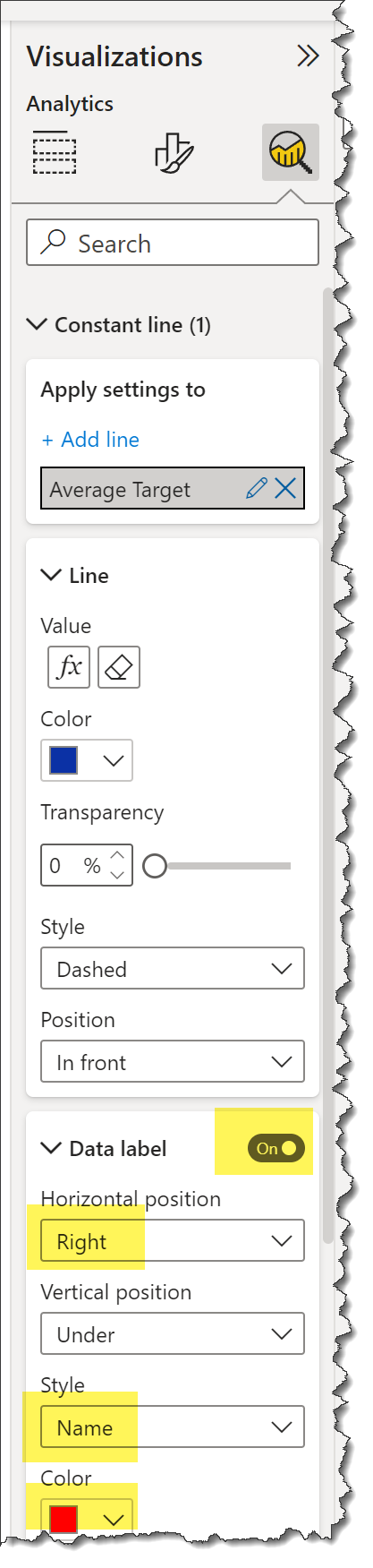
If you want different short, individual target lines for each month, this can be created with the Deneb custom visual, but again, I’m not familiar with Power BI Desktop for Report Server, where it may not be an option.
Hello @farmboy, it’s been a while since we got a response from you. In case there won’t be any activity on it in the next few days, we’ll be tagging this post as Solved.
Hi @farmboy, due to inactivity, a response on this post has been tagged as “Solution”. If you have any concern related to this topic, you can create a new thread.