HR_comma_sep.csv (582.8 KB)
dashbiard.pbix (3.5 MB)
I’m trying to integrate my machine learning model (Random Forest) I did in Jupyter Notebook inside power BI in order to predict if an employee will leave or not based on features. Using gridsearch , and after testing multiple algorithms, it turned out that the Random Forest was the most performant one for my dataset (CSV below) .
I created a clone table of my dataset , I called it “Training” and I run inside that dataset this script , given the best hyperparamters of my model:
import classification module and setup environment
from pycaret.classification import *
clf1 = setup(dataset, target = ‘left’)train and save random forest classifier model
rf= create_model(‘rf’, max_depth=8, max_features=0.5, n_estimators=300)
final_rf = finalize_model(rf)
save_model(final_rf, ‘C:/Users/hp/Desktop/Sprint PBI/final_rf_powerbi’)
Then in the original clone, I did this python code to import the saved pickle file.
from pycaret.classification import *
rf = load_model(‘C:/Users/hp/Desktop/Sprint PBI/final_rf_powerbi’)
dataset = predict_model(rf, data = dataset)
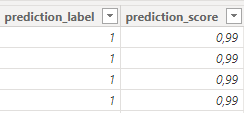
Eventually, this will add to my dataset two columns “Predicted label” and “predicted score”
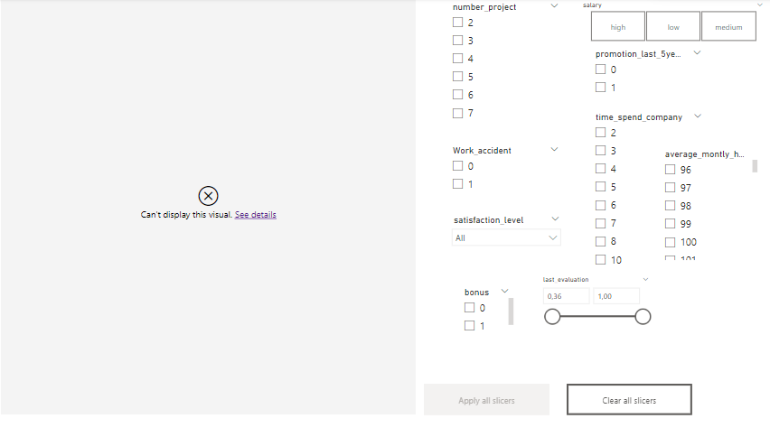
The last thing , I wanted to visualize a prediction text based on the predicted value using the python visual. Eventually, based on my inputs (features) (which will also be my filters/slicers) , when their values changes, the prediction should change too.
Here’s a sneak peek , you’ll find the PBIX file below along with dataset
Here’s the code of the python custom visual:
dataset = pandas.DataFrame(average_montly_hours, bonus, Department, last_evaluation, left, number_project, promotion_last_5years, salary, satisfaction_level, time_spend_company, Work_accident)
dataset = dataset.drop_duplicates()import pandas as pd
from pycaret.regression import *
import matplotlib.pyplot as pltrf = load_model(‘C:/Users/hp/Desktop/Sprint PBI/final_rf_powerbi’)
Use the trained model to make predictions
predictions = predict_model(rf, data=dataset)
Get the predicted label and score columns from the predictions
predicted_label = predictions[‘prediction_label’]
predicted_score = predictions[‘prediction_score’]Check if any element in predicted_label is equal to 1
if any(predicted_label == 1):
# score = predicted_score.iloc[0]
# output_text = “The employee is likely to leave with a probability of {:.2f}”.format(score)
output_text = "The employee is likely to leave with a probability "else:
output_text = “The employee is not likely to leave”def display_text(s, color=“blue”, fontsize=20):
plt.figure(facecolor=“none”)
plt.text(0, 0, s, color=color, fontsize=fontsize)
plt.axis(‘off’) # Optional, remove axes from the plot
plt.show()Call the function to display the text
display_text(output_text)
I was wondering how can I correct my work , like how to make this prediction visualized correctly.