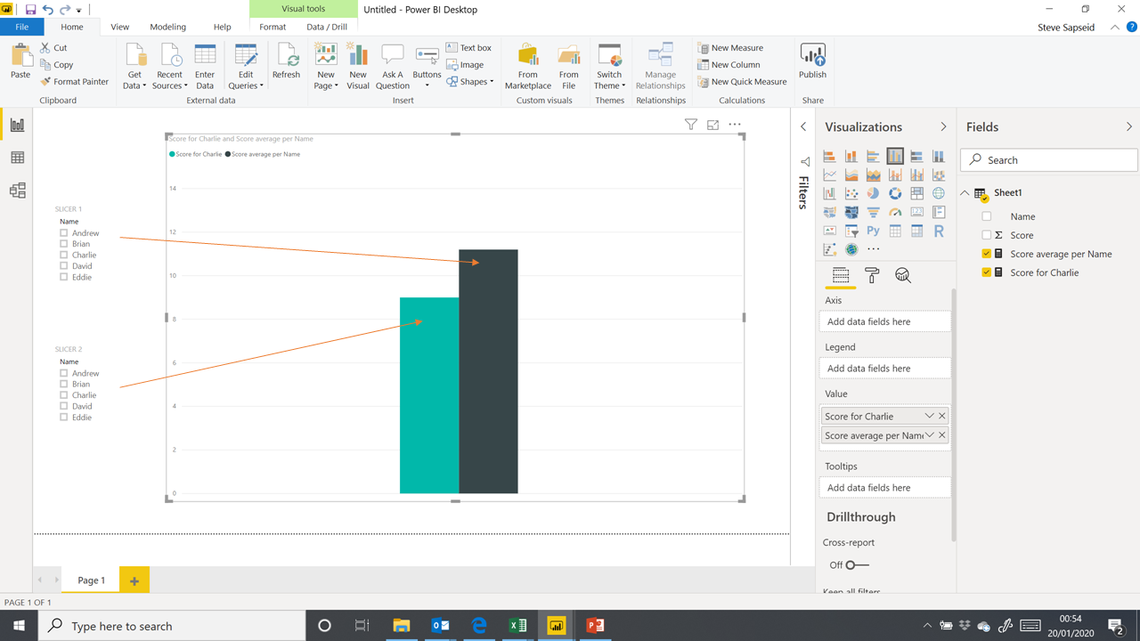
I have attached a simple model where I am trying to compare an individuals score against a selection of his peers. I have currently hard-coded the individual to Charlie, but I would like to select any one of the five names to be compared against the average. Is there anyway to ‘parameterize’ this ?
If for the average of the other bar you want to calculate the average for the other individuals, excluding the selected name, you can use the exact same structure as above just changing the filter condition from = to <> (i.e., Sheet1[Name] <> [Harvest Name Select] ).
You can also use the CONCATENATE function and the Card visual to create a dynamic title for your chart including the actual selected name from the slicer.
I hope this is helpful. Full solution file posted below.
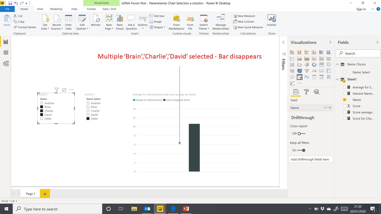
In the model that you created, so efficiently, I would like not only to select a specific name from SLICER2 (the harvested name), but also to select multiple or single values from SLICER1.
At the moment PBI averages all the names in the bar chart, but as soon as you select a single name, or multiple names in SLICER1, the bar for that slicer disappears.
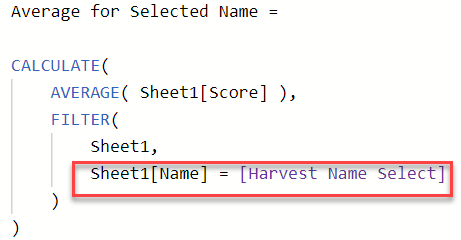
Here’s why that is happening. Look at the filter condition in the measure that calculates the score based on Slicer 2:
Assume Eddie is selected in Slicer 2, but not in Slicer 1. Since Slicer 1 is tied to Sheet1[Name], Eddie is no longer present in the filtered version of that column, and the filter condition above cannot be true, so it returns a table with no records, thus causing the measure to evaluate as blank, and the teal bar on the graph to disappear.
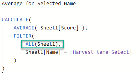
So, how to fix this? The fascinating (and occasionally maddening) thing about Power BI is that there are many different ways to do the same thing. This problem can be solved in a number of different ways, but the simplest is probably just to remove the filter on Sheet1 coming from Slicer 1 in our measure above by adding ALL in the table parameter of the FILTER function:
So now, the bar for Eddie shows up unchanged, regardless of whether or not he is selected in Slicer 1.