Using a donut chart as a filter and need colors te be in line with countries on map

Hi,
I am using a donut chart as a filter. This is a filter on country level.
image

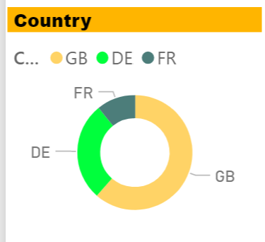
There is also a map with countries. It would be very helpfull if the colors in the donut chart are the same as in the map that represents the countries

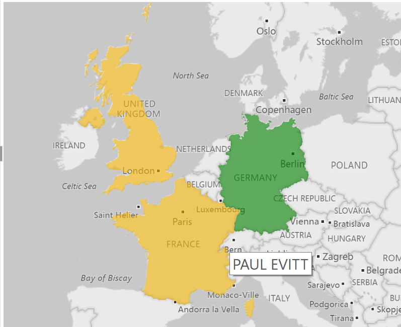
As you can see the colors are not the same. The colors of the donut i can control but not the colors of the map representing the countries…

Is this even possible?

Good Morning,

If you are using the Filled Map visualization select your map visual and then the paint roller. In these settings I select the Data colors and am able to change the map colors there.

Both the Donut and Filled Map visuals are using the same color theme.

Guy

Enterprise%20DNA%20Expert%20-%20Small

Goodmorning Guy,

You are right. It is really easy actually to adjust the colors for the countries.

:slight_smile:

kind regards,
Sjaak

Happy to help

Guy

Enterprise%20DNA%20Expert%20-%20Small