I Just want to know that we can not use measure in the charts created by charticulator becuz i created a chart with value and when i try to populate measure in place of col it do not except it as value.
@Anurag You can certainly use measures in Charticulator. It happened to me also so I reinstalled the PBI that fixed it.
Can you upload your sample file so we can see if there is another issue?
Can you also show us what did you design?
I am new to Charticulator Now i put measure on table first and get that table data on charticulator site and now the visual is working but its legend are not at same place at it shown in charticulator. I have two question
Do I need to put the exact value on the charticular mean for example first i put three col in charticulator but for visulization two is the needed one so we need to export same col to charticulator .
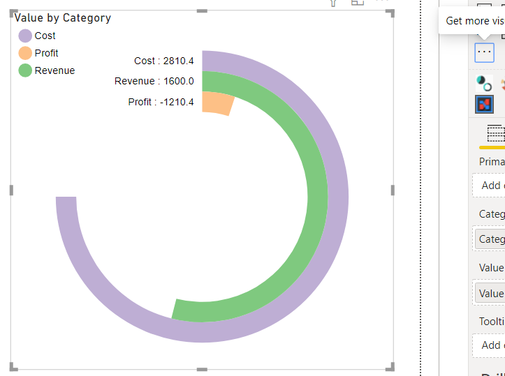
How to fix the below issue of legend.
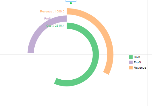
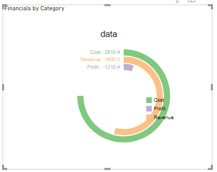
As my data set contain negative so it show correctely and legend i fix it there but when i put in bi it look like below:
The negaive number shows in positive side and legend goes to middle
For your first question, whatever the # of columns (if actually used in the visual) you use to design in Charticulator , you would have to feed the same # of columns when you use it in PBI.
Can you share the sample dataset you exported to design in Charticulator? I would like to have a go at it to answer the rest of your questions.
@Anurag
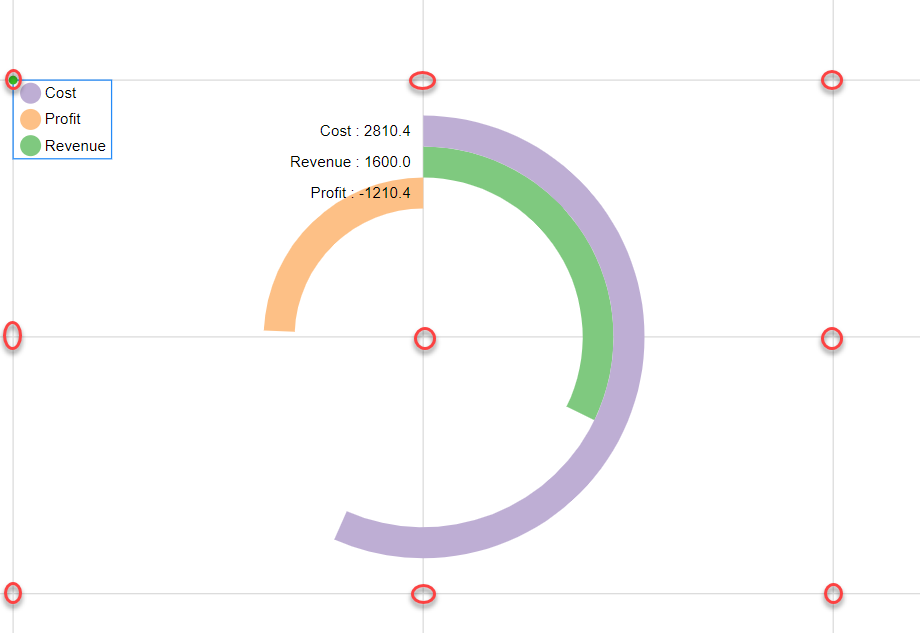
When repositioning the legend in the Charticulator, it should be postioned on the X-Axis & Y-Axis intersection points otherwise it will behave strangely once imported in PBI.
The question is why you are showing the legend when the categories are already distinguished by colors?
Radial charts in PBI move clockwise not anti-clockwise therefore, the negative values are not moving in different direction. However, if you sort the data in descending order, that way you can clearly see your lowest value while radial chart still looks good.
You need to have the answers to the following questions before designing your own visual:
How the data will be arranged for Charticulator?
Whether the same arrangement is possible while using the visual in PBI?
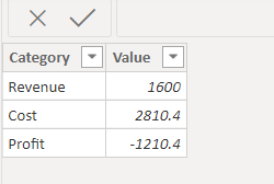
For e.g. I had to rearrange the data in the following pattern that is different to your existing PBI structure:
Lastly, you are using the wrong visual to display your analysis. It is equally important to choose the right type of visual for your analysis. You can show Revenue, Cost & profits in Cards as KPI’s or through Line Charts to show trends or through the most popular Bar & Column charts.
Remember that the visual behaves differently in Charticulator and in Power BI.
Thanx for clearing my doubt and i just trying my hand on charticulator and I think if we look cost and revenue and profit as whole it may serve the purpose but I am using bar chart for that .
what is your view on my above point.
@Anurag It’s great that you are trying something new and designing your own visuals. If you talk about radial or pie charts, they are used to display the composition out of total value or %. For e.g. looking at the composition of the products sold. In your case, it would be realistic to use expenses category in Radial Chart. However, if you want to show the Revenue, cost & profit with radial line, it’s still fine but then you have to make some adjustments in your pbix file and sort the data in descending in the visual.