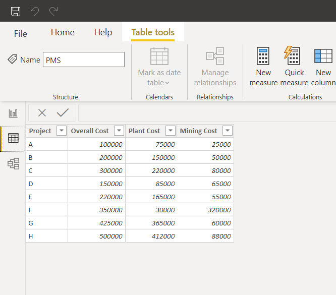
I would appreciate some assistance on the following. I have a table (see attached example image).
I would like to apply a Donut Chart such that I am able to report on the percentage split between mining and plant cost.
We have quiet a substantial back-end of data and I want to avoid having to unpivot data in the query editor, Is there any alternative measure that can be created that will correctly apportion the cost for mining and plant?
@Akshay_05
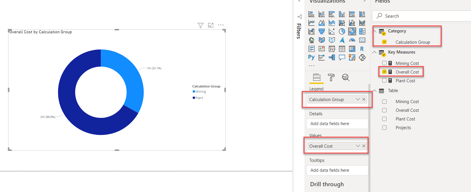
Calculation Groups to your rescue here . First create three SUM aggregations for Plant , mining and overall costs. Go to Tabular Editor create calculation groups and then create calculation items.
Then save your changes, refresh the Power BI model, select the Donut Chart and drop the calculation group under Legend and Overall Cost measure in Value.
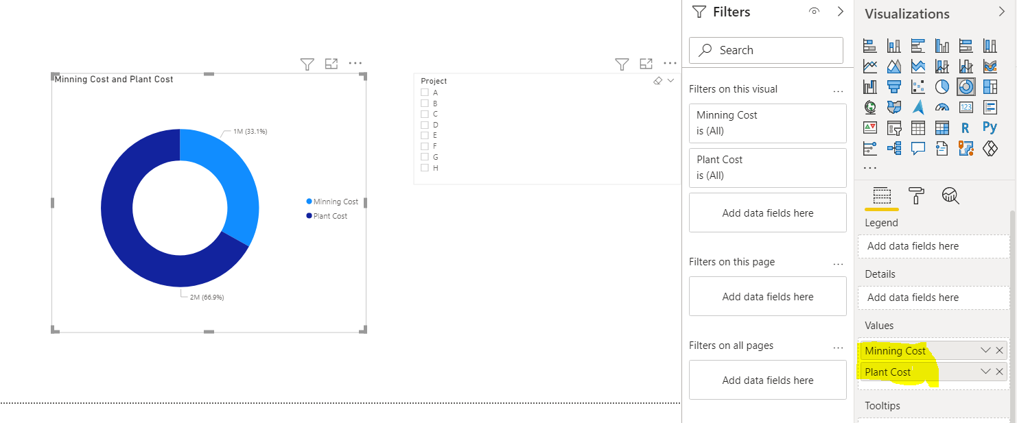
@Akshay_05 I am afraid that Waterfall chart is not a viable option here as it accepts only one measure. You can start another thread with a sample of required result and we can advise what’s the best visualization to use in this case.