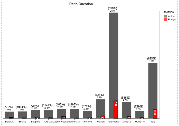
I spent the past few days in Deneb crash course learning. Thank you Greg for all that you provide! I am hoping two questions can be answered with the below Budget to Actual chart. 1) Why is the ratio returning (Blank) and 2) why does some of the syntax in the column titles appear “broken” or pixelated? Thank you for your assistance.
re: #1, the transform that generates ratio is in a different layer to the mark that you are using to display it. As such, the other layer doesn’t know about it and will return a null (blank) value.
As the layer contains a transform that you aren’t looking to use in other layers, one approach could be to create a nested layer in that layer that uses the mark you were originally plotting, and moving the mark described as BACK BAR PERCENT LABEL in there too. This will then work as expected, e.g.:
re: #2, the labels appear pixelated because the mark that has the description Displays the Budget value is set to use white text, and this is sitting over the axis labels when it is positioned too close to the axis. This is creating the artefacts that you’re observing.
If you change the colour of the mark to something that will show up, you can see the effects of this, e.g.:
Note that Italy and Germany have enough space and the text mark doesn’t overlap the axis.
It is going to be difficult to mitigate this (as collision detection/truncation isn’t something that Vega-Lite does by itself and you would normally need to work out the valid width of your text mark. I thought about using the limit property for this, and an expression to work out the size of the bar you’re trying to match, but this will truncate some labels with a (…) if they are too wide.
A quick and dirty fix would be to set the zindex of the axis to be 1 or higher, which will position it above the mark on the page, e.g.:
{
  ...
  "encoding": {
    "x": {
      ...
      "axis": {
        ...
        "zindex": 1
      }
    },
    ...
  }
}
Your mileage will vary with this approach, as your mark’s colour needs to match the background of your report.
To make the positioning a litle more reliable, I’ve also swapped out the yOffset, with setting the alignment to right (so the label sits relative to the encoded y value, and then dx to -3, which will offset relative to this prior to rotating.
I’ve attached a copy of your workbook with the changes applied.
Cheers,
Daniel
Greatly appreciated Daniel!


