I would probably call this a Stacked Bar Chart rather than a rectangular pie chart, but semantics … In any event, to your questions:
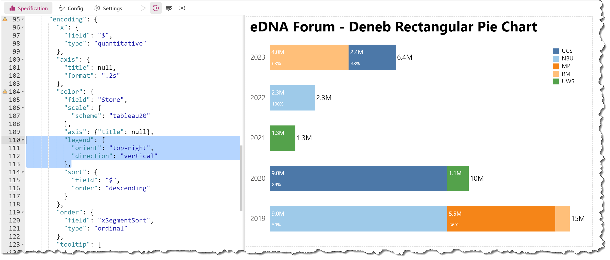
Q1: How to adjust position of Legend from bottom to upper right?
A1: Adjust the “orient” and “direction” key:value pairs as desired; see https://vega.github.io/vega-lite/docs/legend.html for details.
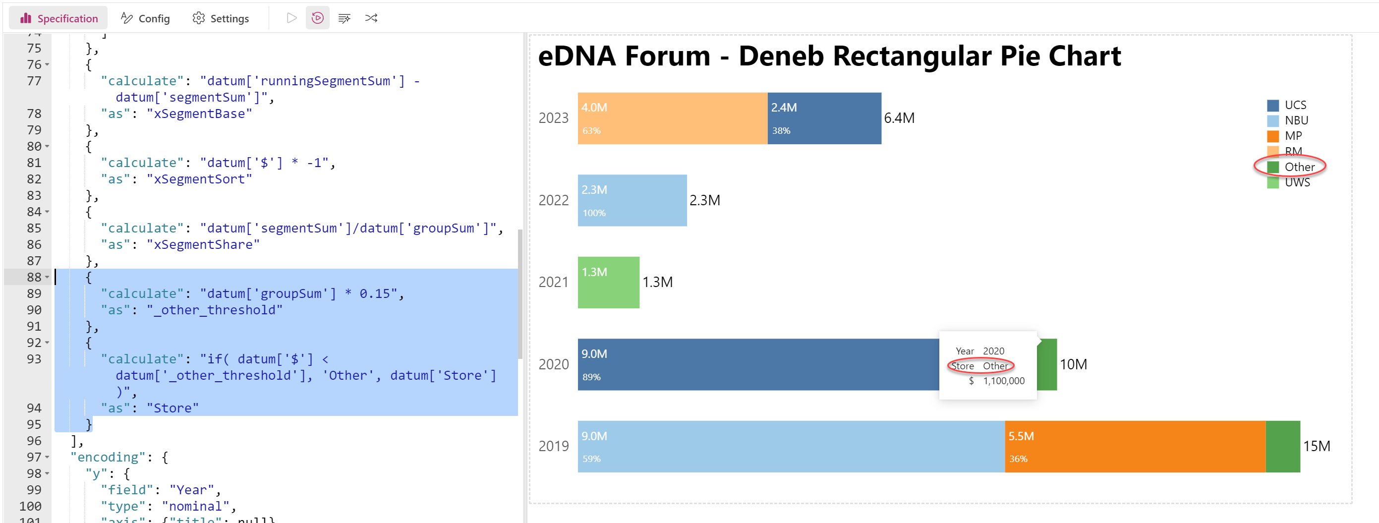
Q2: How to group small segment (approximately less than 15% of total into “Other”)?
A2: Add a “transform” (I’ve used 2) to reset the store name to “Other” if below threshold
For your first 2 questions, I’m guessing you’re talking about the labels; if so, I’m not clear on exactly what you’re looking for, so could you please upload a marked-up screenshot of the visual with the changes you like to see?
For your 3rd question, again I need to guess, as the conditional color encoding is used 3 times with 2 different values. A complete WAG here, but does this work (is this what you’re looking for)?
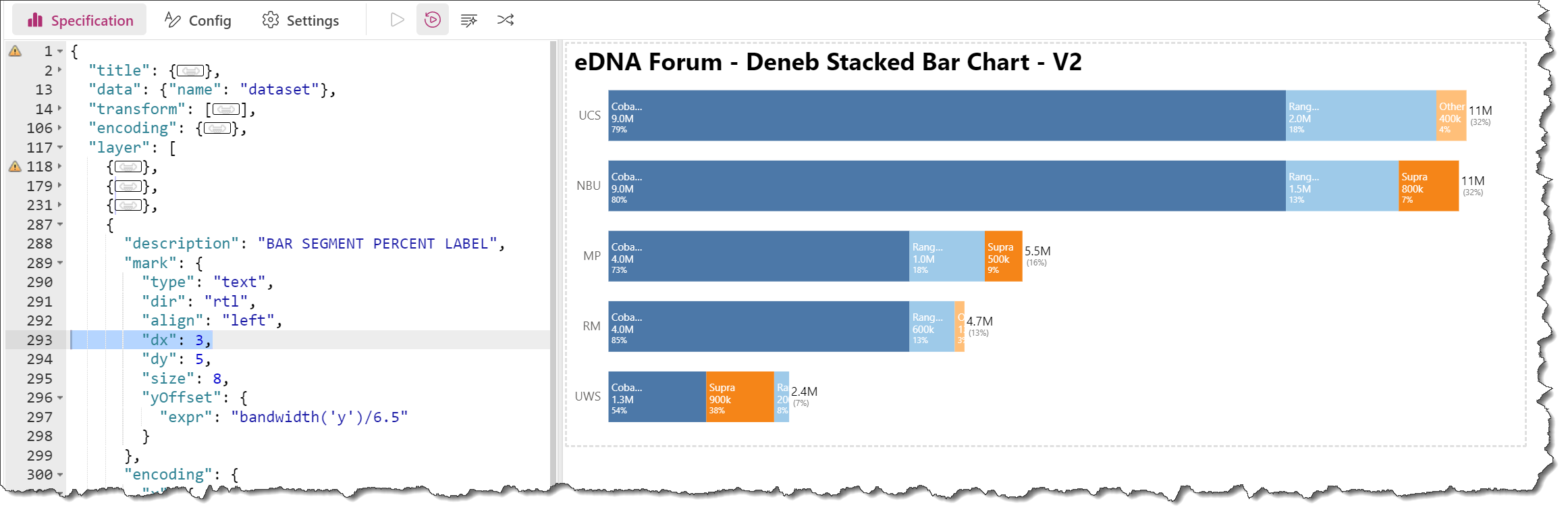
Q1: How to adjust segment % so it follows immediately after $'s regardless of sizing?
A1: Adjust the “dx” property for the [BAR SEGMENT PERCENT LABEL] “text” mark to be the same as the other 2 “text” marks above it (which are set to 3)
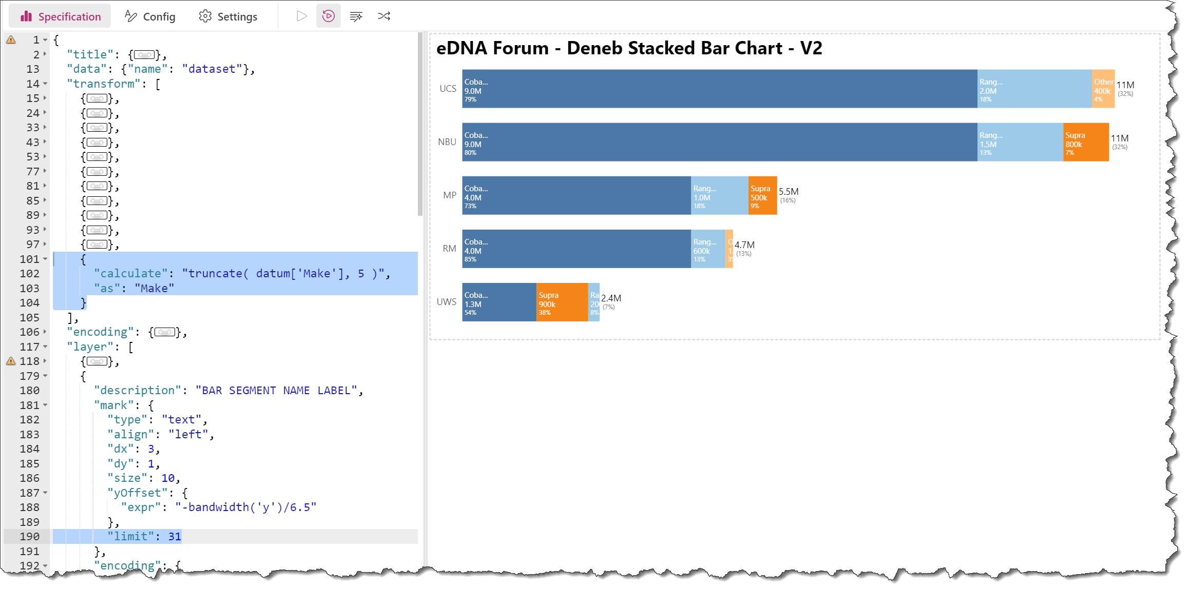
Q2: How to truncate “Make” at 5 characters"?
A2 (option 1): Add a “limit” property to the “text” mark and set its value to the desired number of pixels (not characters); Vega-Lite by default adds an ellipsis if the text is truncated; see [https://vega.github.io/vega-lite/docs/text.html] for more details
A2 (option 2): Add a “calculate” transform and truncate the “Make” to 5 characters; see [https://vega.github.io/vega/docs/expressions/#string-functions] for more details
(Note that in my example I used both options, which conflict.)
With respect to the “top N and others” visual you showed at the end of your screencast, that’s both a new question and that visual was not in the PBIX you uploaded. Please create a new thread and attach a new PBIX and desired outcome screenshot (ideally for 1 or more specific examples) whenever you want to pursue this.
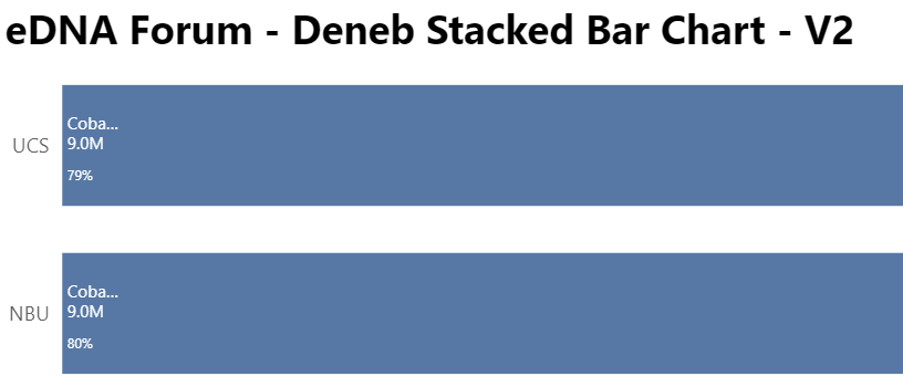
Thank you Greg!! The % still pulls away when you stretch the chart (see attached pic). I would think that the spacing would be the same as is between the name on the total? I
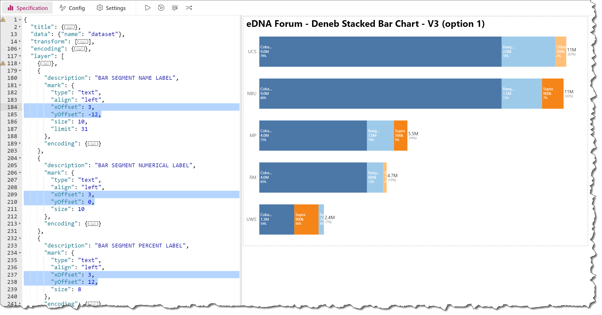
Not surprising. I’ve never seen both “dy” and “yOffset” used in the same mark before; they do the same thing, so I’m guessing are colliding.
(General: I removed the “tooltip” block from each “text” mark as they didn’t seem necessary given the “bar” mark already had the tooltip.)
There are 2 options I can think of right off the bat for keeping label spacing consistent:
Option 1:
I eliminated “dy” and kept “yOffset”; after that, I just played with the “yOffset” values until it worked the way I wanted (set “yOffset” values to -12, 0, 12 for the 3 labels, respectively, to center the labels).
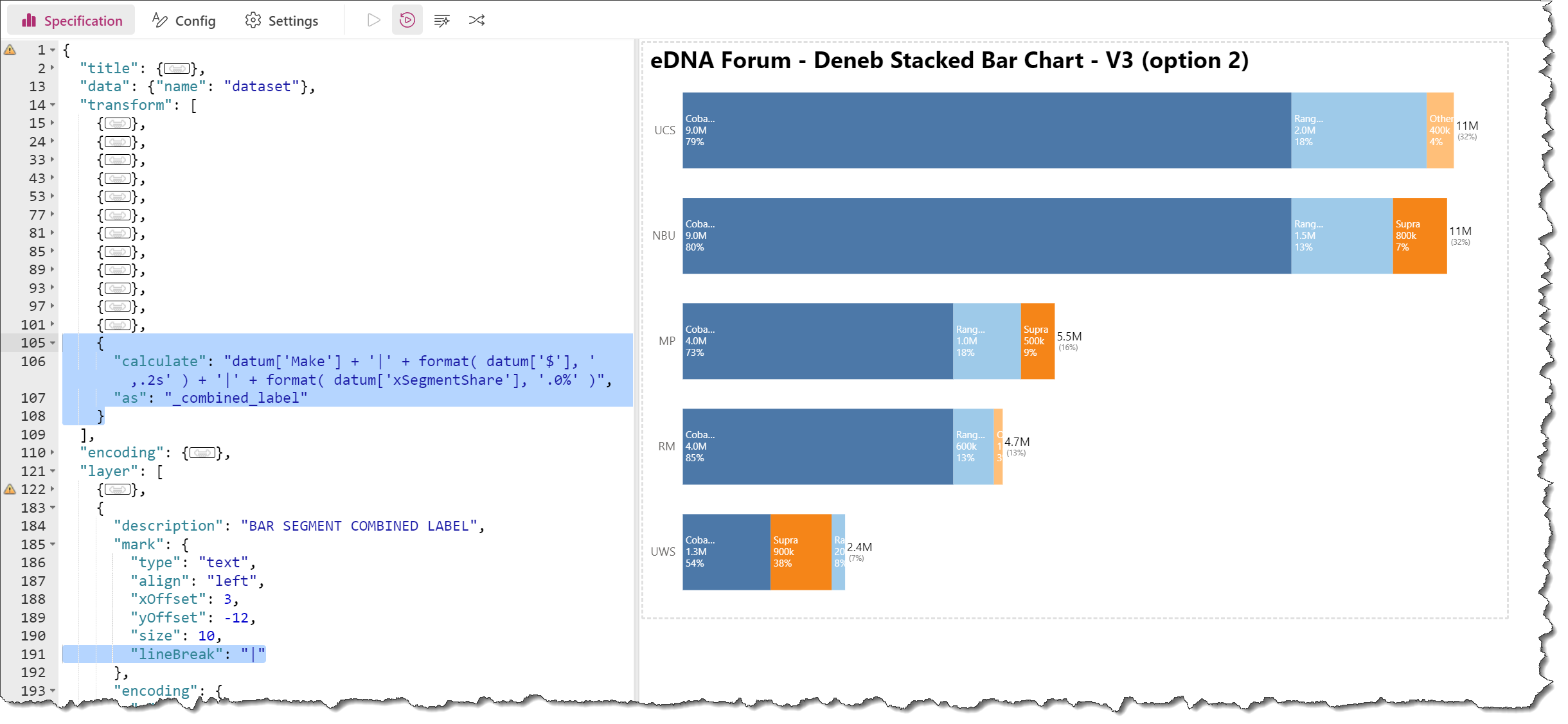
Option 2:
Let Vega-Lite take care of the spacing by adding a “calculate” transform to combine all 3 formatted labels and used a “|” character as a separator, then add a “lineBreak”: “|” to the (now single) segment “text” mark
While the second option will perform better, as there are less objects to render, you can only set the font properties (e.g., size, weight, color, etc.) once; you’ll have to choose which option suits your requirements best.