Hi
I tried to put trend line on the Line chart I found (Average, Percentile,Min,Max,Median) line but I didn’t found this type of line (trend), can any expert or member guide me on how create this line?
Note: I attached the (pbix) file with my thread , please refer to report page titled(Trends).
HR_DB 1.1.pbix (1.2 MB)
@MAAbdullah47,
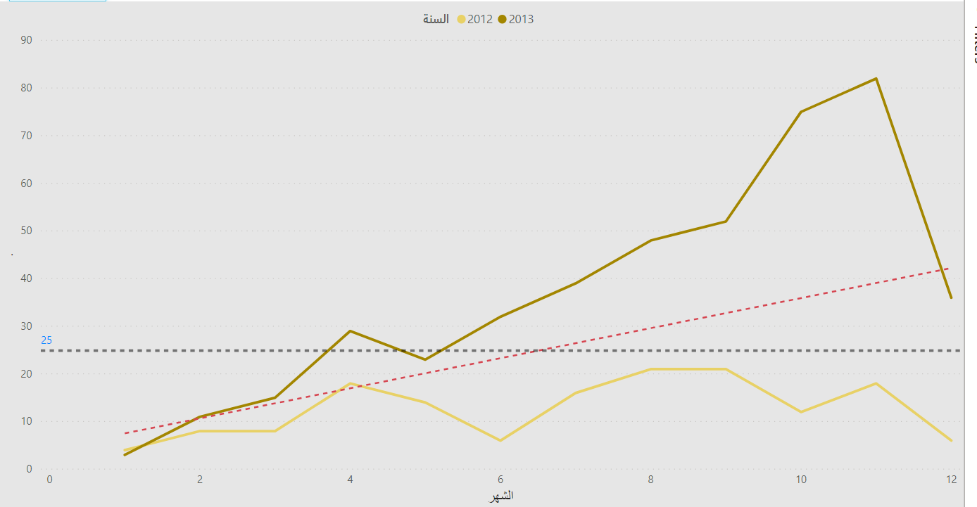
If you change your X axis to a numeric type, the trendline option will become available (red line below):
I hope this is helpful.
Hi @BrianJ Again
Sorry About the missunderstod, what about the Dates (Month and Year) how can we convert it to Number?
@MAAbdullah47,
The problem is that the trendline feature only works with continuous data, and something like “Jan 2014"” is categorical, not continuous. So, I think you have 3 options:
-
You can create a numeric YearMonth column in your Date table, e.g., 201401, 201402, etc. and use that as your x-axis column. Easy fix, but doesn’t look great on your visual; or
-
Instead of the auto trendline feature, you can develop a measure that will estimate a linear regression line for your data and then add that to your line chart as a third data series. This will allow you to use a categorical x axis.
-
Create the visual via an R script and import it into Power BI.
If you choose option #2, this video may be quite useful:
I hope this is helpful.
2 Likes
Thank you @BrianJ I did it now as you said in the begining of your answer (Jan 2014) through the following column formula : “Year-Month”, EOMONTH ( [Date], 0 ), It works now.
@MAAbdullah47,
Great – glad to hear that worked well for you.