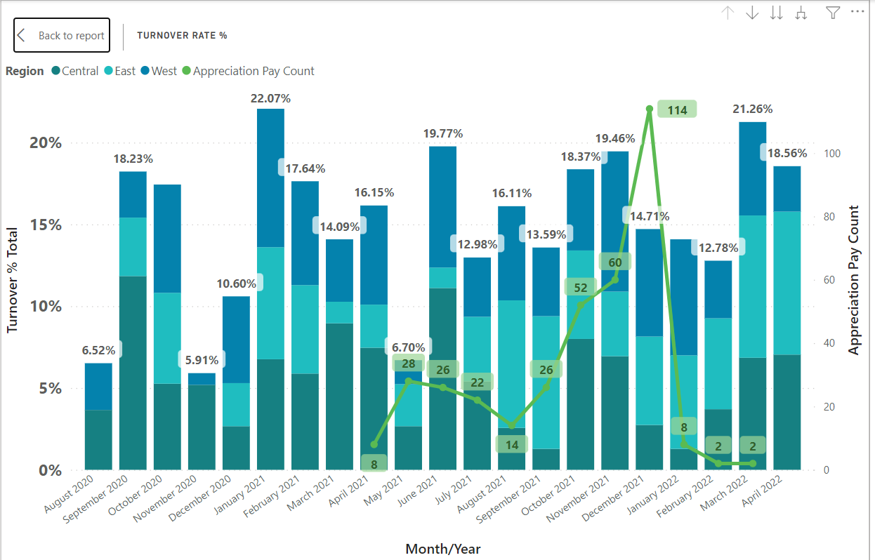
Included is an image of a stacked bar graph I have showing turnover percentages for my company month over month, stacked by region. (We calculate turnover by TerminatedEmployees/ActiveEmployees.) If you look at March 2022, you’ll see the visual showing a total turnover % of 21.26%. What’s happening is the calculation is just summing up the individual percentages for each region (5.71%, 8.70%, and 6.85%). When, in fact what I want, is for the total to show me the actual total percentage of that month (total terminated/total active), not the sum of those 3 values from each region. In addition, I would like for each region to continue displaying its respective amount, which are currently correct. As any FYI, the actual total should be 4.48% vs the 21.26%.
I’ve searched high and low, watched videos, etc. looking at HASONEVALUE, SUMMARIZE, etc., but I still can’t seem to find a solution. Can someone point me in the right direction here?
I have looked through several, but will look again. I know there are so many different ways to “fix” totals and subtotals, but didn’t know if anyone had suggestions with percentages specifically. The summarize/sumx combo is not working for me like it has in the past because of percentages not being “summed”.
Hi @daniel.new, it’s been a while since we got a response from you. In case there won’t be any activity on it in the next few days, we’ll be tagging this post as Solved.
Hi @daniel.new, due to inactivity, a response on this post has been tagged as “Solution”. If you have a follow question or concern related to this topic, please remove the Solution tag first by clicking the three dots beside Reply and then untick the check box.
Unfortunately these were not helpful. I was just looking for some direction, if other people had run into that issue. I ended up removing the rollup in the graph due to the data displaying incorrectly. I wish I could send my PBIX file, but it’s against my company’s policy due to trade rights and data security.
Hi @daniel.new, have tried the suggestions above on how to mask sensitive file or have you created a mock pbix file so members can help you with your query?