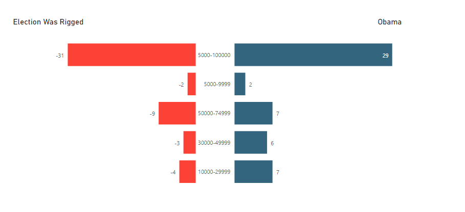
Does anyone know if they make a tornado chart where the data labels are in the middle? Like the picture
I have imported a Tornado chart but the labels are on either the left or right.
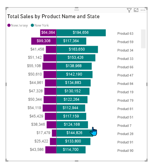
T.I.A.
Does anyone know if they make a tornado chart where the data labels are in the middle? Like the picture
I have imported a Tornado chart but the labels are on either the left or right.
T.I.A.
@mbraun The feature you are looking for is not available in custom visuals. You would have to create your own. I will be making videos on how you can create different creative visuals on your own. Stay tuned !!
Hello @mbraun,
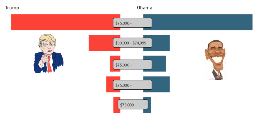
You could try building a supporting table that contains also a rank for sorting order. In order to build your visualization, you need to cut it in two. Once with the labels on the left and the bar chart on the right, and one additional barchart without labels sorted by your rank. For this second barchart you will need a measure with negative values.
Best regards,
Thanks - Looking forward to the custom visuals. I’ll be honest I am seeing things in Tableau that can’t be done in Power BI and sometimes it seems so simple but it drives me mad. Then there is the flip side things that are so simple in Power BI that take a lot of work in Tableau.
Hi @mbraun, did the response/training content provided by @alexbadiu help you solve your query? If not, how far did you get and what kind of help you need further? If yes, kindly mark the thread as solved. Thanks!
Hi @mbraun, we’ve noticed that no response has been received from you since the 15th of December. We just want to check if you still need further help with this post? In case there won’t be any activity on it in the next few days, we’ll be tagging this post as Solved. If you have a follow question or concern related to this topic, please remove the Solution tag first by clicking the three dots beside Reply and then untick the checkbox. Thanks!
@alexbadiu - Can you provide screen shots of what you wrote about? Maybe I am missing something.
@mbraun, I do not have screenshots. In the comment above I described the mind process for a possible solution. It would be easier if you could provide a pbix with the structure of your data.
Hi @mbraun, we aim to consistently improve the topics being posted on the forum to help you in getting a strong solution faster. While waiting for a response, here are some tips so you can get the most out of the forum and other Enterprise DNA resources.
I also suggest that you check the forum guideline How To Use The Enterprise DNA Support Forum. Not adhering to it may sometimes cause delay in getting an answer.
Please also check the How To Mask Sensitive Data thread for some tips on how to mask your pbix file.
Hi @mbraun, we’ve noticed that no response has been received from you since the 19th of December. We just want to check if you still need further help with this post? In case there won’t be any activity on it in the next few days, we’ll be tagging this post as Solved. If you have a follow question or concern related to this topic, please remove the Solution tag first by clicking the three dots beside Reply and then untick the checkbox. Thanks!
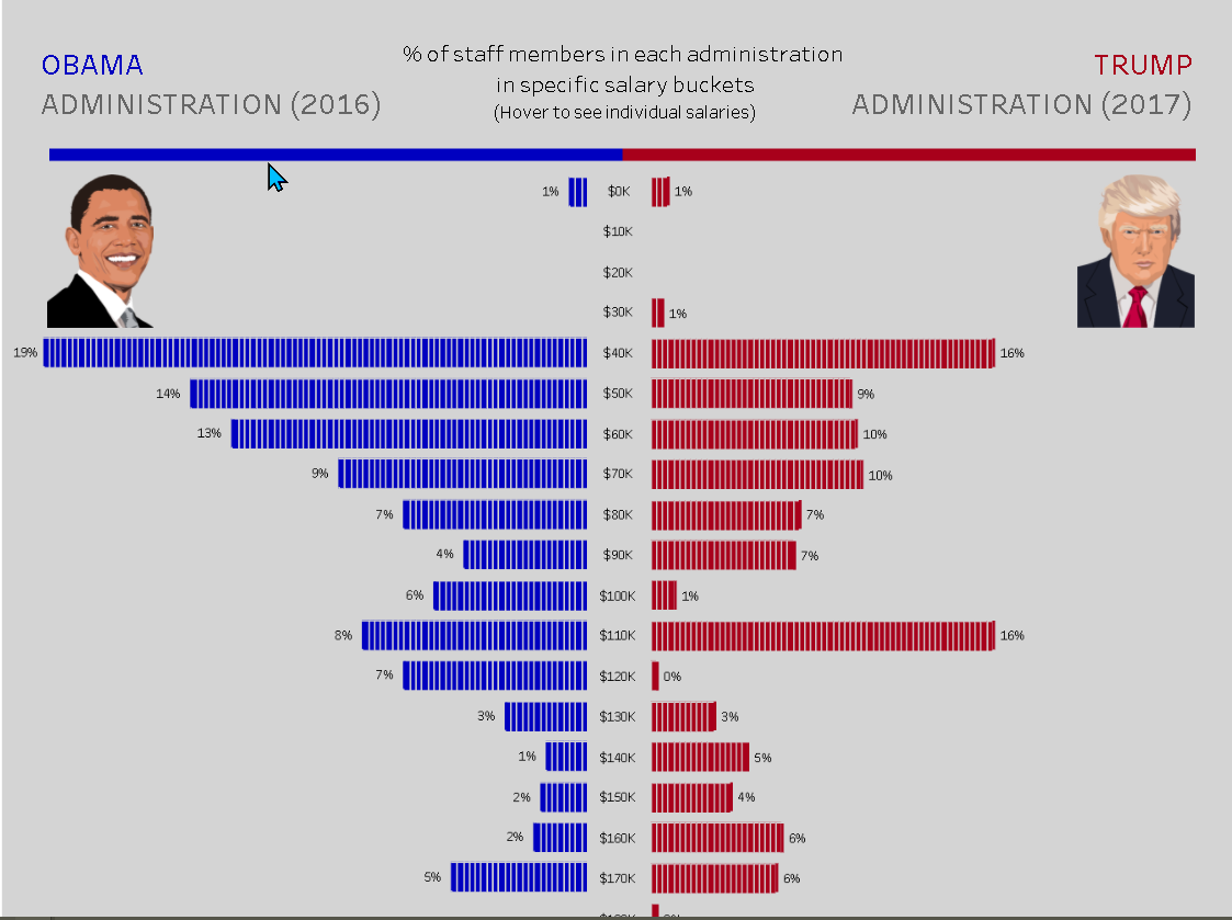
@alexbadiu - I attached a simple pbix that I created. The inspiration for the Power BI version is the screen shot of a Tableau dashboard. I was trying to mimic.
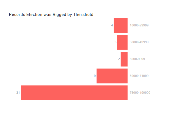
Trump vs Obama Staff.pbix (32.6 KB)@mbraun This is the result with Charticulator. The benefit of Charticulator is that you can avoid placing negative sign to change the shape position.
MadassirAli -
I appreciate the response. I will have to look into charticular when I have a moment.
Matt
So yes, the approach I explained above can get you close but not exactly to what you want.
You have negative values, but this shouldn t be a blocking point as what you want to create seems more like a static visual.
This can be close now. Thanks again Enterprise DNA community
Yes, it’s starting to look good. Maybe you need to delete the title Trump & Obama as the photos are enough for identification. You could also use the right colors for democrats & republicans. And also choose a punchy title. I would also rework the thresholds colors. Add as a final touch a good background, and your infographic should look great!