All,
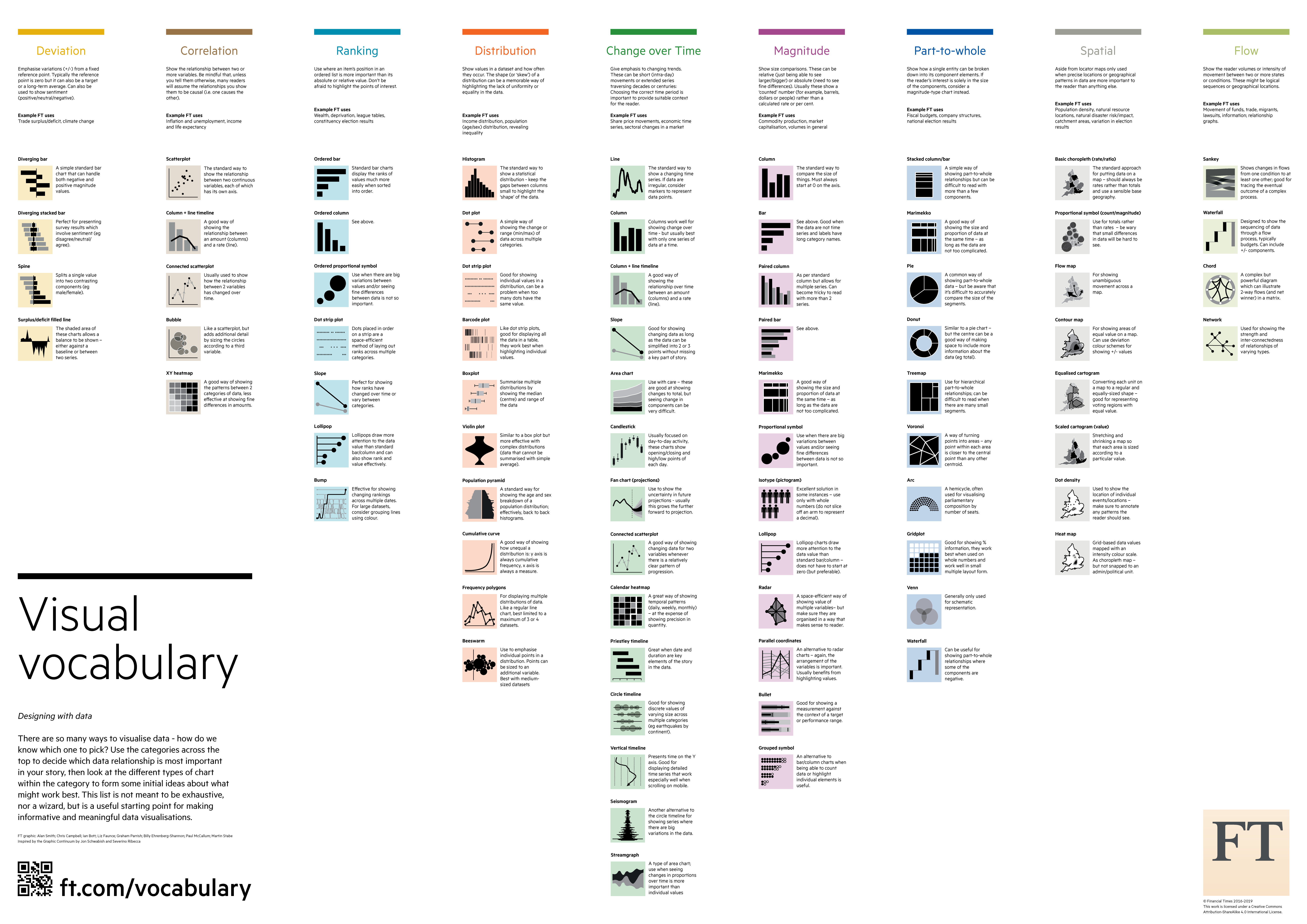
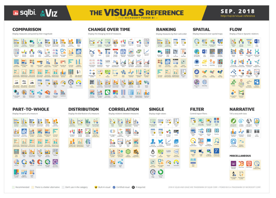
In doing prep work for an Enterprise DNA portal course I’m developing, I stumbled on a phenomenal site called From Data to Viz. This site has a great set of tools for helping select the best visual(s) to represent different types of data. Here’s a screenshot of their flowchart, and they provide really detailed information about every visual type listed.

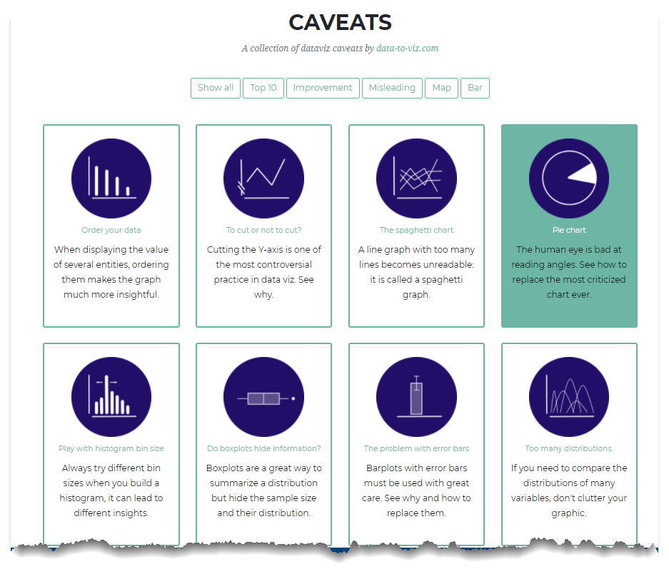
In addition, they have an incredible section on common mistakes that people make in the visualization of data using these different visual types, far more in depth and insightful than many similar analyses I’ve seen.
Definitely worth taking a few minutes to check the site out if you’ve not come across it prior.
– Brian