Hi
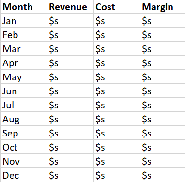
I have 3 measures - revenue, cost and margin.
My table visualisation currently shows the following,
I’d like the layout to be,

Is there a way to achieve this?
Thanks
Manoj
Hi
I have 3 measures - revenue, cost and margin.
My table visualisation currently shows the following,
I’d like the layout to be,
Is there a way to achieve this?
Thanks
Manoj
@M_K,
Then go to the format options for “values” and turn on the show on rows option:
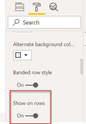
That should do the trick.
Awesome, thanks Brian 
I’ve learnt a new trick.
@M_K,
Great – glad that got you what you needed. The “show on rows” option is not that intuitively named IMO. I think it was months before I figured out what that thing did. It is handy once you know what it’s for though…