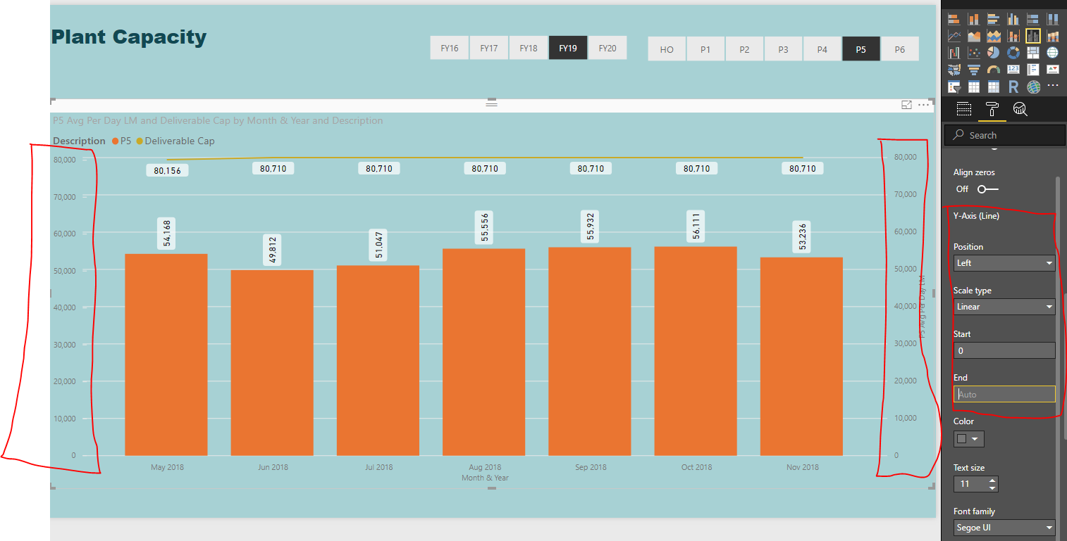
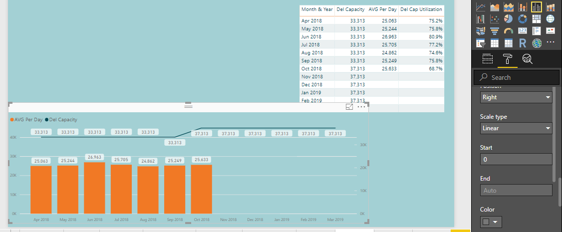
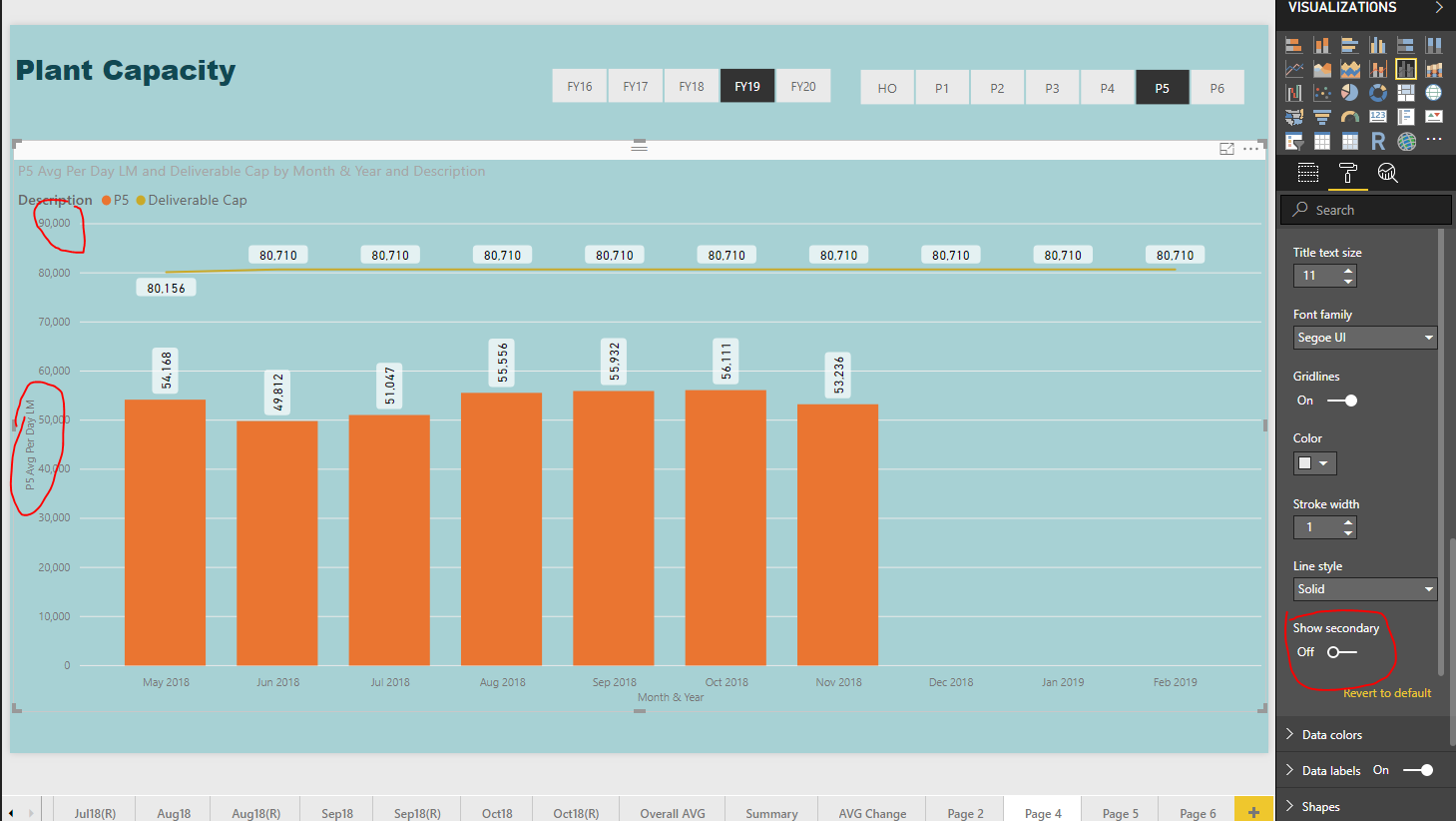
I have made a line and stacked column chart in Power BI. There are two Y axis. In one I plot the Capacity and in other actual production.
Both the Y axis should be in same scale to understand the graph.
I am not able to set both the axis in same scale. Can you please help.
If you select ‘Auto’ as the End Value then it will dynamically select the nearest maximum thousands from the respective measures to plot the graph. In your case, Y axis in left has used P5 where nearest maximum thousand is 50000 and the right side has used Deliverable Cap where nearest max value is 80000. So ‘Auto’ is the only option that currently available(!!!Bearing mind, I am no expert) where the end value can be dynamically selected to plot the graph. In order to improve the contrast between two measures you could switch off the secondary Y axis from the graph so it will dynamically select max value from both measures.