Hi @vazik.
Here’s some comments:
(1)
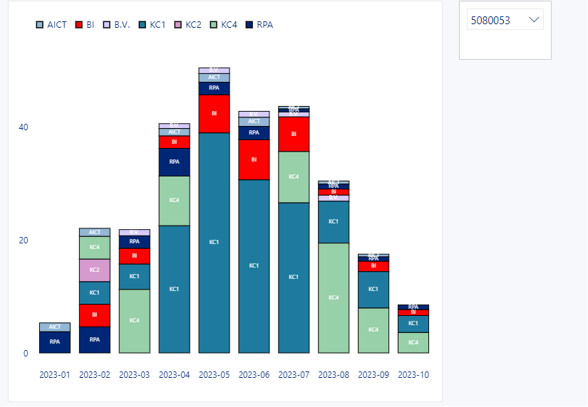
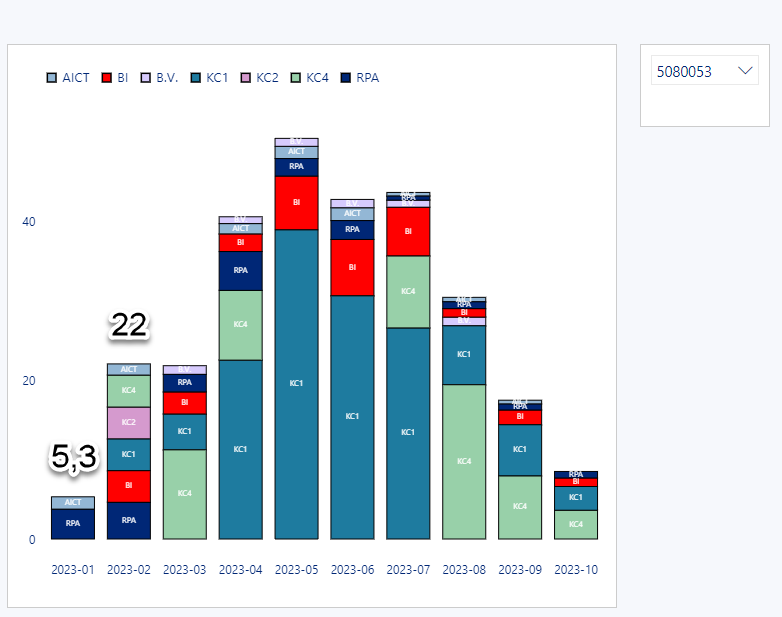
To maintain constant role colours when different projects are selected, specify both “domain” and “range” arrays in the “scale” block inside the “color” block.
"color": {
  "field": "Role",
  "sort": [
	"AICT","BI","B.V.","KC1",
	"KC2","KC3","KC4","RPA"
  ],
  "scale": {
	"domain": [
	  "AICT","BI","B.V.","KC1",
	  "KC2","KC3","KC4","RPA"
	],
	"range": [
	  "#93B7D5","red","#D7CBFD","#1E7B9F",
	  "#D59ACE","#98D0A9","#002776","green"
	]
  }
}
(2)
To add totals to each column, add a new “text” mark with a “transform” block containing an “aggregate” calculation for the total, then use the new field.
    {
      "name": "PERIOD_TOTAL",
      "transform": [
        {
          "aggregate": [
            {
              "op": "sum",
              "field": "Žádanky",
              "as": "_total"
            }
          ],
          "groupby": ["Rok/Měsíc"]
        }
      ],
      "mark": {
        "type": "text",
        "color": "black",
        "fontSize": 12,
        "fontWeight": "bold",
        "yOffset": -10
      },
      "encoding": {
        "text": {
          "field": "_total",
          "format": ".1f"
        },
        "y": {
          "field": "_total",
          "type": "quantitative"
        }
      }
    }
Hope it helps.
Greg
eDNA Forum - Deneb Stacked Column Chart.pbix (1.6 MB)