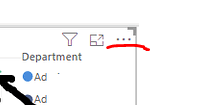
If you look at the attached screenshot, you’ll see my legend appears in alphabetical order. Now, to someone not knowing - - you’d expect that the “highest” department is “B”. In fact, not so - it is “Fic”.
Question: Is there a way for the legend to be in a more “relevant” order according to what is displayed in the chart? I remember seeing this subtle functionality in Tableau and thinking it was really useful. If this does not exist in power bi, is there a way I could sort my legend by my measure Running Total? . This would still improve the usability of the viz would be improved.
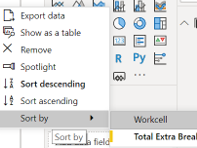
Thank you, but that doesn’t work. I am able to sort by Total Cost but then my x-axis (weeks) goes out of order. And, my legend stays in alphabetical order.
Thanks for posting your question @michellepace. To receive a resolution in a timely manner please make sure that you provide all the necessary details on this thread.
Here is a potential list of additional information to include in this thread; demo pbix file, images of the entire scenario you are dealing with, screenshot of the data model, details of how you want to visualize a result, and any other supporting links and details.
Including all of the above will likely enable a quick solution to your question.
Hi @michellepace, we’ve noticed that no response has been received from you since the 15th of September. We just want to check if you still need further help with this post? In case there won’t be any activity on it in the next few days, we’ll be tagging this post as Solved. If you have a follow question or concern related to this topic, please remove the Solution tag first by clicking the three dots beside Reply and then untick the checkbox. Thanks!