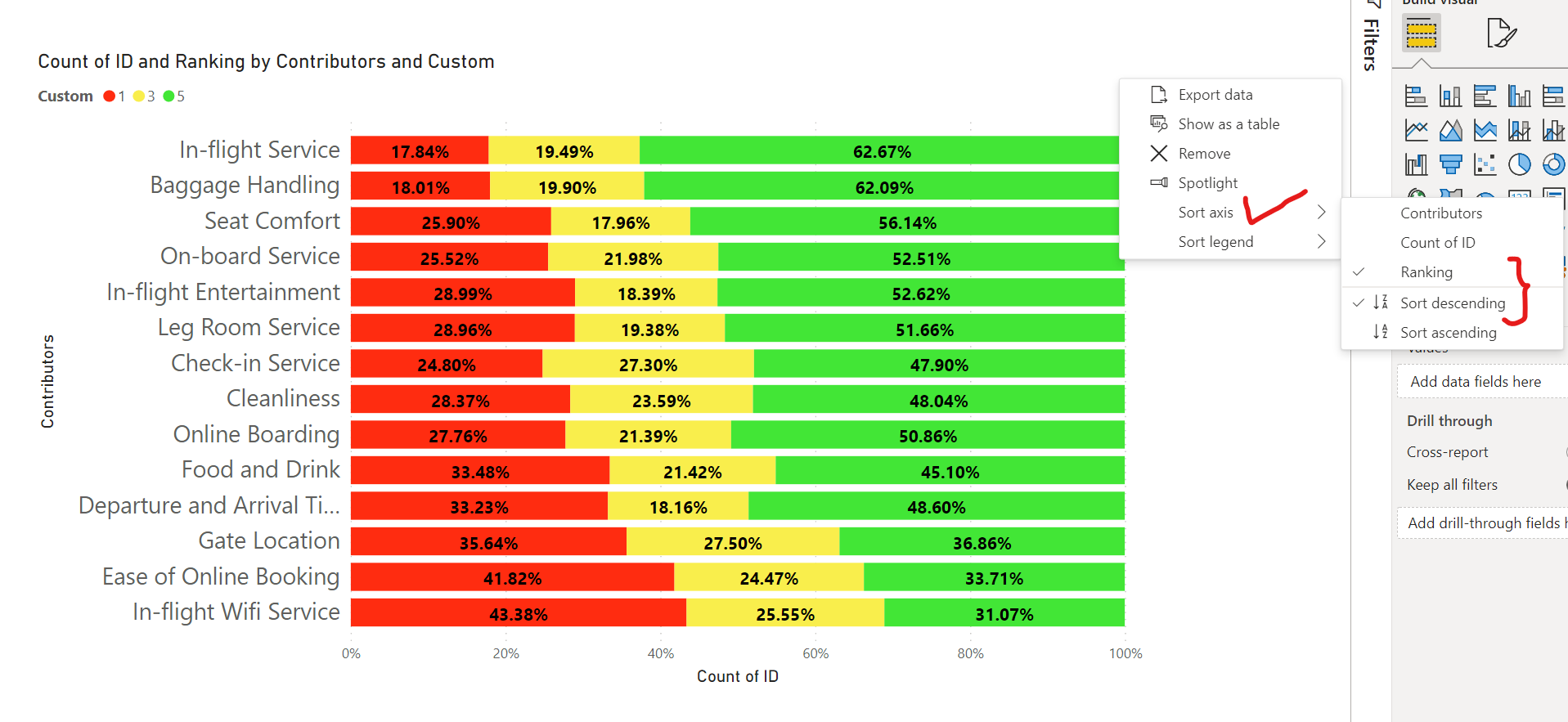
In order to sort the axis based on the condition that you’ve specified. I’ve created a ranking column inside the “Passengers Likert” table. Below is the simple DAX formula provided for the reference -
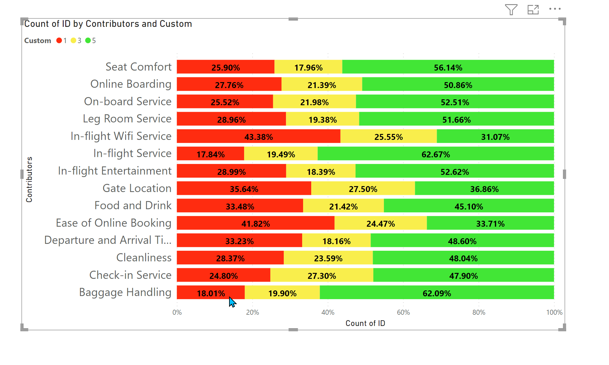
Once that Ranking column is created, I’ve placed that field inside the “Tooltips” section so that sort can be applied where “the highest percentage in RED is placed at the bottom” and then you’ll be able to see the desired results. Below is the screenshot of the final results provided for the reference -
I’m also attaching the working of the PBIX file for the reference purposes.
Hoping you find this useful and meets your requirements that you’ve been looking for.
Important Note: Since “Ranking” field is placed under the “Tooltips” section, when you hover over the chart, it’ll also showcase the irrelevant figures pertaining to ranking. You can either turn off the “Tooltips” but that will also stop showing the information for other fields as well or else you can create a separate Tooltips page, in case you want to show any information.
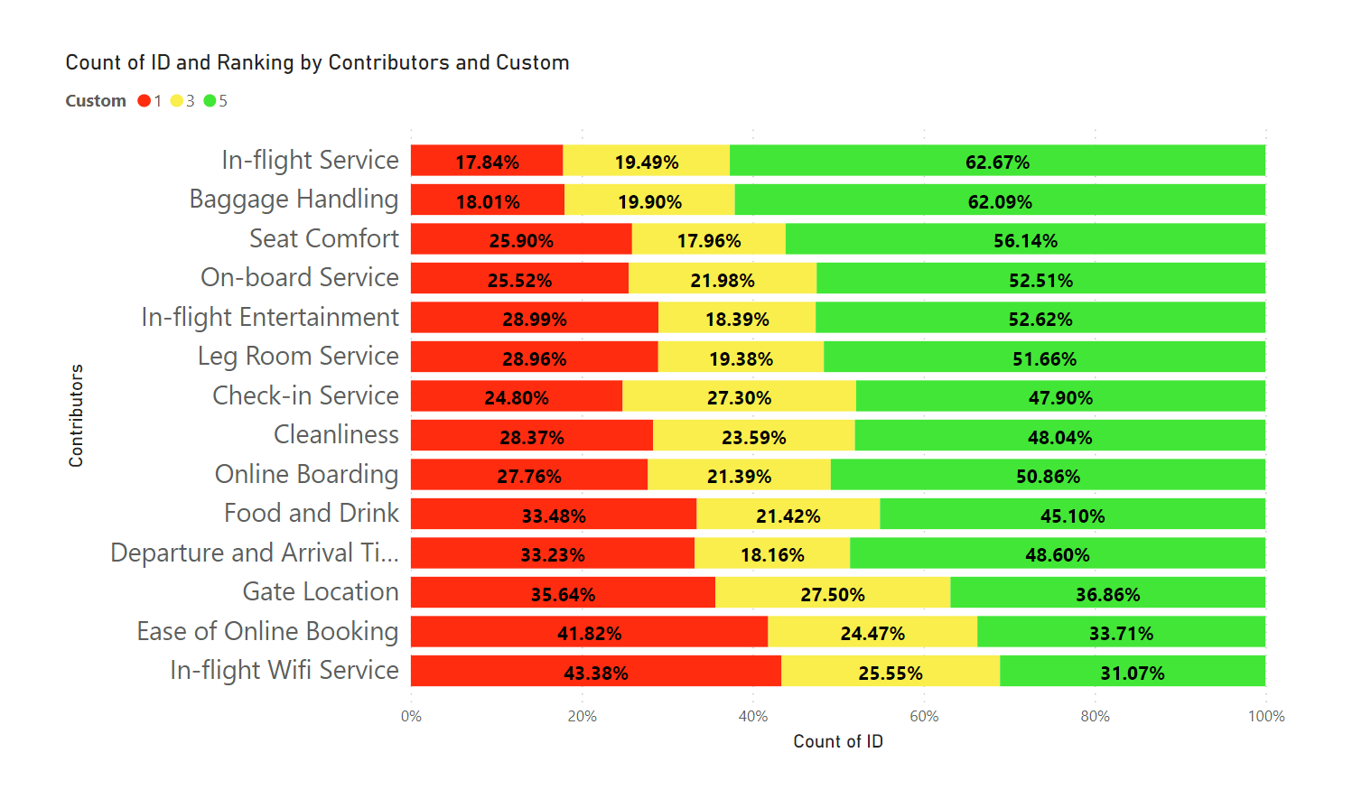
Lastly, I forgot to mention the reason that why I created a calculated column and not a measure in this case is because the sorting is applied over the axis section. Below is the screenshot provided for the reference -
So if a measure is created for this purpose, it’ll not work in that case.
And also attaching the PBIX file where a very simple Tooltip page is created in order to show only relevant information thereby removing the Ranking as a info. You can simply amend it as per the business scenario’s, if required.