Hi @mdalton2100,
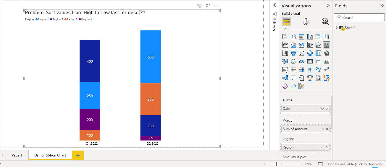
The Stacked Column Chart does not allow us to order the legends according to the value of the measure in each of the categories on the X axis, but instead orders the entire category according to the total value of each category (Q1.2022 and Q2.2022).
You can see it in the following post by @Harsh in the forum and how you could use the Ribbon Chart as @datazoe tells us in the same thread.
How to sort data in Visual - Data Visualizations - Enterprise DNA Forum
This is the example using Ribbon Chart:
Regards