Scattone Silva Patellar tendon loading.pbix (44.2 KB)
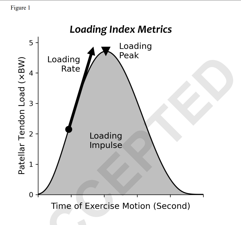
In the attached pbix I’ve taken some data from a recent study looking at the amount of load going through the patellar tendon during different exercises. The researchers quantified the loads in 3 different ways peak, peak loading rate, and peak impulse:
By pivoting the data, in the first page of the attached report, I’ve made a column chart that lets me slice by the different metrics.
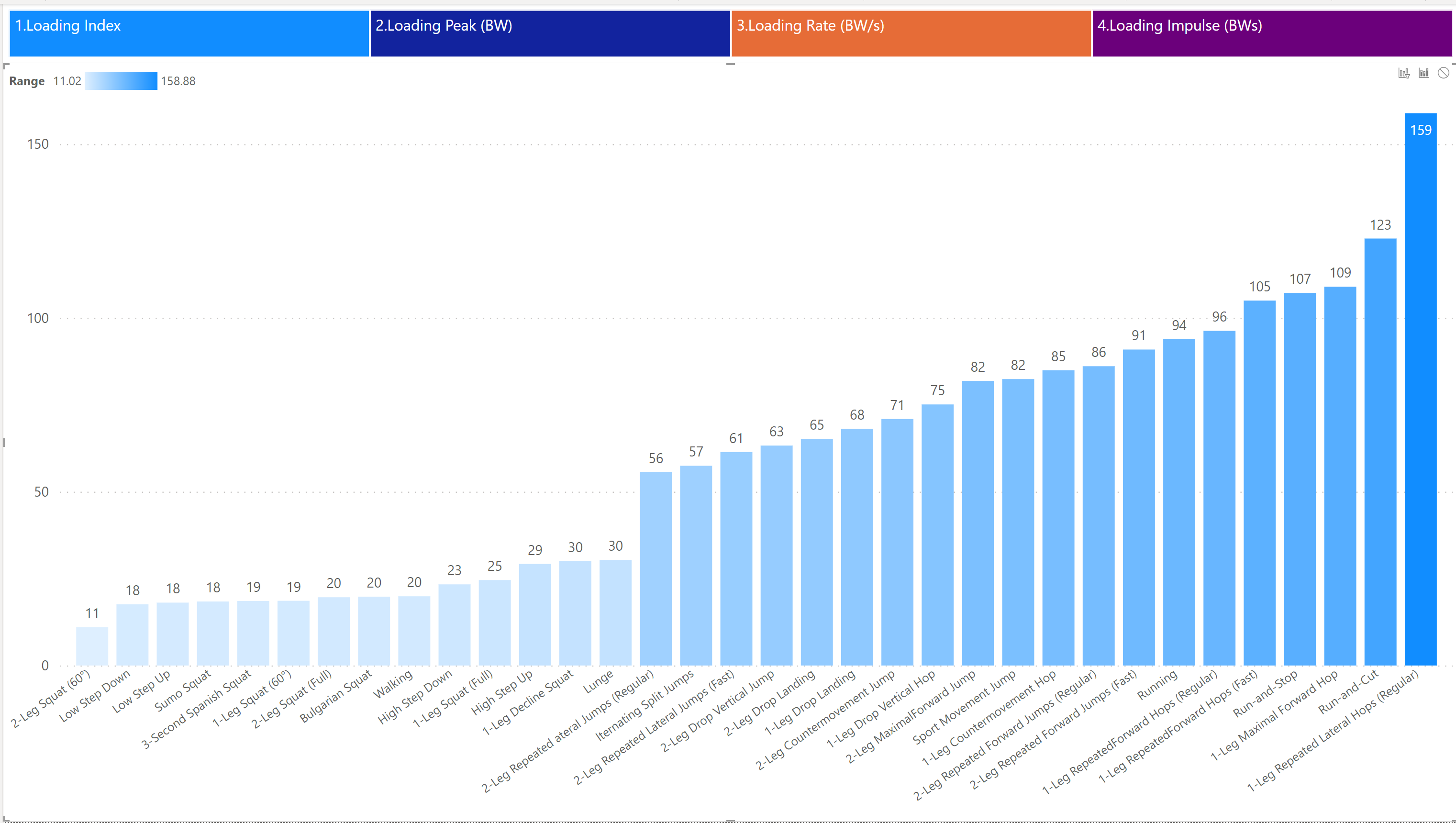
Selecting Peak load:
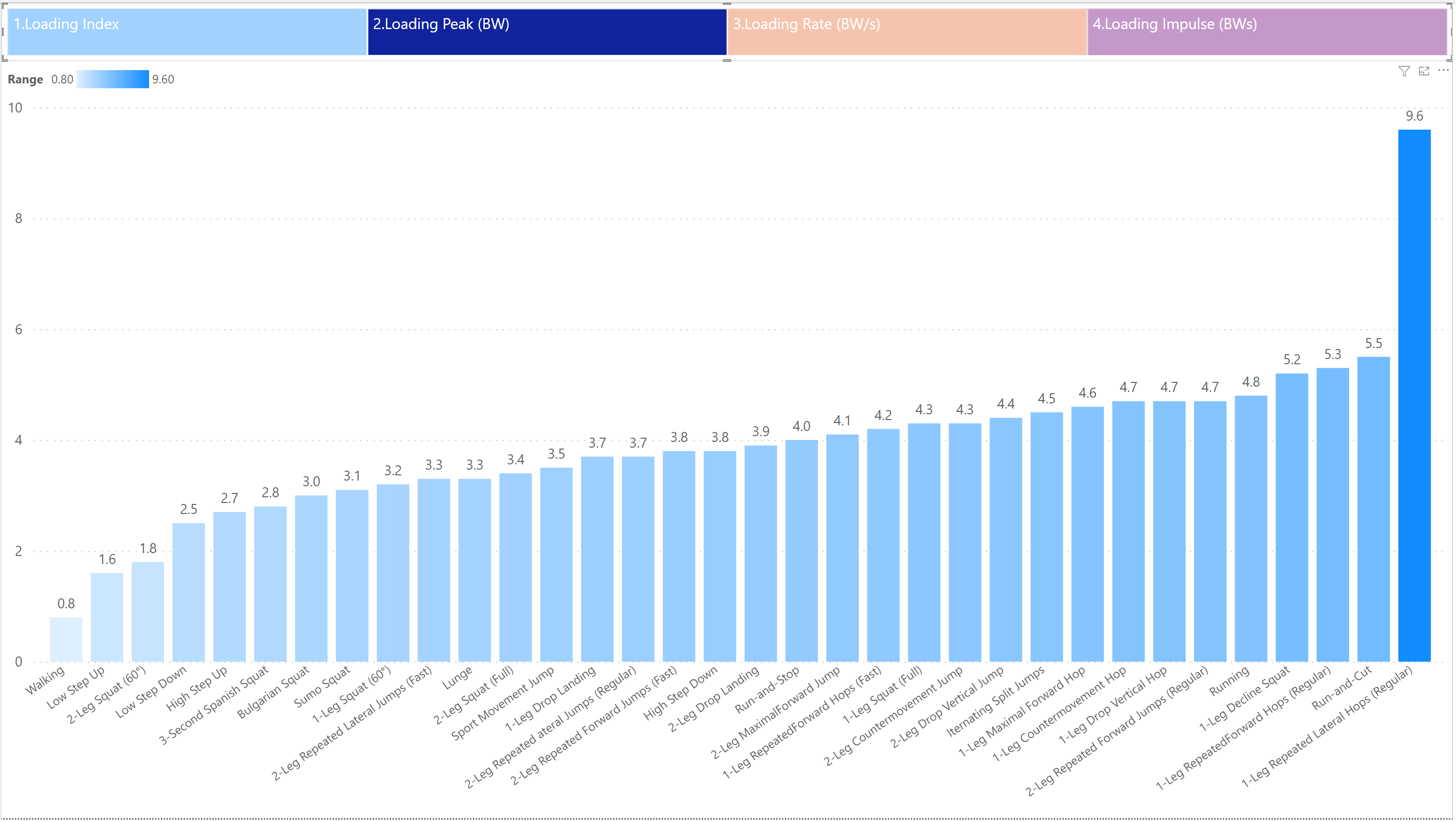
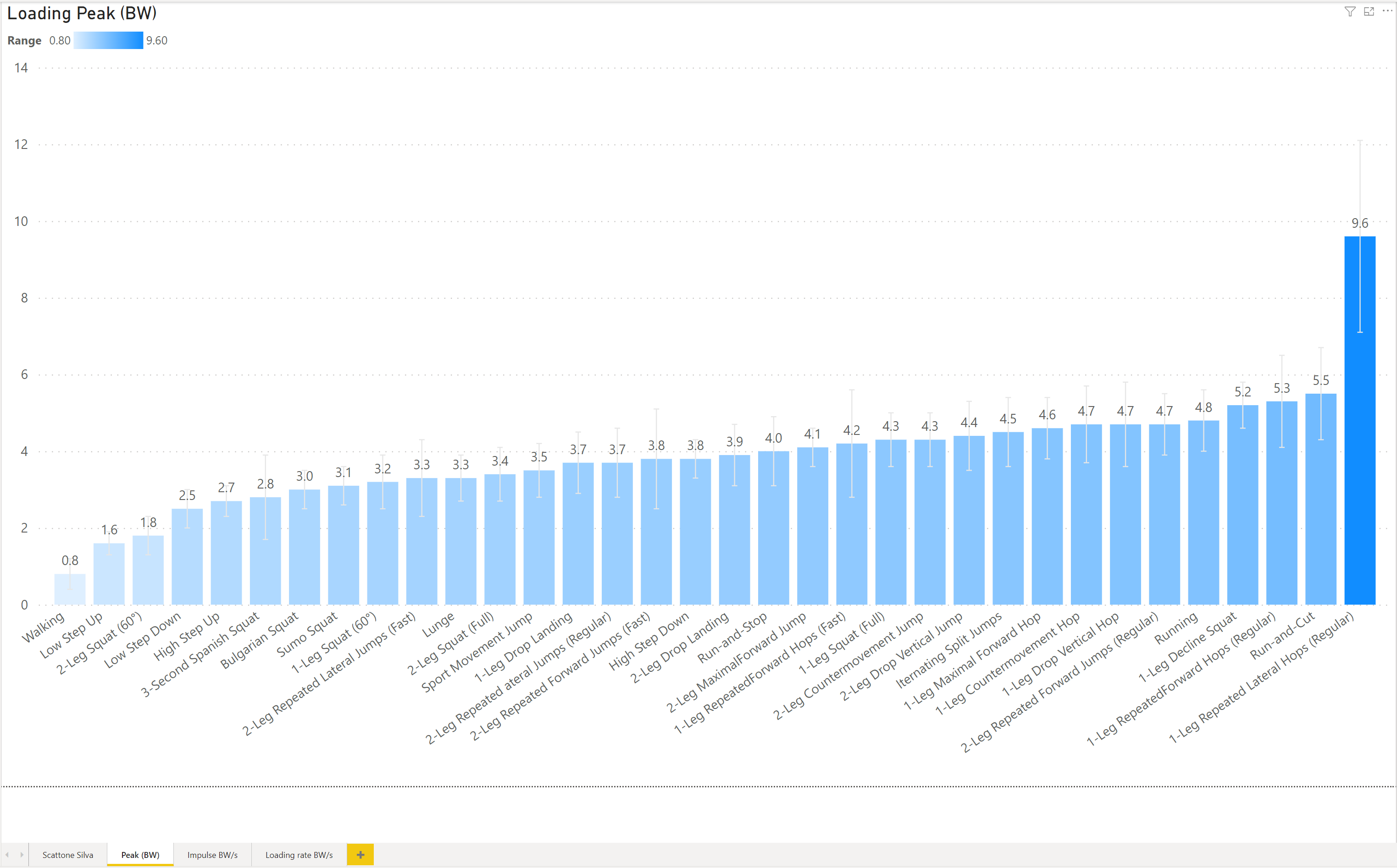
In the 2nd to 4th pages I have each metric, along with the error bars
e.g.:
I can’t figure out how to make a report with the slicer like I have on the first page (“Scattone Silva”) which displays each of the other 3 reports.
Any help gratefully received,
Rod