Showing Top 20 Customers

Hi Fellow Power BI Users!

I have a fact table regarding the sales transactions of roughly 100 customers.

I managed to break down the sales by “Top 20 customers” and others, what I also need to do is have Top 1 to Top 20 customers presented with their name, and all the rest grouped as others, like the image below
1

Is there anyway I can upload my data model so you guys can have a better context?

Sure can you create a zip file and place it in this thread

What will be needed here will be some derivative of the techniques showcased in this video

Send through the model though and can have a look for you

Yes Sam the Dynamic technique is a mouthful but it works just like you said…thanks again for this!

I have applied this to other things (top 3 largest forecast costs) and it works very well…Funny how complicated these iterations work …good job with explanation too

I have shared the model to you and thanks for looking into this :slight_smile:

Ok so how to solve this specific problem is very similar to the video.

Here’s a picture of the result and the formulas used. (I just went to top three)

image

So there’s a bit to the formula but gets a great result I think.

I think also just have a good think about how you want to visualize this two. Because you could also use other techniques to showcase what you want in a slightly different way.

Here’s an example of what I mean.

Agree Garry there’s a bit to it. But I also do think that this type of insight is virtually impossible to find and setup effectively in excel and the fact you can do it in one formula is really great.

DAX is amazing like that. One formula and you can achieve fantastic insights.

Would be great to demo a dynamic grouping based on say a text value instead on number value…Would that be possible?

Like the answer above or different?

Here’s an example of one you could also use.

Hi Sam,

After watching the videos and your comments I could nicely create the table with the top N Customers with the rest slotted into others.

What I cannot get is a nice visualisation in a pie diagram for this.
The only thing I can show as labels are the Top N labels, but I would like to see the Name Rank as a label.

Would that be possible with your technique?

So what I would like to achieve is the diagram on the left, but the diagram on the right is what is showing when using the Grouping technique?

The left diagram is with no grouping. For the name, eg. Top 1 I want to see “Fibreglass pumpstation - vertical” in stead of “Top 1”

I cannot use the measure I created “product name by rank” as an axis for the pie diagram?

Thanks!

There’s a few videos and things discussed in this topic.

Can you show me a bit more detail? For example, what is your current formula you are using?

Initially I’m not to sure you can show this exactly how you want. You should be able to place the tooltip in though?

Have you tried that?

Another way you could do it is via a calculated table. But this would only update on a total refresh of the report.

The reason a calculated table would work is you need to actual dimension (column) to use inside a visual. Currently the ranking calc is in a measure, not a column, that’s why it’s currently not possible.

You can add the pbix file if you like and I can have a closer look.

Chrs

Hi Sam,
Thanks for the reply.

The formulas and techniques used are the ones you show and added to this topic.

I was hoping when using this technique that:

  • You can list a top 10 products by value (WORKS)
  • The rest of the products are slotted into “Others” (WORKS)
  • It should be dynamic, so when you change a filter (Eg. department) then it should recalculate the Top 10. (WORKS)
  • Show it in a Pie diagram visual (NOT POSSIBLE)

So it all works nicely with your provided techniques (very elegant!)
but its the problem of the “Others” which is a bit hard to reason about for me at the moment how to put
it into a pie diagram as a measure cannot be added.

I will cleanup my pbix a bit and send you an example.
But it is basically using your techniques.

In another post https://community.powerbi.com/t5/Desktop/Top-10-Other/m-p/52120#M20971
They mention a different technique but have not tried it yet.

Hi sam,

I have emailed you a stripped down version of my pbix file.

Thanks a lot,

R,

Koen

Is this what you were looking for here

I’ve just wrapped that formula inside an if statement

Product Name = 
IF( SELECTEDVALUE( 'Product Groups'[Top N] ) = "Others", "Others" ,
    CALCULATE( SELECTEDVALUE(Products[Product type], BLANK()),
        FILTER(VALUES(Products[Product type]),
            COUNTROWS(
              FILTER( 'Product Groups',
              RANKX(All(Products[Product type]),[Total products value],,DESC) > 'Product Groups'[Min] 
              && RANKX(All(Products[Product type]),[Total products value],,DESC) <= 'Product Groups'[Max])) > 0 )) )

I’ve played around with another idea here.

It’s a bit complicated by it does complete it somewhat.

The idea is to create a supporting table that can enable this filtering. Ie. inside a visual. I review the example you posted and think that you can leverage off this idea.

Now that I’m working through it think this actually might it. It’s a cool solution actually.

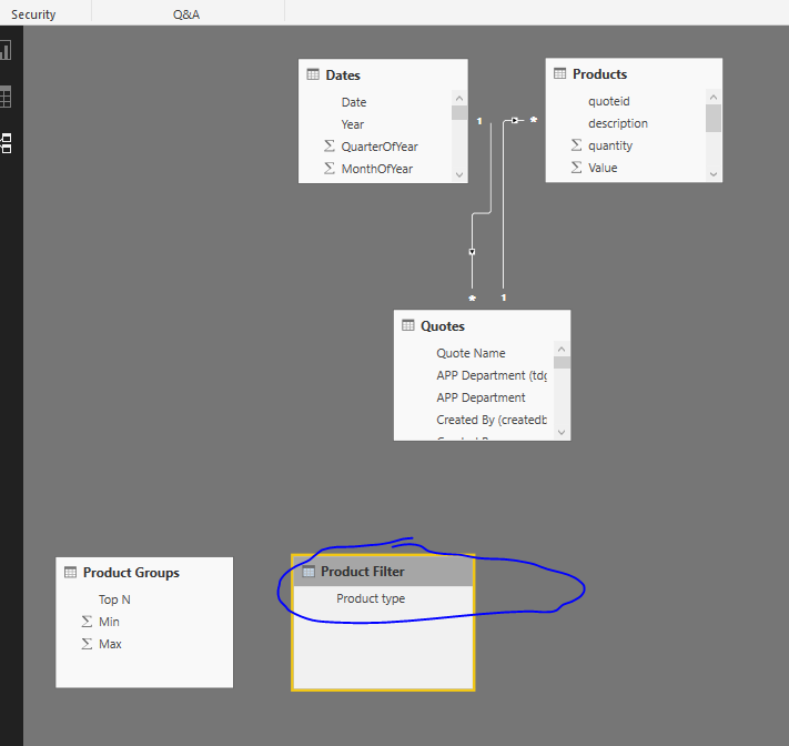
Ok here’s how I did.

First you need to create a brand new table off your products.

image

This will ultimately be the filter in the chart

It doesn’t require any relationship to your core model

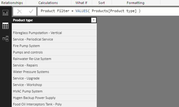
Then you require these formulas

Total Value (w/Filter) = 
CALCULATE( [Total products value],
    TREATAS( VALUES( 'Product Filter'[Product type] ), Products[Product type] ) )


Product Value (w/Filter) = 
CALCULATE( [Total Value (w/Filter)],
    FILTER( VALUES( Products[Product type] ),
        COUNTROWS(
             FILTER( 'Product Groups',
             RANKX( ALL(Products[Product type]), [Total products value] , , DESC) > 'Product Groups'[Min] 
             && RANKX( ALL( Products[Product type] ), [Total products value], , DESC) <= 'Product Groups'[Max]) ) > 0 ) )

All this is doing is re-creating a virtual filter based off this new table/column that’s been created.

Then create a ranking measure like this

Ranking = RANKX( ALL( 'Product Filter'[Product type] ), [Total Value (w/Filter)] , , DESC)

Then you can use this measure as a visual level filter

image

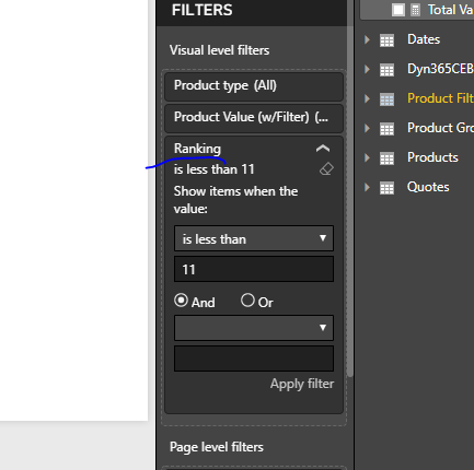
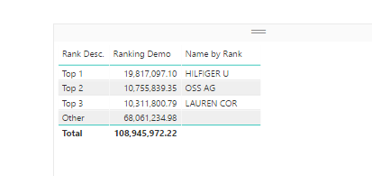
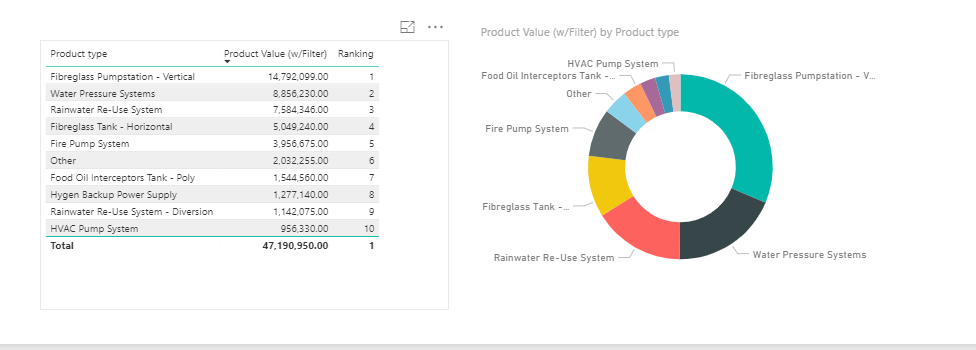
See here for results

The only thing missing here is the ‘Other’ which is a little tougher I think.

See how you go with this.

Will have to think deeper about the ‘other’ part.

Attached
APP-SalesCRM_TEST (1).pbix (1.4 MB)

Hi Sam,

Thanks for this.
Will check it out today.

It seems that the “Others” is a remarkably difficult thing to do.
It just always bite me that I say, “Sure I can do it” and then end up with a bit
more complication then I thought!

Thanks for your enthusiasm!

Sam - thanks for this video. I have read the forum topic but I didn’t see it addressed.

Is there a way to take this ranking a step further and show the % of group sales to the total? I am trying to make it dynamic as well. In the video you show $$ sales by group, by year, but it would be nice the see the % impacts of each group over time.

i.e. Top 5 xx%, 5-20 xx%, The Rest xx%

This is probably a simple DAX but I’m struggling…

Thanks in advance, Glenn