@Hesham,
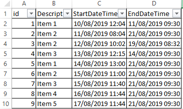
First, thanks very much for posting a clear description of your problem, with the PBIX and data files attached. This makes it much easier to provide support.
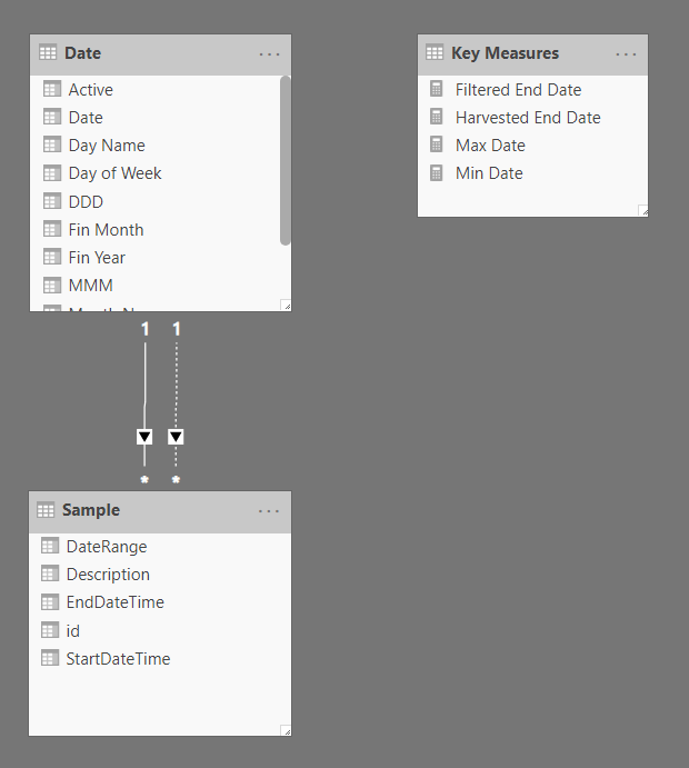
You are on the right track - the main problem here is the lack of relationship between your date and fact tables. First step is to mark your date table as a date table in order that the time intelligence functions work properly.
Then, we can create the needed relationships between the date column in your date table, and the start and end dates in your fact table. You can only have one active relationship at a time, so I made start date the active relationship, and end date inactive:
From there, I created a measure to harvest the end date from the slicer:
Harvested End Date =

CALCULATE(
    MAXX(
        ALLSELECTED('Date'),
        'Date'[Date]
    ),
    'Date'[Active] = 1
)
And then another measure to filter the end date in the table based on the harvested end date:
Filtered End Date =

IF(
    SELECTEDVALUE( 'Sample'[EndDateTime] ) <= [Harvested End Date],
    SELECTEDVALUE( 'Sample'[EndDateTime] ),
    BLANK()
)
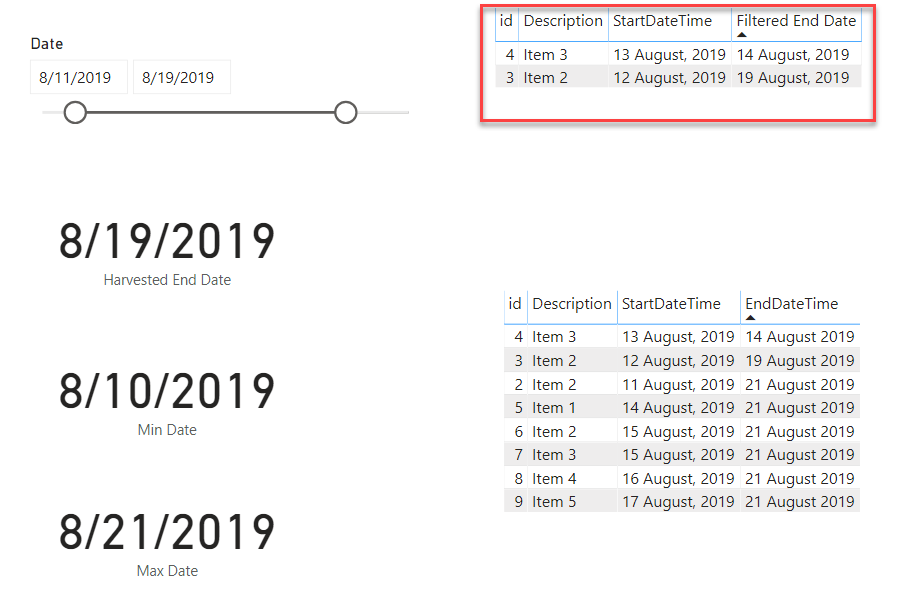
To make the visual look better, I limited the slicer to the minimum and maximum date values in your fact table. The one thing to note here is that because the relationship between the date table in the end date in your fact table is inactive, we had to “switch it on” with the USERELATIONSHIP() function:
Max Date =

CALCULATE(
    MAXX(
        ALL('Sample'[EndDateTime] ),
        'Sample'[EndDateTime]
    ),
    USERELATIONSHIP( 'Date'[Date], 'Sample'[EndDateTime] )
)
From here, you should be able to create whatever graphs you need.
Here are a number of videos explaining these concepts in more detail:
https://forum.enterprisedna.co/t/handling-multiple-dates-in-power-bi-with-dax/507
http://portal.enterprisedna.co/courses/108877/lectures/2000641
I hope this is helpful. Full solution file posted below.