What I am trying to achieve:
- Year-on-Year visualization
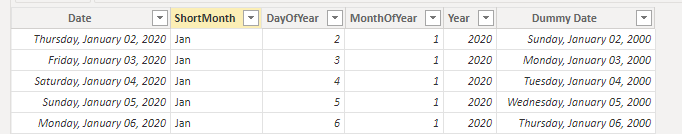
- Daily Granularity
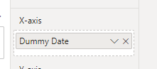
- Showing Months on the X-Axis
- Continuous (would settle for a zoom slider or something, just not the scroll bar)
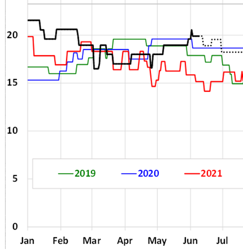
Excel makes it look easy
But in Power BI this is one of these typical “looks straightforward but nope” things.
What I have tried:
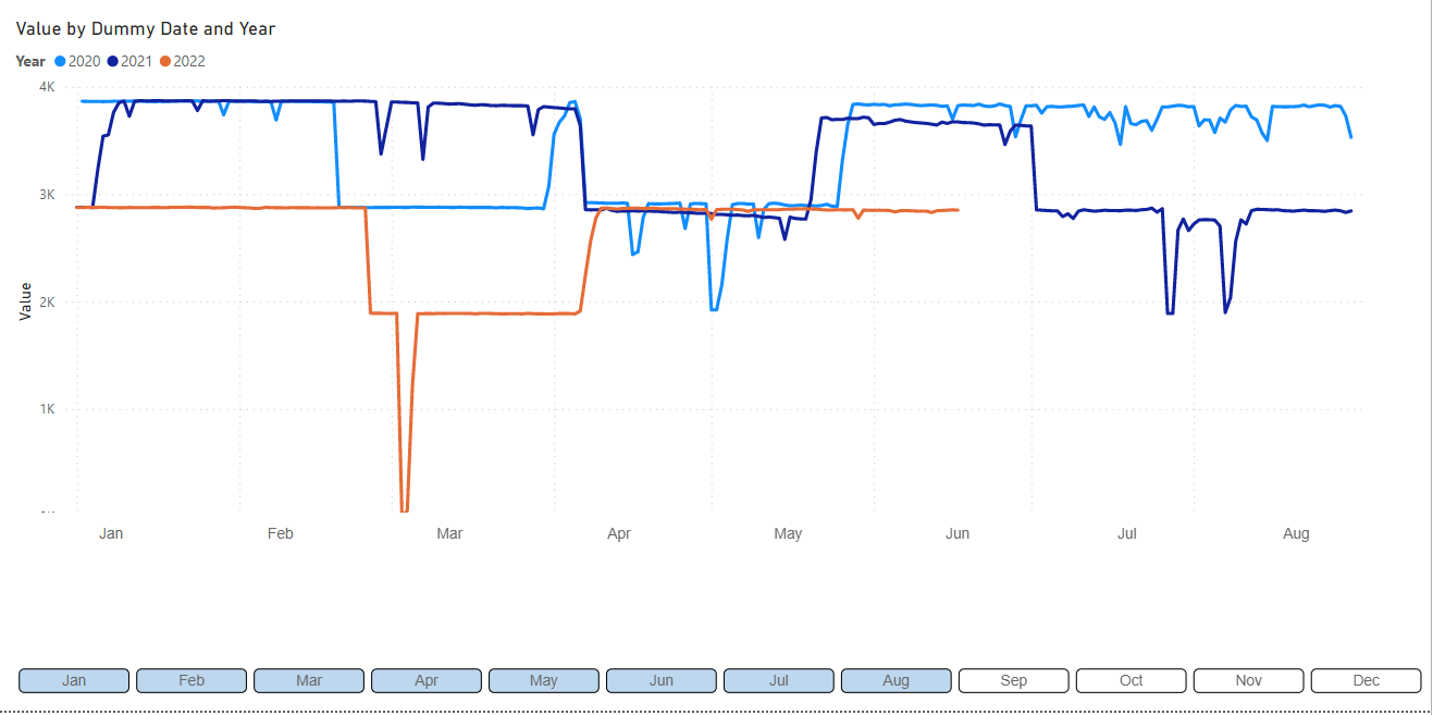
Chiclet Hack
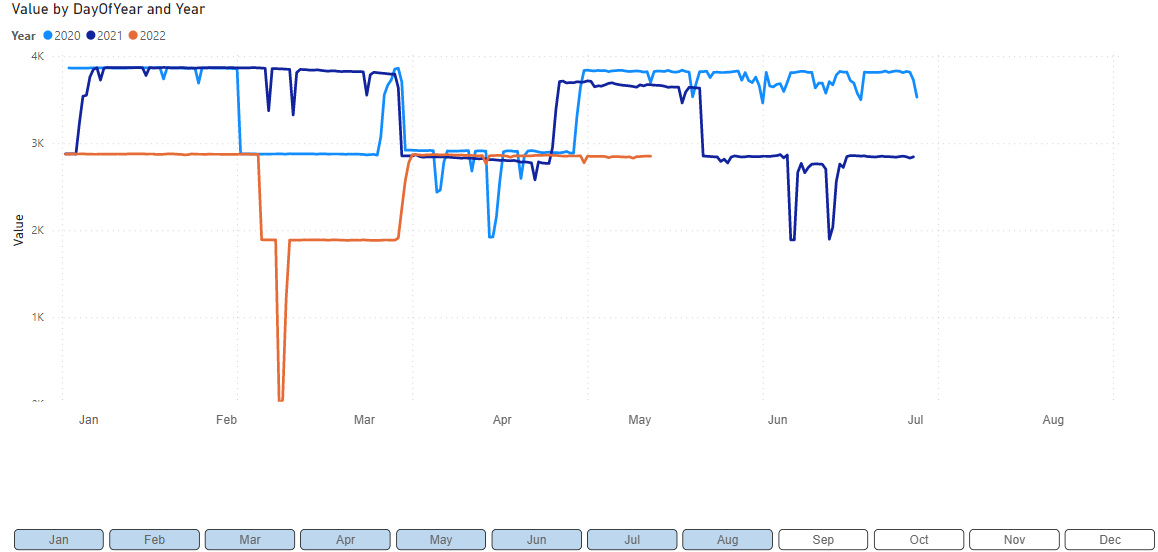
Overlay the X axis with a formatted chiclet slicer.
Problems:
- When you switch off a few months, the chiclets don’t align. This is okay-ish to some extent, but as you can see in the above example there are limits.
- If I have to switch all interactions each and every time I need a graph like this I am going to lose my mind.
Overlay Hack 1: drill down two values
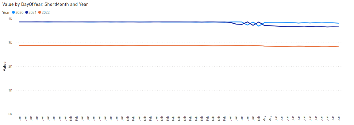
Problems:
- Not continuous
- Month values keep repeating
Overlay Hack 2: drill down Date Hierarchy, leave out year
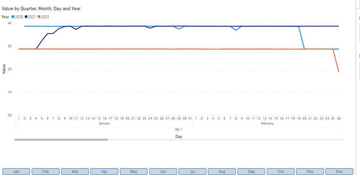
Problems:
- Not continuous
I also looked into DAX formatting tricks, but came up empty there as well.
Does anyone have any better ideas?
.pbix demo below, detailing the above three methods.
daily-x-axis-yoy-view-month-demo.pbix (466.7 KB)