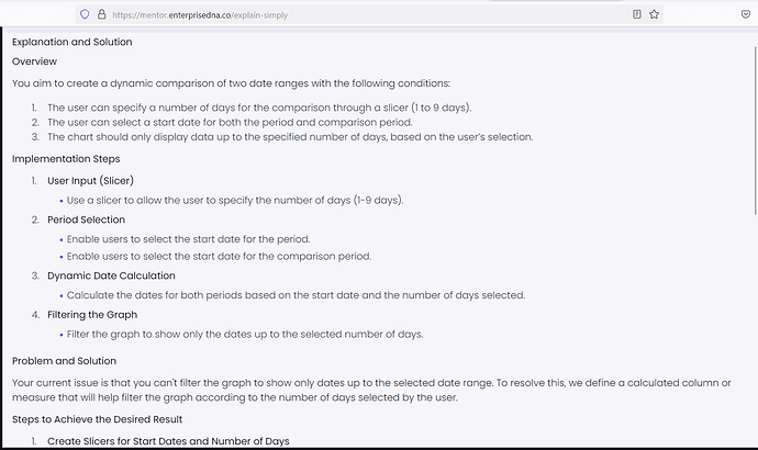
Hi all,
I am working on a report where I need to do the following.
- Enable the user to specific a number of days to compare through a slicer ranging from 1-9 days (1-9 for the sake of the demo file).
- Enable the user to select a period start date
- Enable the user to select a comparison period start date
- Plot both of the date ranges on the same graph… for example:
Period start date = 11/01/2024
Compare period start date = 25/06/2024
Number of days = 4
This will then mean for my period start date:
11/01/2024 = Day 1
12/01/2024 = Day 2
13/04/2024 = Day 3
14/01/2024 = Day 4
And for my comparison start date
25/06/2024 = Day 1
26/06/2024 = Day 2
27/06/2024 = Day 3
28/06/2024 = Day 4
I have managed to get this working and can plot both of these on the same graph
My issue… (and I think I’m missing something really obvious), is that I cannot get the graph to only show me dates UP TO the selected date range, e.g. the graph should only show me 4 days rather than 9.
I have created a secondary ‘Total Days 2’ table to replace my ‘Total Days’ axis, so I can filter this table based on the slicer selection in my Total Days column, so if the day is below or equal to the selected day TRUE, else FALSE.
Then my idea was to simply filter the visual to say only show me the days where TRUE.
I’m not sure where I’m going wrong with this and find I’m going around in circles.
Any help would be hugely appreciated! i have attached the demo file which explains everything in more detail
Thank you
Sales range comparison.pbix (3.6 MB)

