@JulieCarignan,
Comparing year-to-date data from January 1 to May 20 for both 2023 and 2024 is a valid approach, as it provides a consistent comparison period. However, considering it only represents a third of the year, you might also want to compare additional periods to give a fuller picture. This method can still be useful, especially if you clearly explain the partial year context and any observed trends.
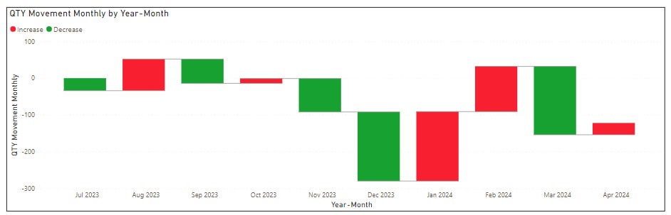
Comparing the last five months (December 2023 - April 2024) with the first five months of the fiscal year (July 2023 - November 2023) can provide insights into recent performance changes. Despite monthly variations, this comparison can highlight trends and improvements over a longer period. The key is to contextualize these variations and explain their impact on the overall trend.
You could use both rolling averages and specific period comparisons to get a sense of how the team has improved. By using both, you can provide a comprehensive view of performance trends and improvements. Calculate the mean ticket closure time for specific periods to show efficiency improvements and use a rolling average or moving trend line to illustrate the general trend over time, smoothing out month-to-month variations.
Consider comparing the first five months of each year (January to May) to account for seasonality and provide a like-for-like comparison. Additionally, compare the last five months (December to April) with the first five months of the fiscal year (July to November) to highlight recent performance changes.
Given the variability in monthly ticket volumes, using a rolling average or comparing longer periods can provide more stable insights. Since the data from January 1 to now represents only a portion of the year, comparing it with the same period last year ensures consistency.
If you can’t include charts in the report (can you include tables?), you can still explain it quite effectively in a narrative. Describe how the rolling average is calculated, such as “a 3-month rolling average is calculated by taking the average of the current and the two preceding months.” Then summarize the trend over the period. For example, “The 3-month rolling average of ticket closure times shows a consistent decrease from July 2023 to April 2024, indicating improved efficiency. In July 2023, the average closure time was 5 days, which steadily decreased to 3 days by April 2024.” Then you can contextualize it like, “This reduction in closure time suggests that the team has become more efficient in resolving tickets, likely due to policy or process improvements implemented in the last year.”
For the first five months comparison, you might say, “From January to May 2023, the average ticket closure time was 6 days. During the same period in 2024, the average closure time decreased to 4 days. This 33% reduction indicates a significant improvement in the team’s efficiency.”
For the last five months compared to the first five months, you could explain, “From July 2023 to November 2023, the average ticket closure time was 7 days. Comparing this with the period from December 2023 to April 2024, the average closure time improved to 5 days. This 28% improvement suggests that recent initiatives, policy changes, etc. have positively impacted the team’s performance.”
Something like that would make sense to me.