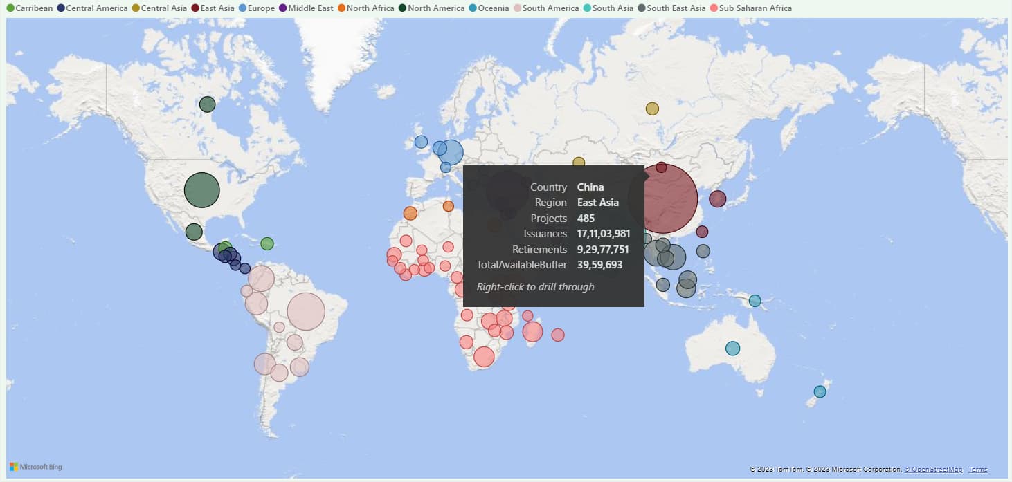
Hi All, I have created the map visual that shows credit issued and retired by country and region. My client is happy with the metrics that i’m showing, but he’s not pleased with how they look and feel visually. Do we have any custom shape maps or visuals in Power Bi that could more effectively convey the same data?
I’ve attached a pbix file; if you can make any suggestions, that would be greatly appreciated. Please feel free to make improvements to my visual. Map Visual.pbix (1.2 MB)
@Keith - I’m looking for to see the same information in shape map, but shape map is still in preview mode and it is primarily designed to work with the US region. Do we have any custom viusal similar to shape map that should work on all the countries. ChatGPT suggested ArcGIS Maps for Power BI, I’m trying it now.