Hey everyone at r/PowerBI,
I’ve got a bit of a challenge on my hands, and I’m hoping some of you might have some wisdom to share. So, here’s the scoop: I’m part of a team of data analysts at my company, and our Power BI dashboards are all over the map. Some are polished and professional, while others… well, let’s just say they could use a bit of a facelift.
My mission? To establish a Power BI dashboard design policy (or whatever fancy terminology you prefer) that brings a sense of coherence and consistency to our analytics efforts.
Have any of you tackled something similar on an enterprise-wide scale? If so, I’d love to hear about your experiences. How did you approach it? Did you make a PDF with the design rules & everyone just followed it ? Did you encounter any unexpected roadblocks? s there any course here that would help me drive adoption of this design policy once it’s created ? And, most importantly, did it make a noticeable difference in your organization’s analytics workflow? I
Additionally, I’m on the lookout for any helpful resources or examples that could guide me in this endeavor. Whether it’s articles, case studies, or personal anecdotes, I’m eager to soak up any knowledge you can share.
Thanks a bunch in advance for any insights you can offer !
Hey,
We have implemented this in our company. I will start first that we have premium per capacity licence, where all our official reports are part of the Premium capacity. Thus everybody in the company has access to them.
We use only apps to distribute content. Everything that’s produced is placed in an app. Distribution via workspace or just sharing a link to a report is not allowed.
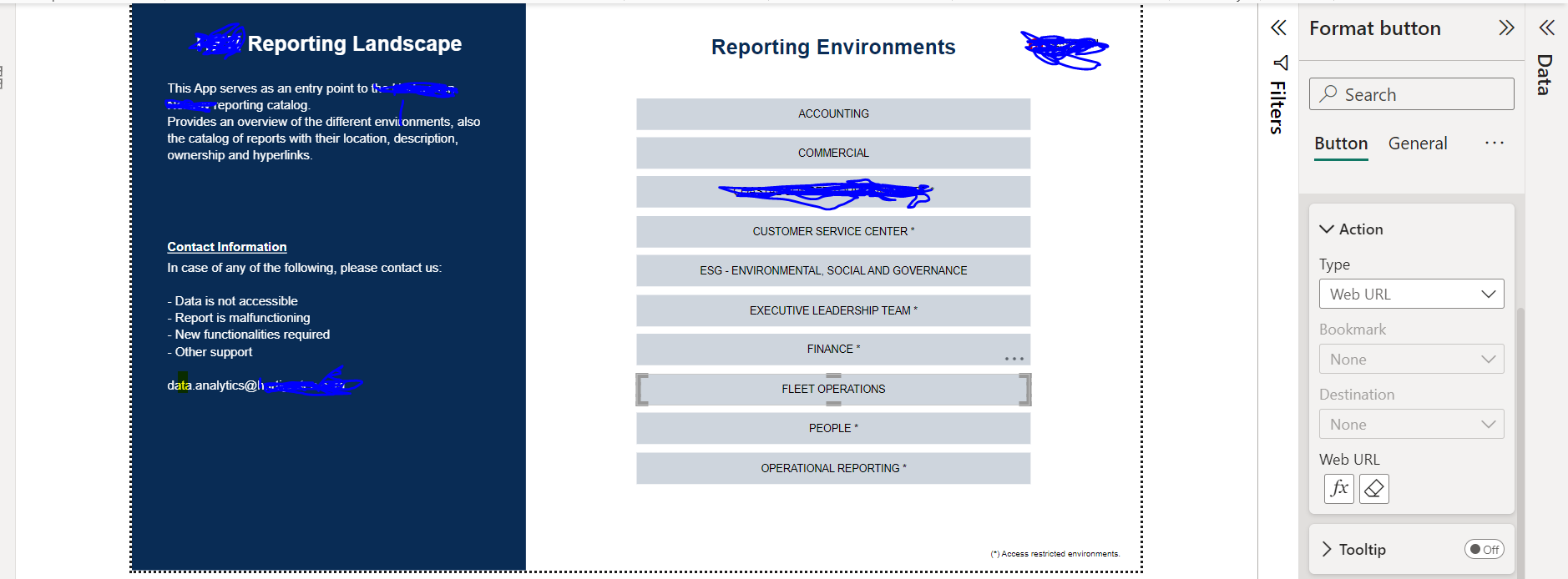
We have a single report (app) that is the the first entering point for any other apps. This report is build in power bi and constitutes different links to different sections ( departments) like Accounting, Commercial, ESG, Operations etc. Here we have a catalogue with all published reports with short description and a link.
After you click on the link to one of the section, you are send to another app that is for a specific department. And here all relevant reports are placed in one app with different sections
1 Like
Let me know if you need more information
@DashIro
Best regards,
Tyankata
@tyankata - if you wouldn’t mind sharing, I’d love to see a screenshot of the primary report that you are using, this is something that I’ve been planning to do for my own team, but have not yet had time to tackle.
@DashIro - my recommendation is from a data standpoint, not a design one. Consider using as few datasets as possible, while it may take time to build out a strong dataset to share with similar reports, it will speed up the report process and let report designers focus on that aspect of the report more when they don’t have to keep re-building the same measures for each report. In my system, I have built separate datasets for Accounting, Sales Team A, and Sales Team B (the two sales teams sell very different product, and their sales come out of different ERP systems). I am currently in the process of combining multiple datasets into one for our warehouse for Sales Team B.
@Heather
Sure, here is it:
the front page with buttons and link to the next App. We use an Excel file as a primary data source where we store all web URL locations to the different apps
1 Like
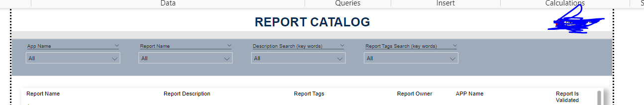
Here is the structure of our report catalog.
Again, the data source is an Excel file where all data is entered.
The name of the reports are having a web link to the correct location.
1 Like
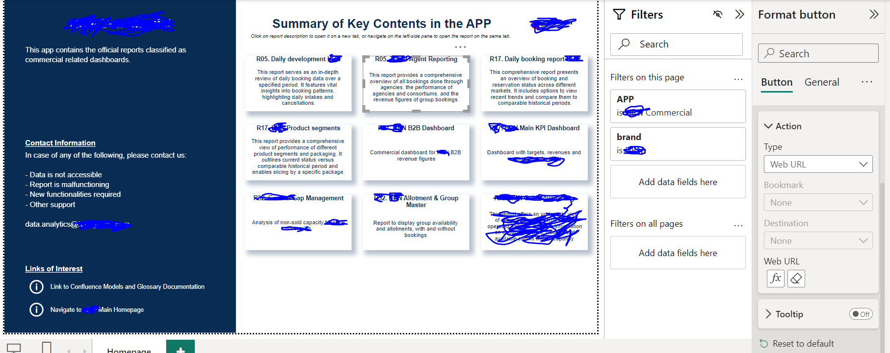
And this is how a section app (department app) looks like:
Again the data source behind is an Excel file. By changing Filters on this page to the different section, the setup adjusts automatically with the data that is entered in the Excel file.
2 Likes
Thank you @tyankata, I have bookmarked, and this will be very helpful once I begin the indexing project! Team of one here, so I always appreciate getting a different perspective!
2 Likes